
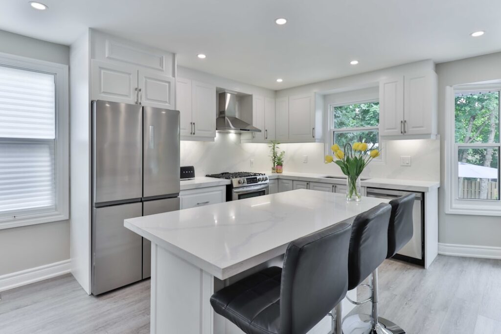
The all-white kitchen had a long run, but designers and homeowners have embraced a more layered look, and that’s exactly what two-color cabinets deliver. The best 2 tone kitchen cabinet ideas use one color on the uppers and another on the lowers or island, adding depth and personality without the room feeling busy. Done thoughtfully, the effect looks custom and expensive. Done carelessly, it can look disjointed. This guide walks through proven color pairings, where to place each color, and the details that make a two-tone kitchen feel deliberate.
Why Two-Tone Works
A single cabinet color can feel flat, especially in a large kitchen. Splitting the palette into two colors creates contrast that draws the eye and defines zones, like grounding the room with darker lower cabinets while keeping the uppers light and airy. It’s also a practical way to introduce a bold color in a controlled dose. You get the drama of a deep navy or forest green without committing the entire room to it.
Two-tone designs also let you highlight a feature, most often the island. Painting the island a different color turns it into a natural focal point and anchors the open floor plan. That flexibility is a big part of why the look has stayed popular.
Where to Place Each Color
The most common and reliable approach is darker below, lighter above. Deeper cabinets on the base and lighter uppers keep the room feeling open and prevent it from feeling top-heavy, since dark colors visually weigh more. This layout mimics how we naturally read a room and rarely goes wrong.
Other placements work too, depending on your goals:
- Island as the accent: keep perimeter cabinets one color and paint the island a bolder or darker shade
- Upper and lower split across the whole kitchen: light uppers, colored lowers throughout for a consistent two-tone effect
- Tall cabinets or pantry as a feature: use the second color on floor-to-ceiling units to frame the space
- Above and below a shelf or open zone: split the color at a natural break like open shelving
Whichever you choose, keep the placement logical. A random scatter of two colors looks accidental, while a clear system of where each color lives looks designed.
Proven Color Pairings
Some combinations have become classics because they simply work. If you want a starting point, these pairings are hard to get wrong:
- White uppers with navy blue lowers or island: crisp, timeless, and endlessly popular
- White with a soft sage or forest green: fresh and calming, pairing beautifully with wood accents and brass hardware
- Cream or off-white with a warm greige or taupe: subtle, sophisticated, and easy to live with
- Light gray uppers with charcoal or black lowers: modern and dramatic with strong contrast
- White with natural wood tones: painted uppers over wood-grain lowers or island for warmth and texture
Wood as the second tone deserves special mention. Pairing painted cabinets with a natural wood island or lower run brings organic warmth that softens a painted kitchen and has become a favorite for transitional and modern-organic styles.
Balancing the Two Colors
The secret to a two-tone kitchen that looks polished rather than chaotic is balance. You generally want one color to dominate and the other to accent, rather than a perfect 50-50 split that can feel indecisive. Let the lighter or more neutral color carry most of the room, and use the bolder color as the supporting accent on the island, lowers, or a feature cabinet.
Tie the two colors together with shared elements. A countertop and backsplash that work with both colors act as a bridge, and consistent hardware across both tones unifies the look. Repeating one of the cabinet colors elsewhere, in a bar stool, a light fixture, or a wall color, also helps the palette feel intentional rather than divided.
Countertops and Backsplash as the Bridge
With two cabinet colors in play, the countertop and backsplash do the important work of tying everything together. A neutral countertop like a white or light gray quartz reads clean against both a light and a dark cabinet, which is why it’s such a safe choice for two-tone kitchens. Busy or heavily veined surfaces can compete with a bold cabinet color, so many designers keep the counters relatively calm when the cabinets are doing the talking.
The backsplash offers a chance to reinforce the palette or add a third subtle element. A classic white subway tile keeps things timeless and lets the cabinet colors shine, while a tile that picks up an undertone from one of your cabinet colors can strengthen the whole scheme. Aim for cohesion; the backsplash and counters should feel like they belong to both cabinet colors.
Hardware and Finishing Touches
Hardware can either unify or fragment a two-tone kitchen. The cleanest approach is to use the same hardware finish throughout, so the pulls and knobs read as a consistent thread across both colors. Matte black hardware looks sharp against white and pops against navy or green. Brass adds warmth to almost any pairing and looks especially good with green, navy, and wood tones.
Consider how the hardware contrasts on each color. A finish that stands out beautifully on the light cabinets should also look good on the darker ones, so hold samples against both before buying. Small choices like matching cabinet hardware to the faucet and lighting are what push a two-tone kitchen from good to genuinely custom-looking.
Avoiding Common Mistakes
A few pitfalls trip up two-tone kitchens. Choosing two colors with clashing undertones, like a cool gray with a very warm cream, can look off even if each color is nice on its own; make sure both undertones lean the same direction. Splitting the colors in a way that has no logic, such as alternating cabinets randomly, reads as a mistake rather than a design choice. And picking two bold colors with no neutral to rest the eye can feel overwhelming in a small kitchen.
If you’re nervous, start conservative: a light neutral for most of the kitchen and a single bolder color on the island is nearly foolproof and easy to change later if your taste shifts.
Two-Tone in Small Kitchens
You don’t need a big open floor plan to pull off two colors, but small kitchens call for a lighter touch. In a compact space, keep most of the room in a light, airy color and use the second, deeper color sparingly, on the lower cabinets, a single run, or a floating shelf backing. Too much dark color in a small kitchen can close it in and make it feel smaller, so let light dominate and treat the accent as a spice, not the main dish.
A clever trick for small kitchens is to reserve the bolder color for a spot that already draws the eye, like the sink base or a bank of drawers, so the contrast reads as intentional. Keeping the countertops and backsplash light and continuous also helps the room feel open, letting the two cabinet colors provide interest without visual clutter. Even a galley kitchen can wear two tones gracefully when the split is planned and the lighter shade carries the room.
Finishes and Sheen Within a Palette
Two-tone doesn’t have to mean two dramatically different colors; it can also play with tone and sheen. Pairing a matte lower cabinet with a slightly different but complementary upper, or contrasting a painted finish against a natural wood grain, creates subtle depth that feels sophisticated rather than loud. The sheen you choose, from matte to satin to semi-gloss, affects how each color reads under your kitchen lighting, and a consistent sheen across both colors keeps the look cohesive.
Painted cabinets generally wear best in a satin or semi-gloss finish because those sheens wipe clean and resist the grease and moisture of a working kitchen, while flat and matte finishes show marks more easily. If you’re mixing a painted color with natural wood, seal the wood well so both surfaces clean up the same way. Thinking about finish and sheen alongside color is what separates a two-tone kitchen that looks custom from one that just looks like two different paint cans.
Designing Your Two-Tone Kitchen
At their best, 2 tone kitchen cabinet ideas give you the depth, warmth, and personality that a single flat color can’t, whether that’s crisp white over navy, painted uppers over natural wood, or a bold island anchoring a neutral room. Keep the placement logical, let one color dominate, bridge the two with calm counters and consistent hardware, and match undertones so the palette feels unified. Follow those principles and your kitchen will look thoughtfully designed and stay stylish for years, all from a smart use of two colors instead of one.


