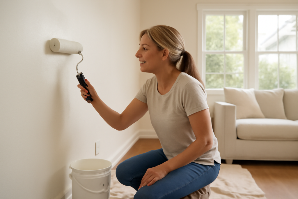
There is a reason one particular white keeps topping designer lists and best-seller charts year after year. Alabaster interior paint, best known as Sherwin-Williams SW 7008, is a soft, creamy white that reads clean without the cold, clinical edge of a stark bright white, and that quiet warmth is exactly why it works in so many homes. Named the brand’s Color of the Year in 2016, it has only grown in popularity, becoming a go-to for walls, trim, cabinets, and entire whole-home palettes. This guide explains its undertones, how it behaves in different light, where it shines, and the colors that make it sing.
What Makes Alabaster Special
Alabaster sits in the sweet spot between a true white and a creamy off-white. It has just enough warmth to feel inviting and lived-in, but not so much that it tips into ivory or yellow. On the color wheel it carries a light greige base, meaning subtle gray and beige undertones temper the white and keep it from ever looking sterile.
That balance is what makes it so versatile. In a bright room it reads as a soft, sophisticated white; in a cozy space it feels warm and enveloping. It plays well with both warm and cool accents, which is unusual for a white and a big reason designers reach for it when they need a color that will not fight the rest of the room.
Understanding the Undertones
Every white has undertones, and knowing Alabaster’s helps you predict how it will look on your walls. Its light gray-beige (greige) undertone means it stays soft and never harsh, but it can shift depending on what surrounds it and how much light the room gets.
Key things to know about how it behaves:
- Warm without going yellow: The warmth is creamy rather than buttery, so it avoids the dated look of some off-whites.
- Slight gray in shadow: In dim corners and north-facing rooms, the greige base can read a touch cooler and grayer.
- Glows in warm light: Under afternoon sun or warm bulbs it takes on a gentle, welcoming radiance.
- LRV of about 82: Its light reflectance value is high, so it brightens rooms while staying softer than a pure white at LRV 90-plus.
Because of that greige base, always test it against your existing flooring, cabinets, and trim. Next to a stark, cool white it will look noticeably warm; on its own it simply looks like a clean, comfortable white.
How Light Changes the Look
Light exposure shifts Alabaster more than people expect, so consider your room’s orientation before committing. South-facing rooms flood with warm light that brings out its creaminess, making it feel especially soft and inviting. North-facing rooms get cooler, flatter light that can pull it slightly gray, which some love for a moodier, muted feel and others find a bit dull.
East-facing spaces glow warm in the morning and cool by afternoon, while west-facing rooms warm up as the day ends. Artificial lighting matters too; warm 2700K bulbs enhance its coziness, while cool 4000K-plus bulbs can flatten the warmth and reveal the gray undertone. Always paint a large sample and observe it at different times of day and under your actual bulbs.
Best Rooms and Uses
Part of Alabaster’s fame is that it works almost everywhere, but a few applications stand out. It is a favorite for whole-home palettes because using one soft white throughout creates a seamless, calming flow from room to room. It also shines as a trim and cabinet color, giving millwork and kitchens a warm, high-end look without the harshness of a bright white.
Consider it for these uses:
- Kitchen cabinets: A warm, timeless alternative to stark white cabinetry that pairs beautifully with brass and wood.
- Trim and doors: Soft enough to complement almost any wall color while still reading crisp.
- Whole-home walls: A cohesive, light-filled backdrop that flatters furnishings of every style.
- Ceilings: Painting the ceiling the same Alabaster as the walls creates a soft, enveloping monochrome look.
One smart trick is using Alabaster on both walls and trim in the same room, varying only the sheen. The subtle contrast between an eggshell wall and a satin trim gives dimension without introducing a second color.
Colors That Coordinate Beautifully
Alabaster’s flexibility means it pairs with a wide range of accents. For a warm, organic scheme, combine it with natural wood tones, soft tans like Accessible Beige, and muted greens such as Sage or Evergreen Fog. For a cooler, more contemporary look, it holds up next to charcoal, soft black trim, and muted blue-grays.
It also makes an excellent partner to bolder wall colors as a trim and ceiling white, letting a deep navy, forest green, or moody charcoal take center stage while keeping the room feeling fresh. If you want a monochromatic layered look, pair it with a slightly deeper greige on an adjacent wall. Because its undertone is balanced, it rarely clashes, which is precisely why it anchors so many designer palettes.
Choosing the Right Sheen
Sheen affects both durability and how the color reads. For walls, an eggshell or matte finish keeps the look soft and hides minor imperfections. For trim, doors, and cabinets, step up to satin or semi-gloss for durability and a subtle, wipeable sheen that catches the light nicely.
On cabinets specifically, a satin or semi-gloss enamel gives the smooth, furniture-grade finish that makes Alabaster look custom. Ceilings usually take a flat finish to minimize glare. Whatever you choose, buy quality paint, since a premium formula lays down more evenly and holds the true color better than a bargain line.
How Alabaster Compares to Other Popular Whites
Alabaster rarely gets chosen in a vacuum, since most homeowners cross-shop it against the other big-name whites, and understanding the differences sharpens your decision. Compared with Sherwin-Williams Pure White, Alabaster is noticeably warmer and softer; Pure White is crisper and cleaner, better when you want a bright, modern white with less cream. Against Benjamin Moore White Dove, the two are close cousins, both warm and soft, with White Dove reading marginally cooler and a touch grayer.
Set beside a stark white like Sherwin-Williams Extra White or Benjamin Moore Chantilly Lace, Alabaster looks distinctly creamy and cozy, which is exactly why people who find true whites cold gravitate to it. If your home has warm wood floors, brass fixtures, and natural textures, Alabaster harmonizes effortlessly. If your finishes lean cool, with chrome, gray tile, and blue accents, a cooler white may coordinate better. The honest takeaway is that Alabaster is the warm-but-not-yellow option, and that middle ground is precisely its selling point.
Tips for Getting the Best Result
A few practical habits ensure Alabaster looks its best on your walls. Prime any patched or bare drywall first so the color goes on uniformly, and use a quality roller to lay down an even film without streaks. Two coats is the norm for full, consistent coverage, especially over an existing darker color. Keep the same sheen consistent across a wall so light does not reveal touch-up patches later.
Because Alabaster shifts with light, buy a sample and paint a large swatch on more than one wall of the room, since a single test spot near a window will not represent the shadier corners. View it morning, midday, and night under your actual bulbs. When you commit, buy enough paint from the same batch, or have the store box multiple gallons together, so there is no subtle color variation between cans across a large job. These small steps protect all the careful thought you put into choosing the color.
Final Thoughts
The lasting appeal of Alabaster interior paint comes down to its rare ability to feel both crisp and warm, working across styles, rooms, and lighting conditions where other whites falter. Understand its greige undertone, test it in your own light before committing, and lean on its flexibility to pair it with everything from natural wood to moody charcoal. Whether you paint a single room or your entire home, this soft, creamy white delivers the calm, timeless backdrop that keeps it at the top of the list.