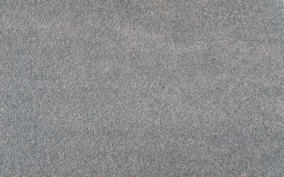
Before most homeowners ever set foot in a flooring store, they spend hours scrolling through carpet photos online — on manufacturer websites, retailer galleries, Pinterest boards, and design blogs. That research is genuinely useful for narrowing down styles and eliminating options that aren’t right for your space. But carpet photos have meaningful limitations, and understanding those limitations is what prevents a purchase you’ll regret. This guide shows you how to read carpet images accurately, what details they reveal and conceal, and how to use them effectively alongside physical samples.
Why Carpet Photographs Are Deceptive
Carpet is one of the most photographically dishonest products in the home furnishings industry. The way a carpet looks on a monitor — in controlled studio lighting, shot from overhead with professional camera settings — can differ dramatically from how it reads in your actual room. Several factors contribute to this gap.
First, lighting completely changes how carpet color appears. A mid-gray carpet shot under cool white LED studio light photographs as a clean neutral. In a room with warm incandescent or halogen light, that same carpet reads as distinctly purple or blue. In a south-facing room with direct afternoon sun, it might look completely washed out. The camera captures a single moment under a single light source. Your room has multiple light sources across different times of day.
Second, carpet texture and pile direction interact with light to create color shifts that photographs can never fully capture. Walk across a plush saxony carpet in different directions and you’ll see streaks of lighter and darker tone — this is called shading, and it’s a characteristic of cut-pile carpets with directional fibers. In a flat overhead photograph, the carpet looks uniform. In a real room, it shows this constant directional shading as the light hits fiber tips at different angles.
Third, pile height and density read very differently at scale. A photo of a 60-oz textured carpet in a magazine spread looks incredibly soft and plush. A photo of a 35-oz berber looks dense and tight. But in a real room, both can look excellent or disappointing depending on how light falls across them and how they interact with your specific furniture colors.
What You Can Reliably Learn from Carpet Photos
Despite their limitations, carpet photos are a useful first filter. Here’s what you can accurately assess from images:
Style and Pattern Category
You can reliably identify which broad style category a carpet belongs to. Is it a looped berber, a cut-pile plush, a frieze (twist), a patterned cut-and-loop, or a flat-weave? These categories have distinct visual signatures that read clearly in photographs. Use this to eliminate entire categories that don’t fit your style or practical needs before requesting any samples.
Color Family
Photos are reasonably accurate at telling you whether a carpet is in the warm beige-to-brown family, the cool gray-to-blue family, or a more saturated color like red or green. They’re less accurate at telling you exactly which shade of gray or beige it is. Use photos to get in the right color family, then rely on physical samples to determine the exact shade.
Pattern Scale
For patterned carpets — geometric prints, floral designs, or traditional medallion patterns — photos accurately convey the scale of the pattern relative to the room. A pattern that reads as small and delicate in a photo shot from 6 feet away will look that way in your living room. A bold geometric in the same photo will look just as bold in reality.
Texture Contrast
Cut-and-loop carpets create deliberate pile height variation that creates visual patterns (geometric or organic shapes) through texture rather than color. These patterns photograph clearly and accurately convey how the finished floor will look in a large room.
Carpet Styles Commonly Seen in Photos
Plush or Saxony
Plush carpet has uniform, upright cut fibers that create a smooth, velvety appearance in photographs. It photographs beautifully — rich, deep, luxurious. The reality is that plush carpet shows footprints and vacuum tracks prominently because the directional fibers retain impressions. What looks flawless in a staged design photo will show traffic patterns within weeks of regular use in a real home. Best in formal rooms with low foot traffic, like a master bedroom or a dining room where chairs aren’t constantly dragged.
Berber and Loop Pile
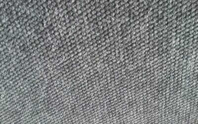
Berber carpet has looped (uncut) fibers that create a dense, nubby surface. In photos it reads as more casual and textural than plush. It hides footprints and tracks extremely well because the looped structure isn’t directional. Berber photographs reasonably accurately — the dense loop structure you see in the image is what you get underfoot. Main caveat: berber loops can snag and unravel if caught by a pet’s nail. That risk is invisible in any photograph.
Frieze (Twisted Pile)
Frieze carpet — sometimes called twist carpet — has highly twisted cut fibers that curl in different directions, creating a casual, textured look. In photos, frieze reads as a slightly more informal surface with a random, textured appearance. It’s actually one of the most practical carpets for family rooms and hallways because the random fiber direction hides footprints, vacuums easily, and has good resilience. Frieze photographs fairly accurately in terms of texture.
Patterned Carpet
Patterned carpets — cut-and-loop, printed patterns, or woven patterns like Wilton — photograph extremely well because the pattern is the dominant visual element. You can accurately assess whether a pattern will work in your space from a photograph, especially if the retailer includes a room-scene image that shows the pattern at floor level relative to furniture. Check scale carefully: a pattern that looks moderate in size in a room-scene photo might be too large or too small for your specific room dimensions.
How Lighting Shifts Color: What to Watch For
Before you fall in love with a carpet photo, ask yourself what kind of lighting your room has:
- Warm incandescent or halogen light (2700–3000K): Amplifies warm tones (beige, gold, orange undertones) and dulls cool tones. A cool-gray carpet can read as distinctly purple in warm light.
- Daylight or cool LED (5000–6500K): Makes cool grays and blues look crisp and clean. Warm beiges can look stark or slightly yellow.
- Natural north-facing light: Consistent, cool, shadow-free. Neutral grays look gray. This is the light that makes photographs accurate — it’s relatively rare in most living rooms.
- South-facing afternoon sun: Intense, warm, shifting throughout the day. Any carpet will look dramatically different at noon versus 4 PM.
The practical solution: when you have a physical sample in hand, place it in your room at different times of day — morning, midday, late afternoon, and under your evening artificial lighting. Check it each time. If the color is acceptable in all four conditions, you’ve found a resilient neutral. If it looks wrong in any one condition, it will bother you in daily use.
Why Physical Samples Are Non-Negotiable
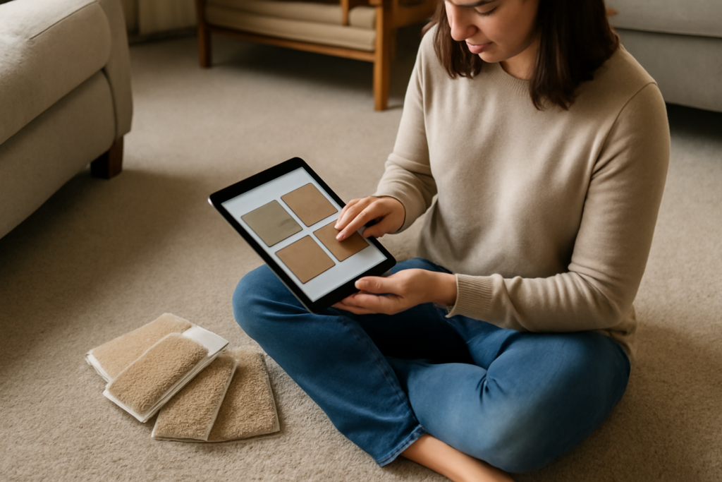
No matter how many carpet photos you study, ordering a physical sample before purchasing is not optional — it’s essential. Here’s what a sample tells you that a photo cannot:
- True color under your specific lighting: No two rooms are lit identically. Only a sample in your room gives you the real color answer.
- Texture and softness: How it feels underfoot. How dense the pile is. Whether the texture matches your tactile expectations from the photo.
- Sheen and light reflectivity: Some carpets have a subtle shine from certain angles; others are completely matte. This reads differently in person than in studio photography.
- How it interacts with your existing colors: Hold the sample against your wall paint, your sofa fabric, your cabinet doors. The color relationships that make a room cohesive can only be assessed with real materials side by side.
Most flooring retailers and manufacturers provide free samples, either at the store or mailed to your home. Request samples from every product you’re seriously considering. A 4×4-inch sample is minimally useful — ask for a 12×12-inch sample or larger if the retailer offers them. The larger the sample, the more accurate your color read will be.
Photographing Your Own Room for Better Matching
If you’re shopping online or working with a retailer remotely, photographing your own room is a practical way to get better guidance. Here’s how to do it usefully:
- Shoot at midday with as much natural light as possible, no flash. Turn off artificial lights during the photo so the image reflects natural light color accurately.
- Include the existing walls, baseboards, and any fixed elements (counters, cabinets) that the carpet needs to coordinate with.
- Take a second photo in the evening under your actual artificial lighting with the same framing.
- Include a white sheet of paper or a white towel in the corner of the frame as a reference point — it helps the retailer or designer calibrate for color cast in your photos.
Send both photos to your retailer with your sample request. A good salesperson can narrow recommendations significantly based on the room context rather than guessing from a vague description like “I want a medium gray.”
Reading Room-Scene Carpet Photos
Manufacturers and retailers publish room-scene photos — styled room images where the carpet is installed in a designed space with furniture, lighting, and decor. These are more useful than isolated carpet swatches but still require critical reading.
Staged room photos almost always use professional photography with adjusted white balance, added fill lighting, and sometimes post-processing to enhance color saturation. The carpet will look more vibrant or richer in a staged photo than in a typical residential room. Use room-scene photos to assess style compatibility and scale — whether the carpet visually suits the architecture, the furniture style, and the room function — rather than as a color reference.
Pay attention to how the carpet reads at the edges of the room-scene photo, where the lighting is less curated. The color there is usually closer to what you’ll see in your own room than the brightly lit center of the staged image.