
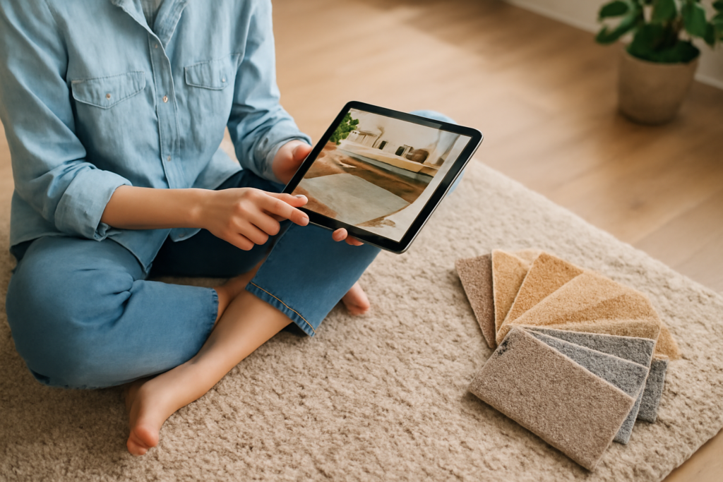
A photograph of carpet has more failure modes than almost any other flooring image. The texture flattens out, the colour shifts under indoor lighting, the camera autofocuses on dust instead of fibres, and the result tells you almost nothing about how the product looks in person. Carpet picture quality matters more than most homeowners realise — for selling a home, comparing samples online, requesting a colour match, or photographing a stain to argue with an installer about a warranty claim. A few small adjustments to lighting, angle, white balance, and lens choice produce images that actually capture pile depth, fibre tone, and pattern accurately.
Why Carpet Is So Hard to Photograph
Three problems compound. First, fibres scatter light unevenly, making the colour read differently from any single angle. Second, modern cameras and phones aggressively smooth textures during processing, flattening the very pile depth you want to show. Third, indoor lighting (typically 2700 K to 3000 K incandescent or LED) shifts colour temperature noticeably away from the daylight conditions a buyer or designer expects.
The result: a photo that looks acceptable on the camera screen but reads as a beige blur on a buyer’s monitor.
Lighting — the First Variable to Fix
Daylight is your friend. Photograph carpet during late morning or early afternoon, with the room lit by indirect daylight from a north-facing window. Direct sun creates hot spots and harsh shadows that exaggerate texture inconsistently.
If the room has no usable daylight, use two soft lights at 5500 K colour temperature, positioned at 45-degree angles to the camera and 6 to 8 feet from the floor. Cheap LED panels with diffusion at $80 to $200 each work well; the daylight-balanced LEDs in modern smart bulbs can substitute in a pinch.
Turn off all other interior lighting during the shot. Mixed colour temperatures produce green or magenta casts that are nearly impossible to correct in post-processing.
Angle and Composition
The default carpet picture is shot straight down from standing height. That angle minimises pile depth and makes everything look flat. Better approaches:
- 30 to 45 degree downward angle — captures both surface colour and edge-on fibre depth
- Eye-level horizontal — shows pile depth dramatically against a vertical background
- Close-up macro — fills frame with 3 to 6 inches of carpet at a 60-degree angle
For room-context shots, frame so the carpet covers at least 60 percent of the visible image and include a known-size reference (a coin, a ruler, or a piece of furniture) so viewers can judge pile height and pattern scale.
Camera and Phone Settings
For phone photography, turn off HDR mode — it tends to crush texture detail. Use the “RAW” or “ProRAW” capture option if available. Set white balance manually to 5000 K to 5500 K rather than auto. Tap to focus on a textured area of the pile, not the bare floor at the edge.
For DSLR or mirrorless cameras, shoot at f/8 to f/11 for adequate depth of field on flat surfaces, ISO 100 to 400 for clean detail, and shutter speed at least 1/100 second handheld or use a tripod.
Use the lowest possible ISO. Carpet noise reduction algorithms turn fibre detail into an oil-painting smear at ISO 1600 and above.
Color Calibration and Reference
Include a colour reference card in the first shot of any carpet shoot — an X-Rite ColorChecker Passport or even a Pantone matching booklet. This single step lets you correct colour cast in post-processing software so the pile colour matches the physical carpet.
For phone shots, a printed white card or a piece of clean printer paper in one frame allows software white balance correction afterwards.
Photographing Carpet for Specific Purposes
For real estate listings: shoot wide-angle room context with daylight, include enough of the carpet to communicate scale and pattern, and avoid hot spots from window glare. Stage the room minimally so attention falls on flooring quality.
For warranty claims: shoot multiple angles of damage with a ruler in frame for scale, and include both close-up macro and a wide shot showing the location in the room.
For colour matching with a manufacturer: photograph in indirect daylight, include the colour reference card, and capture a clean undamaged section. Most mills can match from a high-resolution photo plus a 4-inch by 4-inch physical sample.
Editing Without Distortion
Mild adjustments improve carpet pictures meaningfully. Use Adobe Lightroom, Apple Photos, Snapseed, or any editor with white balance and exposure tools. Aim for:
- White balance set to a neutral grey or white reference in the frame
- Exposure adjusted so highlights are not blown out and shadows are not crushed
- Contrast and clarity nudged up modestly to preserve fibre detail
- Saturation left alone or lowered slightly — oversaturation makes carpet look unnatural
Avoid heavy filters, vignettes, or HDR effects. They distort pile colour and texture.
Common Mistakes
- Using flash directly — flattens texture and produces hot spot
- Mixed colour temperature lighting — produces unfixable colour cast
- Top-down phone shots from standing height — minimises pile depth
- Including the photographer’s shadow in the frame
- Shooting through dust — clean and vacuum first
What Sample Photos Cannot Capture
Even a perfect carpet picture cannot fully convey three things: the actual feel of the pile underfoot, the true scale of the pattern in a room, and how the colour shifts under your home’s specific lighting. For any major purchase, request a 12-inch by 12-inch physical sample to walk on, place against your existing furnishings, and view at all times of day.
Mills typically provide samples for a refundable deposit of $5 to $15 per piece. Spending an extra week ordering samples saves the meaningful possibility of recarpeting an entire home in the wrong colour.
Bottom Line
A useful carpet picture combines daylight (or balanced 5500 K artificial lighting), a 30- to 45-degree shooting angle, a colour reference card, low ISO, and minimal editing. Get those five factors right and the resulting image actually communicates pile depth, colour accuracy, and pattern scale to the person viewing it — whether that person is a buyer, a designer, a manufacturer, or your future self comparing samples six months from now.


