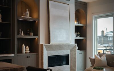
Designers love a paint color that behaves differently from morning to evening, and Sherwin-Williams City Loft (SW 7631) does that better than almost anything else in the warm neutral category. City Loft paint reads as a soft, sophisticated greige in low light and shifts toward a warmer, almost putty tone in bright sun. With a light reflectance value (LRV) of 65, it brightens spaces without going chalky, and it pairs with both warm and cool accent colors. This guide covers undertones, lighting behavior, room-by-room performance, and the coordinating colors that make City Loft sing.
The Color Profile and Undertones
City Loft sits in the warm gray family with subtle beige undertones. On a paint chip, it looks like a balanced light gray, but on the wall it reveals soft tan and putty notes. The LRV of 65 puts it in the medium-light range, dark enough to register as a definite color rather than reading as off-white, but light enough to keep rooms feeling open.
The undertones lean warm enough that City Loft never feels cold or sterile, but they are subdued enough that the color does not read as obviously beige. Sherwin-Williams classifies it within their “neutrals” collection, and it has been a top-50 seller for the brand for several years.
How Lighting Changes the Color
City Loft is one of the most light-reactive grays Sherwin-Williams sells. In a north-facing room with cool natural light, the warm undertones come forward and the color reads as a soft greige with a hint of taupe. In a south-facing room flooded with warm afternoon light, those same undertones intensify and the color drifts toward a creamy warm gray that some people describe as putty.
Under warm white LED bulbs (2700K), City Loft glows. Under cool daylight LEDs (5000K), it pulls slightly cooler and more neutral. Test City Loft on at least two walls of any room you are considering it for, because the same gallon will look noticeably different on each wall depending on its orientation to windows.
Where City Loft Works Best
The color performs beautifully in:
- Living rooms with mixed natural light: The shifting undertones add depth across the day.
- Open-concept main floors: One color flows across multiple lighting conditions without reading flat.
- Bedrooms: Restful, warm, and works with a wide range of bedding colors.
- Hallways and entries: Adds warmth to typically dim spaces.
- Whole-home neutral: Works as a unifying color throughout multiple rooms.
The color performs less well in:
- Bathrooms with bright cool lighting: The warm undertones can clash with cool tile and fixtures.
- Small north-facing rooms: Already cool spaces with warm walls can feel muddy.
- Kitchens with bright white cabinets: The warm gray makes white cabinets look slightly yellow.
Coordinating Colors That Pair Well
City Loft works in countless palettes, but some coordinations are particularly strong. Sherwin-Williams publishes its own designer-approved combinations, and these consistently rank highest:
For Trim and Ceilings
- Pure White (SW 7005): Crisp, clean, slightly warm white that grounds City Loft.
- Alabaster (SW 7008): Slightly creamy white that softens the contrast.
- Snowbound (SW 7004): Brighter white that adds modern crispness.
For Accent Walls
- Urbane Bronze (SW 7048): Deep, sophisticated brown for an anchor wall.
- Iron Ore (SW 7069): Charcoal-black that feels modern and dramatic.
- Sea Salt (SW 6204): Soft green-gray for an organic feel.
For Cabinets
- Tricorn Black (SW 6258): True black for high-contrast modern kitchens.
- Naval (SW 6244): Deep navy that complements the warm gray walls.
- Repose Gray (SW 7015): Slightly cooler gray for tone-on-tone elegance.
City Loft vs Similar Colors
City Loft often gets compared to other Sherwin-Williams warm grays. Knowing the differences helps you pick the right one.
City Loft vs Agreeable Gray (SW 7029): Agreeable Gray is slightly darker (LRV 60) and pulls a bit more obviously beige. City Loft reads lighter and more neutral.
City Loft vs Repose Gray (SW 7015): Repose Gray has cooler undertones and lacks the warm putty notes of City Loft. Use Repose for a cleaner, cooler look.
City Loft vs Accessible Beige (SW 7036): Accessible Beige is more obviously beige, while City Loft sits closer to true gray. Pick Accessible Beige if you want more warmth.
City Loft vs Edgecomb Gray (BM HC-173): Edgecomb has slightly more green undertone. City Loft is closer to a balanced putty.
Application Tips for the Best Finish
Most colors look slightly different applied than they do on a chip. Buy a sample quart, paint a 2-by-2-foot section on at least two walls, and observe over 24 hours. Once you commit, two coats of Sherwin-Williams Emerald or ProClassic in eggshell or matte deliver the cleanest finish.
Prime any patches or new drywall with a tinted primer matched to City Loft. Untinted primer can show through and create blotchy areas, especially with the warm gray undertones at play.
Best Sheen Choice for Each Room
Sheen affects how City Loft reads almost as much as lighting does. Matte and flat sheens emphasize the color depth and hide wall imperfections, ideal for living rooms and bedrooms. Eggshell offers slight scrubbability for hallways and family rooms. Satin works in kitchens and baths where wipeability matters; it also slightly amplifies warm undertones. Avoid semi-gloss on walls because the high reflectivity exaggerates every drywall flaw.
Furniture and Decor That Complement City Loft
City Loft is one of those colors that adapts to nearly any decor style. With white linen sofas, light oak floors, and brass hardware, it leans modern farmhouse. Paired with charcoal velvet, walnut furniture, and matte black accents, it shifts to transitional or modern industrial. Mid-century pieces in walnut and brass also work beautifully against City Loft walls.
Avoid pairing with all-cool decor (icy blues, pure whites, chrome) because the wall warmth makes those elements feel orphaned.
Frequently Asked Questions
Is City Loft warm or cool gray?
Warm. City Loft has subtle beige and putty undertones that classify it as a warm gray. It reads more neutral than colors like Accessible Beige but warmer than true neutrals like Classic Gray.
What is the LRV of City Loft?
City Loft has an LRV of 65, putting it in the medium-light range. It brightens rooms but is not as reflective as off-whites with LRV above 80.
Does City Loft go with white kitchen cabinets?
Yes, especially with warm whites like Pure White or Alabaster. With cool, bright whites the wall color can make the cabinets look slightly yellow, so test before committing.
What white trim color works with City Loft?
Sherwin-Williams Pure White (SW 7005) is the most popular pairing. Alabaster (SW 7008) is a softer option for a less stark contrast.