
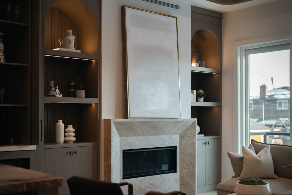
Light pink went from “little girl’s room” to one of the most-specified paint colors in residential design almost overnight — and homeowners scrolling saved Pinterest boards keep hitting the same wall: what on earth do you pair it with? The good news is that colors that go with light pink run the full spectrum from moody and sophisticated to airy and cheerful. The trick is matching undertones correctly and using the pairing in the right proportions. This room-by-room guide gives you the combinations designers rely on, with actual paint codes you can walk into Sherwin-Williams or Benjamin Moore and buy tomorrow.
- Understand Your Pink's Undertone First
- Sage Green: The Instant Sophistication Combo
- Charcoal and Black for Drama
- Navy Blue for Coastal or Prep Rooms
- Warm Whites and Creams
- Brown and Terracotta for Warm Earthiness
- Gold, Brass, and Blush Metals
- Soft Gray and Greige
- Room-Specific Palettes That Work
- Colors to Avoid
- Test Before You Commit
Understand Your Pink’s Undertone First
Not all light pinks behave the same. A pink with yellow undertones (think Benjamin Moore Pink Bliss 2093-70) reads peachy and warm. A blue-based pink (Farrow & Ball Pink Ground) reads cool and almost lavender in low light. Pair a peachy pink with too much cool gray and it will look dingy; pair a cool pink with heavy gold and it skews salmon.
Hold a paint chip against the pink you are using. If it makes the pink look dirty or muddy, trust your eye and keep looking.
Sage Green: The Instant Sophistication Combo
Light pink and muted sage green is the pairing that dominated 2024 and 2025 design awards for a reason. The green grounds the pink, making it read adult rather than sweet. Aim for a sage with gray underneath, not a yellow-green.
- Sherwin-Williams Evergreen Fog SW 9130 with a light dusty pink
- Benjamin Moore Saybrook Sage HC-114 with Pink Bliss
- Farrow & Ball Mizzle 266 with Calamine 230
Use a 70/20/10 split: 70% pink on walls, 20% sage on an accent wall or built-ins, 10% as an accent in textiles.
Charcoal and Black for Drama
Want pink to punch above its weight? Anchor it with charcoal or soft black. This combination works especially well in bedrooms and powder rooms where you want a mood shift from the rest of the house. Black trim, a black vanity, or matte black hardware against blush walls photographs beautifully and holds up in daily life.
Benjamin Moore Black Beauty 2128-10, Sherwin-Williams Tricorn Black SW 6258, or the slightly softer Iron Mountain 2134-30 all pair cleanly with a cool-toned pink. Stick to a maximum of 15% black; more than that and the pink feels oppressed.
Navy Blue for Coastal or Prep Rooms
Navy balances pink without competing with it. Think of a pink bedroom with a navy velvet headboard, or a pink dining room with navy drapery. The contrast adds backbone.
- Benjamin Moore Hale Navy HC-154 with a warm pink like First Light 2102-70
- Sherwin-Williams Naval SW 6244 with Intimate White SW 6322
- Farrow & Ball Hague Blue 30 with Pink Ground 202
Keep metals consistent — brass with warm pinks, polished nickel with cool pinks. Mixing both looks accidental rather than collected.
Warm Whites and Creams
If you want pink to feel fresh and gallery-like, pair it with a warm white rather than a stark white. Pure white (Sherwin-Williams High Reflective White, for example) actually makes pink look artificial. A creamy white lets the pink breathe.
Try Benjamin Moore White Dove OC-17, Sherwin-Williams Alabaster SW 7008, or Farrow & Ball Pointing 2003. These whites have enough yellow to make pink feel sunlit, not chalky. This palette is perfect for nurseries, dressing rooms, and sunrooms.
Brown and Terracotta for Warm Earthiness
This is the unexpected winner. Warm brown — think leather, caramel, walnut — turns pink into something that looks plucked from a 1970s Italian villa. Terracotta tile, a camel-colored sofa, or a walnut dining table against pink plaster walls reads rich and lived-in.
For paint pairings, Sherwin-Williams Cavern Clay SW 7701 works as a 15% accent. Benjamin Moore Copper Patina 686 brings out the warmth. Skip orange-brown if your pink is cool-toned — the combination goes muddy fast.
Gold, Brass, and Blush Metals
Metal is a color decision. In a pink room, brass and gold read warm and vintage; polished nickel reads contemporary; matte black reads modern. You do not need to repaint anything — swap drawer pulls, light fixtures, and picture frames to completely shift the mood.
A $30 set of unlacquered brass knobs on a pink-painted dresser delivers more “designer” impact than almost any other small upgrade.
Soft Gray and Greige
When you want quiet rather than drama, pair pink with warm gray or greige. This is the go-to for whole-house schemes where pink might appear in a bedroom, a bathroom, and a hallway without overwhelming anyone.
- Benjamin Moore Revere Pewter HC-172
- Sherwin-Williams Agreeable Gray SW 7029
- Farrow & Ball Cornforth White 228
Check the undertone: a pink-undertone greige with a blue-pink wall will feel disjointed. Sample both at the same time, side by side, under your actual lighting.
Room-Specific Palettes That Work
Rather than generic rules, here are tested combinations by room.
- Primary bedroom: Pink walls, Hale Navy headboard wall, White Dove trim, brass lighting.
- Powder room: Pink ceiling, Tricorn Black lower walls, marble vanity, polished nickel faucet.
- Home office: Evergreen Fog built-ins, pink chair rail wall above, warm wood desk.
- Kitchen: Pink lower cabinets, white upper cabinets, oak floors, unlacquered brass hardware.
- Nursery: Pink walls, Saybrook Sage crib wall, natural rattan and cream textiles.
Colors to Avoid
Some combinations fight the moment the light changes. Skip bright cool red with light pink (fights for the same visual space), fluorescent yellows (makes pink look sallow), and purple-leaning burgundy (muddy and dated). Sunset-orange next to a cool blush pink can also tip the whole room toward a Tropicana-carton look.
Test Before You Commit
The cheapest insurance in painting is a $10 Samplize or peel-and-stick sample. Paint two coats of each candidate color onto two-foot squares, tape them to the wall at eye height, and live with them for 48 hours. Look at them at morning, noon, and lamp-lit evening.
Pink is a shape-shifter under different light temperatures, and the right answer at 10 a.m. is sometimes wrong at 8 p.m. Once you land the right companion, lock it in across trim, textiles, and metals for a room that feels intentional rather than experimental. The colors that go with light pink are far broader than most homeowners assume — you just have to find the one that sings in your own space.


