Selecting commercial carpet colors is a decision that affects daily maintenance effort, the psychological atmosphere of a space, and the useful life of your flooring investment. Unlike residential carpet, where personal taste drives most choices, commercial carpet colors are selected against a set of practical and psychological criteria: traffic patterns, soil visibility, brand identity, and the needs of the specific end user — whether that’s office workers, healthcare patients, retail customers, or hotel guests. This guide covers the most commonly specified color ranges, why they work, and how to match color choice to your specific commercial application.
Why Color Choice Matters More in Commercial Settings
Commercial carpet takes considerably more abuse than residential carpet. A busy office corridor or retail store can see 500 or more foot passes per day across the same 3-foot-wide path. Even high-quality commercial carpet fiber — nylon solution-dyed or type 6,6 nylon — will show soil and wear more quickly in the wrong color than the same fiber in a better-matched colorway. Getting the color selection right from the start reduces cleaning frequency, extends time between replacement cycles, and maintains a professional appearance with less effort.
Face weight and fiber type matter too — most commercial carpet specs in the 26–40 oz face weight range in cut pile, or 18–28 oz in loop pile — but color is the variable that will most visibly affect how the floor looks two years into service, long before the fiber itself wears out.
Neutral Grays and Gray-Blends
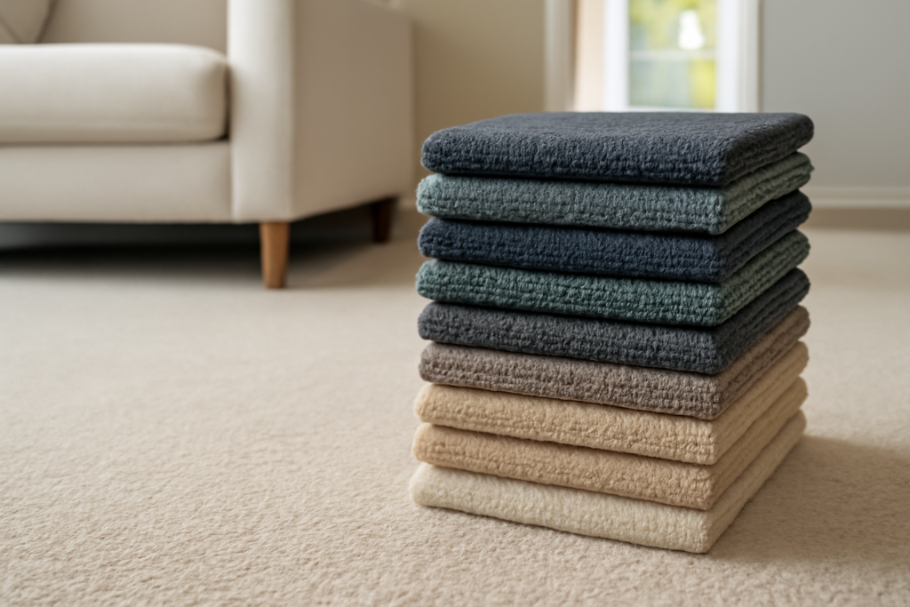
Gray is the dominant color in commercial carpet specifications today, across almost every commercial sector. Medium and dark gray broadlooms and carpet tiles are specified heavily in corporate offices, coworking spaces, government buildings, and educational environments. The reasons are practical: gray in the mid-tone range (not too light, not too dark) does not show dust as readily as very light colors, hides dark stains better than light backgrounds, and photographs neutrally in marketing materials and real estate listings.
Heathered or multi-tone gray — gray carpet with flecks of white, charcoal, or even subtle blue or green undertones woven through — outperforms solid gray for soil concealment because the visual texture breaks up the eye’s ability to resolve individual dirt particles into a visible stain. If you’re specifying for a high-traffic corridor, a heathered medium gray is consistently one of the top-performing choices for appearance retention.
Taupe, Greige, and Warm Neutrals
Taupe and greige (gray-beige hybrids) are the second tier of popular commercial carpet color choices, particularly in hospitality, healthcare, and upscale retail environments where the gray palette feels too cold or industrial. Warm neutrals read as more welcoming than cool grays under incandescent or warm-white LED lighting, which is why they’re common in hotel lobbies, medical waiting rooms, and boutique retail.
Like gray, the most practical versions are heathered or multi-tone — a taupe with flecks of brown, rust, or gold woven through will outperform a flat single-tone taupe for soil concealment by a meaningful margin. In healthcare environments specifically, warm neutrals are often selected over gray because they create a less clinical atmosphere without sacrificing practicality.
Blues and Blue-Grays
Blue is strongly associated with trust, professionalism, and calm in color psychology research, which drives its continued popularity in financial services, law offices, corporate boardrooms, and healthcare facilities. Mid-tone navy and slate blue carpet tiles are common in banking and insurance environments. Softer, grayed-down blues (often described as “steel blue” or “slate”) perform well in open-plan offices where the carpet needs to support a professional environment without being visually aggressive.
Blue carpet tends to show light-colored dust and dander more readily than gray, so specifying a blue in a heathered or multi-tone weave is important for maintenance. Blues also interact with lighting quality: under fluorescent or cool-white LED lighting, blue carpet tends to look accurate; under warm-white light it can shift slightly greenish or gray. Test samples under the actual fixtures before committing.
Multi-Tone and Heathered Patterns
Whether the base color is gray, taupe, or blue, multi-tone or heathered carpet consistently outperforms solid colors in appearance retention scores across the commercial carpet industry. The visual complexity of a heathered or tweed construction breaks up the uniformity of the pile, making it very difficult for the eye to isolate and focus on individual soil particles or staining events.
Pattern carpets — geometric, abstract, or organic patterns in two or more colors — take this principle further. A carpet tile with a geometric pattern in two shades of gray will look cleaner at 18 months of heavy use than a solid gray broadloom of identical fiber and construction. Patterned carpet tiles are particularly popular in hospitality and retail for this reason, as well as for the visual interest they add to a space. The tradeoff is that pattern carpet takes more time and care to install (pattern match across tiles adds waste and time) and can look dated if the pattern is too trend-specific.
Color Psychology by Sector
Different commercial environments call for different emotional registers, and carpet color is one of the most powerful tools for setting that tone.
Corporate Offices
Neutral grays, greiges, and muted blues dominate corporate specifications. The priority is a professional, non-distracting background that works with a range of furniture systems and branding. Open-plan spaces benefit from medium-value neutrals that don’t create visual contrast with task-area furniture, which can cause eye fatigue. Private offices and conference rooms can accept slightly richer or more saturated colors — deeper navy or charcoal — as an accent.
Healthcare
Healthcare carpet color selection balances warmth (to reduce clinical anxiety for patients and families) with practicality (to conceal the type of soil that occurs in medical environments). Warm neutrals, soft greens, and muted blues in multi-tone constructions are common. Carpet tiles are almost always preferred over broadloom in healthcare because they allow spot replacement of damaged or heavily soiled sections without replacing an entire room’s worth of floor.
Hospitality
Hotels and restaurants use carpet color as a direct brand extension tool. Lobby carpet in hospitality can be significantly bolder than what’s appropriate in a corporate environment — rich jewel tones (deep emerald, burgundy, navy) or high-contrast geometric patterns in public areas signal luxury and design intentionality. Guest corridors typically shift to more neutral tones for practical maintenance, with pattern carpet tiles allowing individual piece replacement when a corridor section wears unevenly.
Retail
Retail carpet color strategy depends heavily on the store category. Discount retail typically uses very dark or very patterned carpet to minimize visible soiling under extremely high traffic; upscale retail uses softer, more refined neutrals that don’t compete visually with displayed merchandise. Department stores often use carpet to delineate zones — different carpet colorways in housewares vs. clothing vs. electronics sections create a wayfinding system without signage.
Carpet Tile vs. Broadloom: Color Flexibility
Carpet tile gives you considerably more color flexibility than broadloom for large commercial installations. Individual 24×24 or 18×24 tiles can be mixed in multi-color patterns — two-tone checkerboard, ashlar, or even fully custom randomized designs — and replaced selectively when a section wears or stains beyond cleaning.
Broadloom (typically 12 feet wide) offers a seamless look in smaller spaces and is somewhat lower cost per sq ft in materials, but repair and replacement requires a dye lot match and careful seaming, which gets harder as the product ages. For spaces over about 3,000 sq ft or any space with heavy traffic in predictable paths, carpet tile’s selective replaceability usually justifies its higher upfront per-sq-ft cost.
When mixing carpet tile colors or patterns, order all product in the same dye lot at the outset. Coming back for more tiles in a second dye lot — even the same colorway from the same manufacturer — will produce a visible color discrepancy that no amount of blending will fully conceal.
Selecting the Right Color for Your Space
Before finalizing a commercial carpet color specification, request large-format samples — at least 12×12 inches, ideally 24×24 for carpet tile — and evaluate them in the actual space under the actual lighting. Take photos with your phone at different times of day and check the color under the lighting conditions that will be dominant in the space during operating hours.
Consider the most common soiling you’ll face. If a space is adjacent to an exterior entrance in a rainy climate, darker value carpet with a heathered pattern will extend appearance retention versus a light neutral. If the main concern is beverage spill in a break room or cafeteria, look at solution-dyed nylon options with stain-resistance treatment, which perform better for wet staining than piece-dyed alternatives. The right color is the one that looks good on day one and still looks acceptable on day 500.