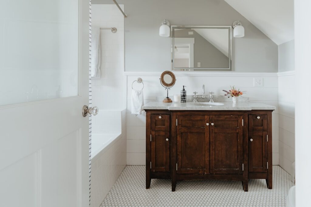
The farmhouse look endures because it balances warmth, simplicity, and a lived-in ease that fussier styles never achieve. Choosing the right farmhouse bathroom paint colors is the fastest way to capture that feeling, and the palette leans on soft warm whites, muted sage greens, gentle greiges, and the occasional moody charcoal or navy for contrast. Beyond picking a pretty swatch, a bathroom demands paint that stands up to steam and splashes, so sheen and finish matter as much as the color itself. This guide names specific, proven shades with their light reflectance values so you can order samples with confidence.
Warm Whites: The Farmhouse Foundation
No color says farmhouse like a soft, warm white, and two shades dominate designer projects. Benjamin Moore White Dove OC-17 is the gold standard, a creamy off-white with a light reflectance value, or LRV, of 85 that reads bright without the sterile blue coldness of a stark white. It pairs beautifully with shiplap, white subway tile, and unlacquered brass fixtures, glowing in both natural and warm artificial light.
Sherwin-Williams Alabaster SW 7008 is its equally beloved counterpart, with an LRV of 82 and a slightly softer, warmer cast. Alabaster was Sherwin-Williams’ 2016 Color of the Year and still anchors countless farmhouse bathrooms because it never looks dingy or too yellow. Either white works as an all-over color on walls, trim, and ceiling for a serene envelope, or as the crisp trim color against a colored wall. When in doubt, a warm white on the walls with the same white on the shiplap is the safest, most timeless farmhouse move.
Soft Greens for Organic Calm
Muted green has become the signature accent of the modern farmhouse bath because it echoes nature without shouting. Sherwin-Williams Sea Salt SW 6204 is the most famous of them, a whisper-soft green-gray with a hint of blue and an LRV of 63. Sea Salt shifts subtly with the light, reading more green in daylight and more gray at night, which gives a small bathroom a restful, spa-like depth. It is forgiving, flattering, and nearly impossible to get wrong.
For a slightly cooler, more coastal green, Benjamin Moore Palladian Blue HC-144 leans blue-green with an LRV around 61 and brings an airy, breezy quality that suits farmhouse baths with lots of white tile. Both shades pair naturally with warm wood vanities, woven baskets, and matte black or brushed brass hardware. Use these greens on the walls with White Dove or Alabaster trim and shiplap for a layered, collected look that feels current without chasing a trend.
Greige: The Versatile Neutral
When you want warmth and neutrality without committing to a color, greige, the blend of gray and beige, is the answer. Sherwin-Williams Agreeable Gray SW 7029 is the most popular neutral in America for good reason, carrying an LRV of 60 and a balanced undertone that flatters nearly any tile, countertop, or wood tone you place against it. In a farmhouse bath it provides a soft, grounding backdrop that lets shiplap texture and vintage fixtures take center stage.
Greige works especially well in bathrooms with mixed materials, such as a marble-look quartz vanity top paired with a warm oak floor, because its dual undertone bridges both. Keep the trim and ceiling in a clean warm white to let the greige walls recede quietly. If Agreeable Gray reads a touch too gray in your particular light, its warmer cousin Accessible Beige SW 7036 nudges the balance toward beige while keeping the same easygoing versatility.
Moody Charcoal and Black Accents
Contrast keeps a farmhouse palette from feeling washed out, and nothing delivers drama like a deep charcoal. Sherwin-Williams Iron Ore SW 7069 is the go-to, a rich near-black charcoal with an LRV of just 6 that looks stunning on a vanity, a powder-room wall, or an accent of board-and-batten. Against warm white walls and brass hardware, an Iron Ore vanity grounds the whole room and reads sophisticated rather than heavy.
Use these dark shades strategically rather than everywhere. A single black vanity, a charcoal accent wall behind a freestanding tub, or black window trim provides the punch of contrast that makes the whites look whiter and the greens look richer. In very small powder rooms, painting all four walls in Iron Ore can actually feel intimate and jewel-box luxurious, since a windowless half-bath has little natural light to lose anyway.
Navy for Timeless Depth
If pure black feels too severe, navy offers the same grounding contrast with a touch more color and classic appeal. Benjamin Moore Hale Navy HC-154 and Sherwin-Williams Naval SW 6244 are both farmhouse favorites, deep and saturated with LRVs in the single digits to low teens. Navy pairs exceptionally well with warm whites, natural wood, and both brass and matte black fixtures, giving a bathroom a crisp, nautical-meets-country feel.
Navy is a natural choice for a vanity, a lower board-and-batten section beneath a chair rail, or a full accent wall. Because it is dark, test it in your actual space at different times of day, since low-light bathrooms can make deep navy read almost black. Balanced with plenty of white above and bright, layered lighting, navy delivers depth that stays elegant for decades rather than dating quickly.
Choosing the Right Sheen
Color choice is only half the battle in a bathroom, because moisture demands the correct finish. Flat and matte paints look beautiful but soak up humidity and are prone to mildew, so they are risky in a room full of steam. For bathroom walls, a satin or eggshell finish is the sensible standard: it resists moisture, wipes clean, and hides minor wall imperfections while offering just a hint of sheen.
For trim, doors, shiplap, and any surface that gets splashed or touched frequently, step up to semi-gloss, which sheds water best and stands up to repeated scrubbing. Many manufacturers now sell bath-specific paints, such as Sherwin-Williams Emerald or Benjamin Moore Aura Bath and Spa, formulated with mildew-resistant additives that let you use a lower-sheen matte look while still surviving the humidity. In a hard-working family bath, those specialty lines are worth the extra $15 to $25 a gallon.
Matching Color to Room Size and Light
The same swatch behaves very differently in a windowless powder room than in a sunny primary bath, so let your room’s light dictate the choice. Small, dim bathrooms benefit from high-LRV warm whites and pale greens that bounce what little light exists, keeping the space from feeling cave-like. A shade with an LRV above 60, like Sea Salt at 63 or Agreeable Gray at 60, is a safe bet for a compact interior bath with no window.
Larger bathrooms with generous natural light can carry deeper, moodier tones without feeling closed in, which is where Iron Ore, Hale Navy, or a saturated green earn their place. North-facing rooms receive cool, bluish light that can make grays and greens read colder than expected, so nudge toward warmer undertones there. South-facing rooms flood with warm light that flatters nearly everything, giving you the most freedom to experiment with bold color.
Coordinating Ceiling, Trim, and Finishes
Farmhouse style rewards restraint, and the cleanest look often comes from keeping the palette tight. A reliable approach is to choose one wall color, carry the trim and ceiling in a single warm white, and introduce contrast only through the vanity, hardware, and textiles. Painting the ceiling the same White Dove or Alabaster as the trim, rather than a default builder white, wraps the room in a soft, cohesive glow that photographs beautifully and feels calm in person.
Hardware and fixture finishes should tie back to the palette rather than fight it. Warm whites and soft greens pair naturally with unlacquered or brushed brass and matte black, while greige and navy also welcome oil-rubbed bronze. Woven baskets, a wood-framed mirror, and a jute runner add the organic texture that keeps a painted farmhouse bath from feeling flat. These finishing layers are what separate a room that merely has the right paint from one that fully reads as farmhouse.
Pulling the Palette Together
The most successful farmhouse bathrooms combine these elements in layers rather than relying on a single color. A common winning formula is warm white shiplap in White Dove, walls in Sea Salt or Agreeable Gray, and a vanity in Iron Ore or Hale Navy, all tied together with brushed brass or matte black hardware. Painting the ceiling the same warm white as the trim keeps the room feeling taller and more cohesive than a stark bright-white ceiling.
When you settle on your farmhouse bathroom paint colors, always buy sample pots and paint large swatches on at least two walls, observing them in morning and evening light before committing. Undertones that look perfect in the store can shift dramatically under a bathroom’s mix of window light and vanity bulbs. Test first, choose a moisture-ready sheen, and your farmhouse bath will feel warm, timeless, and effortlessly gathered for years to come.