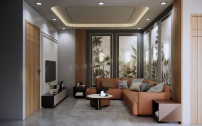
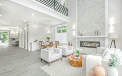
Three pictures is the magic number for wall art. Two looks unfinished, four pushes into gallery-wall territory, but three reads as intentional and balanced almost automatically. How to arrange 3 pictures on a wall examples below cover horizontal lines, vertical stacks, staggered placements, and asymmetric clusters, with specific spacing and hanging-height numbers that match what professional art installers use. Get those measurements right and even a $25 print from IKEA Bjorksta hangs like it belongs in a designer photoshoot.
- The 57-Inch Rule (and When to Break It)
- Layout 1: Horizontal Line, Same Size Frames
- Layout 2: Vertical Stack
- Layout 3: Salon Style (Asymmetric Cluster)
- Layout 4: Stair Step
- Layout 5: Anchored Center
- Layout 6: Mixed Orientation Row
- Layout 7: Tight Grid (Triptych)
- Layout 8: Floating Shelf Pictures
- How to Hang Without Hole Mistakes
- Frame and Mat Choices That Tie It Together
- Common Mistakes to Skip
The 57-Inch Rule (and When to Break It)
Museums and galleries center artwork at 57 to 60 inches above the floor. That is roughly average human eye level. In residential settings, you adapt:
- Over a sofa: bottom edge of art 6 to 10 inches above the back cushion
- Over a console table or sideboard: bottom edge 4 to 8 inches above the surface
- In a stairwell: follow the slope, not eye level
- Above a bed: bottom edge 8 to 12 inches above the headboard
- Stand-alone wall: center of arrangement at 57 to 60 inches
Measure to the center of the arrangement, not the center of each frame. For three pictures, that center is in the middle frame.
Layout 1: Horizontal Line, Same Size Frames
The cleanest, most foolproof layout. Three identical frames, hung in a row.
- Spacing between frames: 2 to 4 inches, dependent on frame width
- Same top edge across all three
- Centered on the wall (or on the furniture below)
Works best with photography, botanical prints, or abstract triptychs. Pottery Barn, West Elm, and Crate & Barrel all sell three-piece sets sized for this layout, typically 16×20 or 20×24 frames with 3-inch gaps.
Layout 2: Vertical Stack
Three frames stacked vertically work in narrow walls between windows or beside a bookcase.
- Spacing between frames: 2 to 3 inches
- Center the column on the wall horizontally
- Bottom frame’s bottom edge should land 30 to 36 inches above the floor in a hallway, 18 to 24 inches above a console
Tall narrow walls in entry foyers, stairwell landings, and between kitchen cabinets are made for this. Try a 12×16 botanical series or vintage poster trio.
Layout 3: Salon Style (Asymmetric Cluster)
One large frame plus two smaller frames stacked on one side. Common in eclectic and bohemian rooms.
- Large frame: 24×36 or 30×40
- Two smaller: 11×14 or 16×20, stacked vertically
- Spacing between large and stack: 3 to 4 inches
- Smaller frames stacked with 2-inch gap between
- Top edges should align: large frame top with small-frame stack top
This layout looks deliberate without being rigid. Great for mixing one statement piece (a photograph or oil painting) with two smaller works (sketches, family snapshots).
Layout 4: Stair Step
Three identically sized frames hung in a diagonal step pattern along a stair wall.
- Each frame stepped down 7 to 10 inches from the previous
- Horizontal spacing between frames: 4 to 6 inches
- Step should match the stair angle (about 35 to 40 degrees)
Photograph each frame’s bottom-left corner at the same distance from the stair rail or skirt board. This is the easiest stair-art arrangement to install with a level and a long tape measure.
Layout 5: Anchored Center
The middle frame is the largest. Two smaller flank it.
- Center frame: 24×36 or 30×40
- Side frames: 16×20 or 18×24, oriented vertically
- Spacing: 3 to 4 inches between frames
- Vertical centerlines of all three frames align
Use this for traditional and transitional rooms. Looks especially strong over a fireplace, with the mantel acting as the visual base.
Layout 6: Mixed Orientation Row
Two vertical frames flanking one horizontal frame. Reads modern.
- Vertical frames: 16×20 each
- Horizontal frame between: 20×16 or 24×18
- Spacing: 2 to 3 inches
- Top edges of vertical frames align with each other; horizontal centered between them
This layout reads as intentional curation. Pair with neutral mats and matching frames for cohesion despite the orientation mix.
Layout 7: Tight Grid (Triptych)
A single image split across three panels, hung with tight gaps.
- All three panels same size
- Spacing: 1/2 to 1 inch maximum (so the image reads as continuous)
- Hung level across the top
Best for landscape photography, abstract paintings, and Asian-inspired wall scrolls. CanvasOnDemand, Shutterfly, and Society6 print custom triptychs for $80 to $250.
Layout 8: Floating Shelf Pictures
Three frames sitting on a 36-inch picture ledge or floating shelf, overlapping slightly.
- Shelf installed at 57 inches above the floor for stand-alone display
- Or 8 to 10 inches above a sofa back for over-couch arrangement
- Frames lean back at a slight angle
- Largest frame anchors one end; smaller frames overlap in front
This is the easiest to update. Swap frames without putting new holes in the wall.
How to Hang Without Hole Mistakes
Get the layout right on paper first.
- Cut paper templates the same size as each frame.
- Tape them to the wall with painters tape and step back. Adjust until you like the look.
- Mark hanging-hardware points through the paper.
- Remove the paper, leaving small pencil marks.
- Drill or insert anchors. For drywall, use a 50-pound rated EZ Anchor or 75-pound Toggler for frames over 10 lbs.
- Use 1.5-inch picture hooks rated for the combined frame and glass weight.
A 4-foot level helps for horizontal layouts; a laser level (Bosch GLL30 at $35) eliminates all guesswork.
Frame and Mat Choices That Tie It Together
Three matching frames are the safest choice for any layout. Black, white, natural oak, and brushed brass each work across styles. Add a 2 to 3-inch white mat for prints to lift the image off the wall visually. For photography, no mat works fine if frames have a clean edge. Mix frame finishes only when at least two share a color: black with brushed brass works if the brass also appears on lamps or hardware in the room.
Common Mistakes to Skip
Hanging too high is the number-one error. Pictures land 6 to 12 inches lower than feels right when you are holding them up. Trust the 57-inch rule. Skipping templates and eyeballing leads to crooked rows and triple-the-hole repairs. Hanging frames too small for the wall makes the wall look bigger and the art smaller. Aim for total arrangement width equal to two-thirds the width of the furniture below, or two-thirds of the available wall.