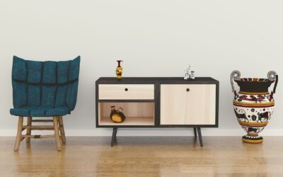
Japandi is what happens when Scandinavian hygge meets Japanese wabi-sabi. The best japandi paint colors share three qualities: low chroma, warm undertones, and a slight muddiness that reads as natural rather than synthetic. Picking the wrong shade turns a calm minimalist room into a sterile dental office. The palette and brand picks below come from interior designers who specialize in the style and from the actual paint chips that show up most often in published Japandi homes on Domino and Architectural Digest.
What Makes a Color “Japandi”
Japandi avoids pure white, true black, and saturated primaries. Every color should look slightly weathered, as if it has been touched by time. The undertones lean warm: beige, ochre, and warm gray rather than cool blue-gray. Chroma stays low, meaning every color is muted rather than vibrant. Sheen choices favor matte and eggshell over satin or semi-gloss.
If you hold a paint chip next to a piece of unfinished cedar or a smooth river stone and they belong in the same scene, the color is likely a fit.
Best Warm Whites and Off-Whites
Pure white reads cold and clinical in Japandi spaces. Choose whites with warm undertones:
- Benjamin Moore White Dove (OC-17): The most-used warm white in Japandi interiors. Slight cream undertone that reads soft without going yellow.
- Sherwin-Williams Alabaster (SW 7008): A warm neutral white with subtle yellow undertones.
- Farrow & Ball Pointing (No. 2003): An off-white inspired by old lime mortar. Reads more sophisticated than typical builder white.
- Benjamin Moore Swiss Coffee (OC-45): Cream-leaning warm white that works in north-facing rooms.
Use these as walls or ceilings to set a foundation that lets natural wood tones and dark accents speak.
Soft Beiges and Mushroom Tones
The middle tier of a Japandi palette adds warmth and depth without going dark:
- Sherwin-Williams Accessible Beige (SW 7036): Warm taupe that reads as a sophisticated neutral.
- Benjamin Moore Edgecomb Gray (HC-173): Warm griege that bridges gray and beige.
- Farrow & Ball Skimming Stone (No. 241): A warm putty color with green undertones.
- Sherwin-Williams Natural Linen (SW 9109): Soft tan with woven texture references.
- Behr Mushroom Bisque (770D-4): Budget option at Home Depot that mimics premium mushroom shades.
These work as feature walls, kitchen cabinetry, or trim work when paired with white walls.
Earthy Browns and Charcoals
Darker accents create visual weight without aggression. Use these on cabinetry, single feature walls, or millwork:
- Farrow & Ball Black Blue (No. 95): Inky black with blue undertones. Reads ink-stick black in low light.
- Benjamin Moore Iron Mountain (2134-30): Deep warm gray with brown undertones.
- Sherwin-Williams Urbane Bronze (SW 7048): Dark brown-gray, the Sherwin-Williams 2021 Color of the Year. Still highly relevant for Japandi.
- Farrow & Ball Tanner’s Brown (No. 255): Rich chocolate brown reminiscent of aged leather.
Limit dark accents to one surface per room. Two dark walls in a small space overwhelm the calm Japandi feel.
Room-by-Room Palette Plans
The same colors can work across the house, but distribute them based on light and use:
- Living room: Benjamin Moore White Dove on walls, Urbane Bronze on a single feature wall behind the TV.
- Kitchen: White Dove walls with Skimming Stone cabinetry. Iron Mountain on the island.
- Primary bedroom: Accessible Beige on walls with White Dove ceiling and trim.
- Powder room: Farrow & Ball Black Blue with brass fixtures and a white oak vanity.
- Home office: Edgecomb Gray walls with Tanner’s Brown built-in shelving.
Pull the palette through the whole home rather than treating each room as its own design. Continuity is part of what makes Japandi feel intentional.
Pairing With Wood Tones
Japandi leans heavily on natural wood. The wood species you use will dictate which paint colors disappear behind it and which sing:
- White oak: Pairs with almost any warm white or beige. Avoid cool grays.
- Walnut: Works with warm whites, mushroom tones, and deep black-blues.
- Light maple: Choose softer warm whites; bright whites compete.
- Hinoki or cedar: Lean into Farrow & Ball Skimming Stone or Pointing to match the natural undertones.
Get wood samples at your local lumberyard and bring them to the paint store. Holding the actual species against a paint chip is the only reliable way to see whether the undertones harmonize.
Finish and Sheen for Japandi
Sheen choices affect Japandi success as much as the color itself. Use Benjamin Moore Aura Matte or Sherwin-Williams Cashmere Flat on walls. Both have a chalky non-reflective quality that mimics traditional Japanese lime-washed walls. Trim and millwork in Pearl or low-luster avoids the plastic-y look that semi-gloss creates.
For an even more authentic look, try Farrow & Ball Dead Flat or Limewash. Limewash specifically creates the mottled, hand-applied texture that defines high-end Japandi interiors. Expect $90 to $130 per gallon and plan for a learning curve on application.
Lighting Changes the Color Read
Japandi colors are subtle by definition, which means lighting changes the perception dramatically. Use 2700K to 3000K LED bulbs throughout. Cool 4000K and 5000K bulbs strip the warmth from beige and mushroom tones and make the whole palette read cold. Cree, Philips, and GE all make 90+ CRI bulbs in the warm range for $4 to $9 each.
Add natural light wherever possible. Paper screens, sheer linen curtains from The Citizenry, and floor-to-ceiling windows let the colors shift with the time of day, which is part of the Japandi philosophy of welcoming impermanence.
Sampling Before Committing
Buy three to five sample quarts before painting a full room. Brush each sample on a 2×2 foot patch of poster board rather than directly on the wall. Move the boards around the room throughout the day to see how the color behaves in morning light, midday sun, and evening lamp light. Live with the samples for at least a week; first-impression favorites often lose to a more subtle option once you have spent time with both.
Samplize ($6.99 per peel-and-stick sample) sells real paint samples on adhesive sheets that you can move freely around the room. They use actual Benjamin Moore and Farrow & Ball paint, so the chroma and finish match what you will get in a full gallon. This service saves the cost of multiple sample quarts when you are deciding between five candidates.