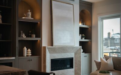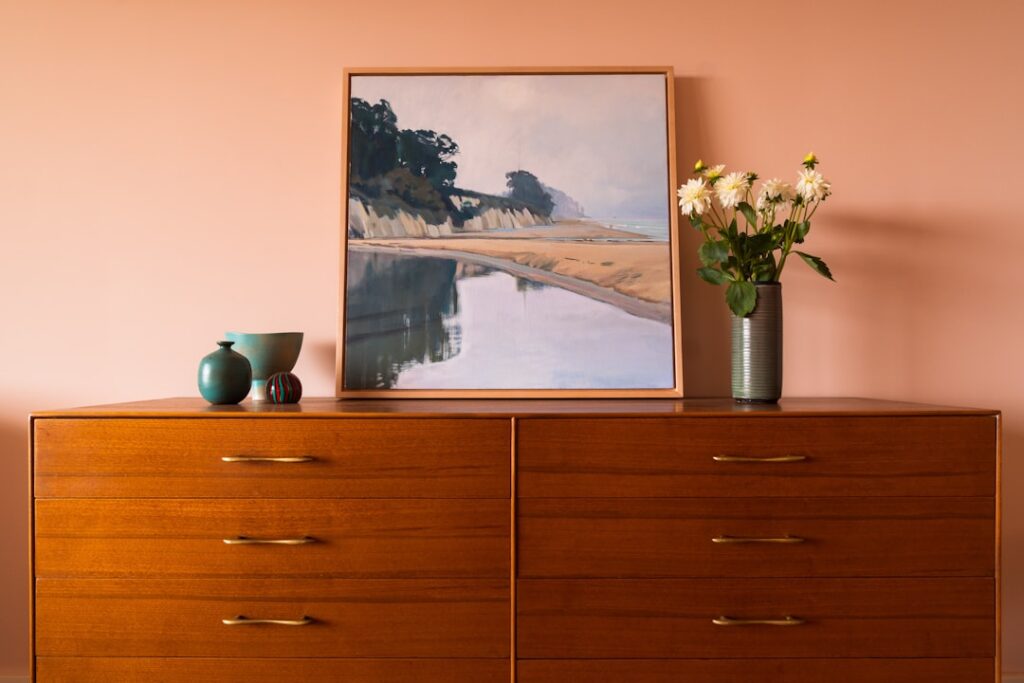
The mid-century modern movement, which peaked from roughly 1945 to 1969, gave us clean lines, an embrace of nature, and a distinctive color sensibility that remains one of the most popular design styles in American homes today. The best mid century modern paint colors blend earthy, nature-inspired neutrals with confident pops of saturated accent hues, creating spaces that feel both warm and effortlessly cool. This guide breaks down the signature palette, how to combine these colors room by room, and the practical tips that keep the look authentic rather than gimmicky.
What Defines the Mid-Century Color Palette
Mid-century color was shaped by optimism, new manufacturing, and a deep connection to the outdoors. Designers of the era paired grounded earth tones with cheerful, almost playful accents. The result is a palette built on two layers: a foundation of warm, organic neutrals and browns, and a smaller dose of bold, energetic color drawn from nature and the new synthetic dyes of the postwar years. Rather than the cool grays that dominated the 2010s, mid-century leans warm, with mustard, avocado, terracotta, teal, and walnut at its heart.
The Signature Warm Neutrals
Every great mid-century room starts with a neutral base that feels warm rather than stark. These foundation colors do the heavy lifting on walls and large surfaces:
- Warm white and cream. Soft, slightly yellow-toned whites keep walls bright without feeling cold, and they let wood tones and bold accents stand out.
- Greige and warm taupe. A blend of gray and beige that grounds a room and pairs beautifully with walnut furniture.
- Camel and tan. Earthy mid-tones that echo the leather and wood of the era.
- Chocolate and walnut brown. Deeper browns used on accent walls, built-ins, or paneling to add richness and warmth.
These neutrals reflect the movement’s love of natural materials and create a calm backdrop for the punchier colors to come.
The Bold Accent Colors
What truly signals mid-century modern is the confident use of saturated accent colors against those warm neutrals. Used sparingly on a feature wall, a front door, cabinetry, or furniture, these hues bring the style to life:
- Mustard yellow. Perhaps the most iconic mid-century accent, warm and sunny without being garish.
- Avocado and olive green. Earthy greens that nod directly to the appliances and textiles of the 1960s.
- Burnt orange and terracotta. Warm, clay-inspired tones that add energy and pair naturally with wood.
- Teal and peacock blue. Rich blue-greens that feel sophisticated and retro at once.
- Deep coral and rust. Muted reds that bring warmth without overwhelming a space.
The trick is restraint. One or two bold colors per room, balanced against neutrals and wood, keeps the look intentional rather than chaotic.
Building a Cohesive Palette
A reliable formula for a mid-century room follows a roughly 60-30-10 split. Devote about 60 percent of the space to a warm neutral on the walls and large surfaces, 30 percent to a secondary tone such as wood furniture or a deeper brown, and the final 10 percent to one or two bold accent colors in pillows, art, a painted door, or a feature wall. This ratio keeps the saturated colors feeling like deliberate highlights rather than a wall-to-wall statement that quickly tires the eye.
Room-by-Room Ideas
Different spaces call for different balances of neutral and accent:
- Living room. Warm white or greige walls let a walnut credenza and a mustard or teal accent chair shine. A single terracotta or olive feature wall behind the sofa adds depth.
- Kitchen. Try warm wood cabinetry paired with a sage or avocado lower cabinet, or keep cabinets neutral and add a burnt-orange or teal backsplash for a period pop.
- Bedroom. Soft camel or taupe walls create a restful base, with a muted coral or peacock-blue headboard wall for gentle drama.
- Bathroom. Warm white walls with sage-green vanity cabinetry and brass fixtures capture the era without going full retro.
- Front door and exterior. A mustard, teal, or burnt-orange door against a neutral facade is a classic mid-century welcome.
Pairing Paint with Wood and Materials
Mid-century style is inseparable from natural wood, especially walnut, teak, and oak. When choosing wall colors, hold paint samples against your actual wood tones. Warm neutrals make walnut glow, while overly cool grays can fight with the orange undertones in mid-century woods. Brass and matte-black hardware, leather, and woven textures all complement the palette. The goal is a layered, organic feel where paint, wood, and materials work together rather than competing.
Matching Paint Finishes to the Look
Color is only half the equation; sheen matters too. Mid-century interiors favor understated, low-glare surfaces. Use these finishes for an authentic result:
- Matte or eggshell on walls. A low-sheen finish reads as soft and modern and hides minor wall imperfections.
- Satin on trim and doors. Enough sheen to clean easily and to make accent doors pop without looking glossy.
- Semi-gloss sparingly. Reserve higher gloss for cabinetry or a statement piece where you want light to play off the surface.
Flat, even finishes suit the era’s clean aesthetic far better than high-shine walls, which can feel out of period.
Common Mistakes to Avoid
A few missteps can push a room from stylish to costume:
- Overusing bold color. Painting every wall a saturated hue overwhelms the space. Anchor with neutrals and let accents punctuate.
- Choosing cold grays. Cool, blue-gray neutrals clash with the warmth that defines the style. Stay in the warm family.
- Ignoring undertones. Always test paint in your room’s actual light at different times of day, since mid-century earth tones shift noticeably under warm versus cool lighting.
- Forgetting the wood. Picking colors without considering your flooring and furniture tones leads to clashes. Coordinate paint with the wood you already own.
Testing Colors Before You Commit
Paint can look dramatically different on a wall than on a swatch. Buy sample pots and paint large patches, at least two feet square, on more than one wall. Live with them for a few days and observe how morning and evening light change the tone. This is especially important with mid-century accents like avocado and burnt orange, which can read very differently depending on your lighting and the wood and flooring around them. A little patience here prevents an expensive repaint later.
Bringing the Look Together
The best mid century modern paint colors are warm, nature-inspired, and used with confidence and restraint. Build on a foundation of cream, greige, camel, and walnut, then add personality with one or two saturated accents such as mustard, avocado, teal, or burnt orange. Follow the 60-30-10 balance, coordinate your colors with natural wood, choose low-sheen finishes, and always test in your own light. Done well, the result is a home that feels both timeless and fresh, with the easy warmth that has kept this style beloved for more than half a century. If your update includes new floors to anchor the palette, D and G Flooring can help you choose warm wood-look options that complete the mid-century feel.