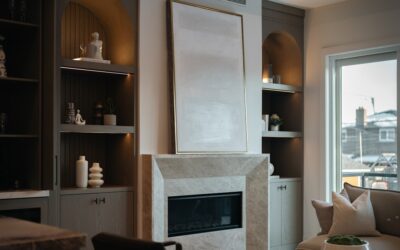
Grey paint goes wrong more often than any other color category. A swatch that looks soft and warm in the store turns blue, purple, or hospital-green on a bedroom wall under different lighting. The undertones in grey shift dramatically with natural light, artificial light, flooring color, and trim choice. Choosing among popular grey paint colors means picking the right undertone for your room, not just the right value of grey on the chip card.
I’ve specified paint for hundreds of homes across the country, and the same 10-15 greys come up again and again because they hold up in real conditions. Here are the ones designers and contractors actually use — sorted by undertone — along with notes on what works with each and what doesn’t.
Understanding Grey Undertones
Every grey has a secondary color hiding underneath. The undertone shows up most clearly in:
- North-facing rooms with cool natural light
- Rooms with warm incandescent lighting in the evening
- Large unbroken wall areas where the color builds up visually
The three main undertone families:
- Warm greys — beige, tan, or pinkish undertones (sometimes called “greige”)
- Cool greys — blue, green, or purple undertones
- True or neutral greys — minimal undertone, reads as pure grey
Buy a sample pot and paint a large swatch (at least 2 feet by 2 feet) on multiple walls before committing. Watch it at 8am, 2pm, and 8pm with the lights on. The undertone you see at 8pm with the lights on is what you’ll live with for years.
Warm Greys (Greige)
Greige is the most forgiving grey for whole-house schemes because the warm undertone reads as inviting rather than cold.
Benjamin Moore Revere Pewter (HC-172)
The single most popular grey of the last 15 years. LRV 55.51. Reads warm in most light, slightly green-grey in cool light. Pairs with white trim (Benjamin Moore White Dove) and most wood tones. Best in rooms with natural light from any direction.
Sherwin-Williams Agreeable Gray (SW 7029)
Benjamin Moore’s main competition. LRV 60. Lighter and more neutral than Revere Pewter. Works in north-facing rooms where you want warmth without going too dark.
Benjamin Moore Edgecomb Gray (HC-173)
Lighter cousin to Revere Pewter. LRV 63. Excellent for whole-house schemes where you want continuity across rooms with different lighting. Reads almost beige in low light but holds its grey identity in daylight.
Farrow & Ball Cornforth White (No. 228)
Sophisticated greige with a slight rose undertone. LRV 56. More expensive than Benjamin Moore options ($120 per gallon) but with a depth and richness that’s hard to match.
Cool Greys
Cool greys photograph well and feel modern. They work best in rooms with good natural light or in spaces where you want a crisper, more contemporary feel.
Benjamin Moore Stonington Gray (HC-170)
A cool, slightly blue grey. LRV 59. Sherwin-Williams Sea Salt’s more grown-up cousin. Pairs beautifully with white kitchens, navy accents, and brass hardware.
Sherwin-Williams Repose Gray (SW 7015)
Slight purple undertone. LRV 58. Tricky in north-facing rooms where the purple can dominate, but stunning in south-facing rooms with warm afternoon light.
Benjamin Moore Coventry Gray (HC-169)
True medium cool grey. LRV 35. Darker than the others in this list and works as a feature wall color or in well-lit rooms with high ceilings.
Farrow & Ball Cromarty (No. 285)
Pale grey-green. LRV 67. Reads as soft and elegant in bright daylight. Subtle enough for whole-house use but distinctive in person.
True Neutral Greys
The hardest category to get right and the smallest in number. True greys with minimal undertone are useful as backgrounds for art collections, for kitchens where cabinet colors carry the warmth, and for spaces where you don’t want the paint to influence the room.
Benjamin Moore Classic Gray (OC-23)
LRV 73. Light enough to almost read as off-white, but with enough grey to ground the room. The default whole-house grey for clients who want quiet walls.
Sherwin-Williams Mindful Gray (SW 7016)
LRV 48. Medium-depth neutral grey. Works in transitional homes where you want a clear grey without committing to warm or cool. Often used in primary bedrooms.
Benjamin Moore Gray Owl (OC-52)
LRV 65. Reads as a soft, true grey in most lighting with a barely-there green undertone in north light. Reliable in bathrooms and kitchens.
Dark Greys and Charcoals
For accent walls, exteriors, dining rooms, and offices.
Benjamin Moore Kendall Charcoal (HC-166)
LRV 12. Deep, slightly warm charcoal that works on exteriors and as a dining-room accent. Pairs with creamy whites and warm metals.
Sherwin-Williams Iron Ore (SW 7069)
LRV 6. Near-black charcoal. Used on cabinets, exterior doors, and feature walls. Holds up to direct sun on exteriors better than most dark colors.
Farrow & Ball Down Pipe (No. 26)
LRV 19. Slightly blue charcoal. Beloved for dining rooms, libraries, and exteriors of farmhouse-style homes.
Matching Trim and Ceiling
Trim color makes or breaks a grey wall. The reliable pairings:
- Warm greys -> creamy white trim (Benjamin Moore White Dove, Simply White, Cloud White)
- Cool greys -> bright white trim (Sherwin-Williams Pure White, Benjamin Moore Decorator’s White)
- True neutral greys -> any white in the same temperature family as your light fixtures
For ceilings, the safe move is to use the wall color tinted to 50% strength. This creates visual continuity without the contrast issues that bright white ceilings can create over grey walls.
Common Mistakes to Avoid
Even with the most popular greys, a few patterns lead to disappointed homeowners:
- Skipping sampling — the chip and the wall behave differently
- Ignoring flooring undertones — cool grey floors with cool grey walls feel sterile
- Using cool grey in a north-facing room — it will read cold and depressing
- Pairing warm grey with bright white trim — the trim makes the grey look dingy
- Matching trim color to wall color exactly — kills visual depth
Spend $20 on three sample pots and a weekend testing them. The difference between picking from a chip and picking from a painted swatch is dramatic, and the wrong grey gets re-painted within two years.