Trends in tile come and go, but muted earth tones keep proving they have staying power. Sage green tile sits right in that sweet spot, soft enough to feel calming and neutral enough to read as a near-neutral in the right setting. It has become one of the most requested colors for kitchen backsplashes and bathroom walls because it pairs with warm woods, brass, white, and black without fighting any of them. If you want color without committing to something loud, this is the shade that delivers. Here is how to use it well.
Why Sage Green Works So Well
The appeal of sage is its restraint. It is a desaturated, gray-leaning green that borrows the calming quality of nature without the intensity of a true emerald or forest tone. That makes it behave almost like a neutral, which is why it reads as fresh today but is unlikely to look dated in five years the way a bold trend color might.
Sage also flatters the materials homeowners already love. Against natural oak or walnut it feels organic and grounded. Next to crisp white it looks clean and a little vintage. Paired with brass or unlacquered hardware it turns warm and slightly historic. Few colors play this nicely with so many companions.
Best Rooms for Sage Green Tile
Some colors are room-specific, but sage adapts. Its most popular homes are:
- Kitchen backsplashes: A sage backsplash adds personality to white or wood cabinets without overwhelming the room.
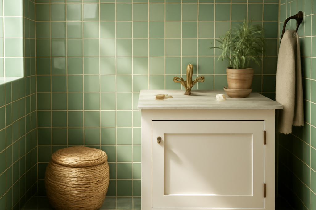
- Bathroom walls and showers: The color’s spa-like calm suits a bathroom, especially in a glossy finish that bounces light.
- Powder rooms: A small space is the perfect place to be a little bolder, wrapping walls in sage for a jewel-box effect.
- Laundry and mudrooms: Sage holds up visually against the practical clutter of these hard-working spaces.
- Fireplace surrounds and accent walls: A focal area where the color can shine without taking over a whole room.
It works on floors too, though most homeowners reach for it on vertical surfaces where it functions as the room’s color statement.
Shapes That Suit the Color
The tile shape changes the personality of the same green entirely. Classic subway tile in sage feels timeless and clean, and a 3-by-6 inch or slimmer 2-by-8 inch format reads modern when set in a vertical stack or a herringbone pattern. Zellige-style square tiles, with their handmade ripples and color variation, lean artisanal and give sage a Mediterranean, lived-in warmth.
For something more contemporary, large-format sage tiles minimize grout lines and create a smooth, continuous wall. Penny rounds, fish-scale, and hexagon mosaics turn sage into a textured feature, perfect for a shower floor or a backsplash accent strip. Match the shape to the mood you want: crisp and classic, artisanal and warm, or sleek and modern.
Glossy vs Matte Finishes
Finish has a big effect on how sage reads. A glossy glaze reflects light, makes the green look brighter and a touch more saturated, and keeps a small bathroom from feeling closed in. It also cleans easily, which matters behind a stove. The downside is that gloss shows water spots and fingerprints more readily.
A matte finish mutes the color further and gives a soft, contemporary, almost chalky look that feels current and understated. Handmade zellige and crackle-glaze finishes add depth and subtle variation that make a flat wall feel rich and intentional. There is no wrong answer here; it is a matter of whether you want the color to pop or recede.
Grout Color: The Detail That Changes Everything
People underestimate grout, but with sage tile it is a major design decision. The grout you pick can either blend the tiles into a soft, seamless field or turn the installation into a graphic grid. Consider these directions:
- Matching sage or soft green grout: Blends seams for a calm, monolithic look.
- Light gray grout: A safe, slightly defined option that keeps things subtle.
- White grout: Brightens the wall and gives a classic, clean subway-tile feel.
- Warm beige or greige grout: Pairs beautifully with zellige and warm-toned sage for an organic look.
- Charcoal or dark grout: Creates a bold, modern grid; striking but high-contrast, so use it intentionally.
When in doubt, a grout one shade off the tile keeps the look soft. Stark contrast is a deliberate style choice, not a default.
Color Pairings That Flatter Sage
Sage is a team player, but a few combinations are reliably beautiful. With warm metals like brass, gold, or aged bronze, it leans elegant and slightly vintage. With matte black fixtures it turns crisp and modern. Natural wood tones, from white oak to walnut, bring out its organic side and make a kitchen feel grounded.
For countertops, a white or cream quartz with subtle veining lets sage be the star, while a warm marble-look surface ties into the green’s softness. Avoid pairing sage with too many other strong colors; its strength is in being the quiet, confident anchor of a calm palette.
Keeping Sage Tile Looking Its Best
Maintenance is the same as any glazed ceramic or porcelain tile. Wipe with a pH-neutral cleaner and a soft cloth, and skip abrasive pads that can dull a glossy finish over time. Sealed grout stays cleaner and resists staining, so seal it after installation and re-seal periodically in wet areas like showers and backsplashes.
Because sage is light and slightly muted, it hides minor wear and water spots better than a deep saturated color or a stark white. That low-maintenance forgiveness is one more reason it has become a go-to for homeowners who want lasting style without constant upkeep.
Is Sage Green Tile Right for You
If you crave a little color but worry about regret, sage green tile is about as safe as a colored tile gets. It functions like a neutral, flatters wood and metal alike, and adapts from classic to modern depending on the shape and finish you choose. Pick the format that matches your style, choose grout that supports the mood, and you will have a surface that feels fresh now and timeless for years to come.
Prefer to explore on your own?
See how new flooring looks in your actual room in seconds — free, no signup.
Try the free Floor Studio →