
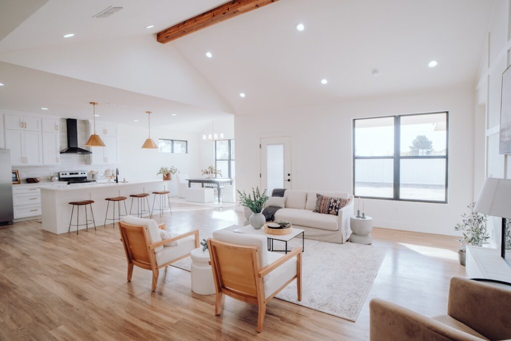
Every decade serves up a flooring color that feels brilliant for three years and dated for fifteen. Honey oak in the 1990s, dark espresso in the 2000s, gray wash in the 2010s — each looked fresh at launch and screamed “renovation cycle” by the time the next trend rolled in. Choosing timeless flooring colors is less about picking a neutral and more about understanding which undertones, value contrasts, and grain expressions have outlasted multiple design cycles. The picks that hold up share a small set of traits worth examining before you commit thousands of square feet.
- What Makes a Color Actually Timeless
- The Hardwood Tones That Endure
- Tile and Stone Colors That Survive Trends
- The Gray Question
- LVP and Laminate Picks That Hold Up
- Carpet Colors That Don't Become Liabilities
- Mistakes That Lock You Into a Decade
- Testing Before You Commit
- Sheen Matters Almost as Much as Color
- The Practical Takeaway
What Makes a Color Actually Timeless
True timelessness in flooring tends to come from three properties working together. The first is muted saturation — colors that lean slightly desaturated rather than vibrant age more gracefully because they pair with shifting wall and furniture palettes. The second is balanced undertones, ideally pulling neither strongly warm nor strongly cool. The third is visible grain or natural variation that disguises wear and prevents the floor from reading as a single flat plane.
Note what is missing from that list: extreme darkness, extreme lightness, and any color that draws the eye away from furniture. The floors that disappear into the architecture tend to be the ones that still look right in 2045.
The Hardwood Tones That Endure
- Mid-tone natural white oak with a clear matte finish — the closest thing to a universally safe pick across decades
- Natural red oak with a satin finish, particularly in 2.25 to 3.25 inch strips that read traditional rather than trend-driven
- Soft mocha walnut without heavy stain — the natural color shifts subtly without ever feeling current or dated
- Warm mid-brown hickory with character grade variation that masks scratches and tracks years of family life
- Honey-toned maple in a clear waterborne finish — a reliable choice for traditional and craftsman-style homes
The unifying thread is mid-value tones. Floors in the middle 40 to 60 percent of the lightness scale tend to age better than either dark espresso or near-white bleached looks.
Tile and Stone Colors That Survive Trends
For tile, the same principles apply. Travertine in honed cream and tumbled tan finishes has looked appropriate in American homes for thirty straight years. Carrara marble or its porcelain look-alikes pull off the same trick because the veining is naturally varied enough that no single year owns the look. Warm beige and soft greige large-format porcelain at 24 by 24 inches or 12 by 24 inches reads contemporary without committing to a specific trend cycle.
Avoid pure cool grays in tile. The 2014 to 2020 gray wave is already aging in real-time, and buyers walking through homes during showings register cool gray tile as recently renovated rather than ageless.
The Gray Question
Gray flooring is the most important color to discuss honestly because so many homes still carry it. Cool-toned gray hardwood and gray-wash LVP defined the late 2010s and are now showing their age, particularly in lighting that reveals the underlying blue or purple cast. If you have it and love it, keep it — replacing functional floors for fashion reasons is rarely smart. If you are selecting new, lean toward warm greige with brown undertones rather than pure cool gray. Greige reads as a softer transition and ages with less obvious vintage stamp.
LVP and Laminate Picks That Hold Up
- Realistic mid-tone oak visuals with subtle warmth — Shaw Floorte Pro Plus in colors like Allusion or Sahara have aged well
- Natural hickory looks with character knots — Mohawk RevWood Plus offerings in the natural hickory family
- Reclaimed barnwood patterns with mixed-tone planks — variation prevents the floor from dating to any single trend
- Warm walnut visuals in 7 to 9 inch wide-plank formats — recall traditional walnut without committing to dark espresso depth
Carpet Colors That Don’t Become Liabilities
For carpet, soft taupe, warm beige, and oatmeal have outlived every trend cycle since the 1980s. The reason is practical — these tones hide soil between cleanings, complement nearly every wall color, and read neutral enough to support resale. Cool gray carpet, particularly in pure tones, is already aging like 1990s pink berber. Stick to warm neutrals or commit to charcoal if you want depth.
Mistakes That Lock You Into a Decade
- Picking the floor color first and forcing wall and cabinet decisions around it
- Choosing a color that perfectly matches the current cabinet trend — both will date together
- Going full ultra-dark espresso or pure bleached white, both of which show every speck of dust and tend to scream their decade
- Heavy distressing or aggressive hand-scraping that signals a specific design moment
- Bold accent colors — bright red oak stains, blue-washed planks, jet black floors in large open areas
Testing Before You Commit
Order 12 by 12 inch samples and live with them for at least one week. View each sample in morning daylight, midday daylight, evening lamp light, and against your existing furniture. Photograph the samples next to wall paint and cabinetry — your phone camera flattens nuance the way photographs of installed floors do. The colors that read calm and neutral across all four lighting conditions are the ones that will still look right in two decades.
Sheen Matters Almost as Much as Color
The finish level on a floor ages as visibly as the color itself. High-gloss finishes on hardwood read as 1990s real estate, satin and matte read as current and likely to age gracefully. On tile, polished surfaces date faster than honed or natural finishes. On LVP, low-sheen finishes mimic real wood more convincingly and avoid the plastic look that ages poorly. Whatever color you pick, lean toward a lower sheen level — the floor reads as more sophisticated and ages with less obvious vintage marker.
The Practical Takeaway
The safest timeless flooring colors share warm-to-neutral mid-tone characteristics with visible natural grain. Natural white oak hardwood, warm greige LVP, honed travertine, and oatmeal carpet have outlived multiple design cycles for good reason. Pick within those families, choose a matte or satin sheen over high gloss, and you will own a floor that still looks intentional long after the current trend has gone the way of honey oak and dark cherry.
Prefer to explore on your own?
See how new flooring looks in your actual room in seconds — free, no signup.
Try the free Floor Studio →

