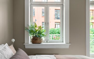
Greige became the default neutral of the last decade for one simple reason: it fixes the two problems that plagued pure gray and pure beige. The best greige paint colors blend gray’s cool sophistication with beige’s warmth, giving you a flexible backdrop that never turns cold and clinical or dated and yellow. But greige is deceptively tricky — its undertones shift dramatically with your lighting, and the wrong pick can lean lavender, green, or pink on your walls. This guide covers the top greiges worth considering, how to read their undertones, and how to test them so the color on the wall matches the color you fell in love with.
Part of our Paint & Walls guide — explore the full guide →
- What Exactly Is Greige?
- Understanding Undertones — the Make-or-Break Factor
- Top Greige Paint Colors Worth Considering
- How Lighting Changes Everything
- How to Test Greige the Right Way
- Using Greige Throughout the Whole House
- Greige vs. Gray vs. Beige — Which to Choose
- Pairing Greige With Trim and Accents
- Final Thoughts
What Exactly Is Greige?
Greige is precisely what the name suggests — a blend of gray and beige. Gray alone can feel cold and, in poor light, downright depressing. Beige alone can read dated or overly yellow. Greige splits the difference, holding onto beige’s warmth while borrowing gray’s modern, refined edge. The result is a neutral that works in nearly any room, pairs with almost any accent color, and flatters both warm and cool furnishings.
That versatility is why designers reach for greige constantly. It functions as a true chameleon: cooler-leaning greiges modernize a traditional home, while warmer greiges soften a contemporary space. Because it sits in the middle, it forgives a mixed palette of wood tones, metals, and fabrics that a stronger color would clash with.
Understanding Undertones — the Make-or-Break Factor
Every greige leans slightly one direction beneath its surface, and that undertone is what determines whether you love or hate the color once it is on the wall. The three most common undertones to watch for are:
- Green or taupe undertones: These greiges read earthy and organic and can flash green in certain light, especially near foliage outside a window.
- Purple or lavender undertones: Cooler greiges can turn faintly lilac, particularly under cool north light or LED bulbs.
- Pink or red undertones: Warmer greiges may lean rosy in warm evening light.
The undertone is not a flaw — it is a feature you match to your room. The key is knowing which way a given color leans before you commit, so it complements rather than fights your fixed finishes like flooring and countertops.
Top Greige Paint Colors Worth Considering
These shades have earned their reputation across thousands of real homes. Use them as a starting point, then test in your own space.
Sherwin-Williams Agreeable Gray
Arguably the most popular greige in America, Agreeable Gray (SW 7029) is a true middle-of-the-road neutral with a soft, barely-there warmth. It reads slightly cooler in bright rooms and warmer in dim ones, which makes it a reliable whole-house color. Its undertone is gentle enough that it rarely surprises you.
Benjamin Moore Revere Pewter
Revere Pewter (HC-172) is a warmer, slightly darker greige with a subtle green undertone that gives it an organic, grounded feel. It works beautifully in traditional homes and adjoining open-concept spaces. Because it carries more depth, it shows up more as an actual color than a barely-there neutral.
Sherwin-Williams Accessible Beige
Leaning a touch warmer and beigier than Agreeable Gray, Accessible Beige (SW 7036) is the pick when you want cozy warmth without going full beige. It flatters wood floors and warm-toned furnishings and keeps north-facing rooms from feeling cold.
Benjamin Moore Edgecomb Gray
Edgecomb Gray (HC-173) is a light, airy greige that sits between white and beige. It brightens small rooms and hallways while adding just enough warmth to avoid the sterility of a pure off-white. It is a favorite for homes that want soft and light rather than moody.
Sherwin-Williams Repose Gray
For those who want their greige to lean a bit cooler and more contemporary, Repose Gray (SW 7015) delivers a modern, slightly gray-forward neutral with just enough warmth to stay inviting. Watch it in low light, where the cooler base can flash faintly purple.
How Lighting Changes Everything
The same greige can look like three different colors in three rooms of the same house, and lighting is the reason. Before you commit, understand how your exposure will pull the color:
- North-facing rooms get cool, indirect light that emphasizes gray and can amplify cool undertones. Choose a warmer greige to compensate.
- South-facing rooms get abundant warm light that softens and warms any color. Cooler greiges balance beautifully here.
- East-facing rooms are warm in the morning and cooler by afternoon.
- West-facing rooms turn warm and golden in the evening, pushing greige toward its warm undertone.
Your light bulbs matter just as much. Warm 2700K bulbs push greige warmer; cooler 4000K bulbs pull it grayer. Test under the actual bulbs you use at night, not just in daylight.
How to Test Greige the Right Way
Never choose greige from a tiny store chip. The color needs to be seen large, in your room, in your light. Follow this process:
- Buy sample pots of your top two or three picks.
- Paint two coats onto a 2-by-2-foot piece of poster board for each color.
- Move the boards to different walls in the room and view them against your flooring and furniture.
- Check each color in the morning, midday, and at night under artificial light.
- Hold the board next to your countertops, trim, and largest furniture to see how the undertones interact.
Poster board beats painting directly on the wall because you can move it around and it is not influenced by the existing wall color bleeding through. Give yourself a full day with each option before deciding.
Using Greige Throughout the Whole House
One of greige’s greatest strengths is its ability to serve as a single, cohesive color for an entire home. Because it is a true neutral, a well-chosen greige flows from room to room without clashing, tying open-concept spaces together and making a home feel larger and more considered. This is exactly why builders and flippers reach for colors like Agreeable Gray for whole-house palettes.
When you run one greige throughout, remember that it will read differently in each room based on exposure and furnishings, and that variation is a feature, not a flaw. To keep things cohesive while adding subtle depth, some homeowners use the same greige at full strength in main rooms and a lighter version — the paint tinted to 50 or 75 percent — in darker spaces like hallways and north-facing bedrooms. This keeps the whole house in the same family while compensating for uneven light.
Greige vs. Gray vs. Beige — Which to Choose
If you are still deciding whether greige is even the right neutral, it helps to compare the three directly. Each has a distinct personality and best use.
- Gray reads cool, modern, and crisp but can feel cold and stark, especially in low or north light.
- Beige reads warm and cozy but risks looking dated or yellow, particularly in older shades.
- Greige blends the two, giving you warmth and modernity at once, which is why it suits the widest range of homes and furnishings.
Choose gray if your home and decor lean cool and contemporary, beige if you want maximum warmth and traditional coziness, and greige if you want a flexible middle path that flatters almost anything. For most homeowners buying paint that has to work with a mix of existing furniture and finishes, greige is the safest and most forgiving of the three.
Pairing Greige With Trim and Accents
Greige plays beautifully with crisp white trim, which keeps the walls feeling fresh and defined. For a softer, more seamless look, pair it with a creamy off-white trim instead of a bright white. On accents, greige is famously accommodating — it welcomes navy, black, sage green, warm wood, brass, and matte black hardware equally well. That flexibility is the whole point: choose the greige first, and nearly any accent palette will follow.
Final Thoughts
The best greige paint colors are the ones whose undertone matches your room’s light and finishes, not simply the ones topping a popularity list. Start with proven picks like Agreeable Gray, Revere Pewter, or Accessible Beige, understand whether each leans green, purple, or pink, and always test large samples under your own daylight and bulbs. Match a warmer greige to cool north light and a cooler one to sunny southern exposure, pair it with the trim and accents you love, and you will land on a neutral that quietly makes every room look pulled together.