
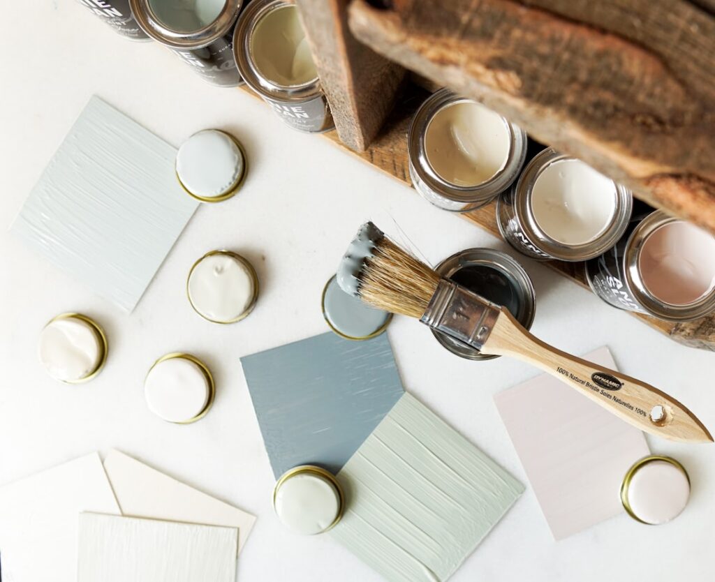
Nothing dates a historic-style home faster than a modern color slapped on 18th-century bones. Choosing the right colonial paint colors is less about matching a trend and more about honoring a palette that has quietly worked for three centuries. Colonial architecture — think symmetrical facades, multi-pane windows, and dentil molding — was built for muted, earthy tones drawn from the pigments available at the time. Get the color story right and your Cape, saltbox, or Georgian looks intentional. Get it wrong and even the most careful restoration reads as a costume.
Part of our Paint & Walls guide — explore the full guide →
- Where the Colonial Palette Comes From
- Exterior Body Colors That Read as Authentic
- Trim, Shutters, and the Front Door
- Interior Colonial Colors Room by Room
- Choosing the Right Sheen
- Testing Colors Before You Commit
- Matching Colors to Colonial Sub-Styles
- Coordinating With Fixed Materials
- Historic District Rules and Approvals
- Common Mistakes to Avoid
- Putting Your Palette Together
Where the Colonial Palette Comes From
Early American painters didn’t have thousands of chips to flip through. They mixed pigments from iron oxides, lampblack, ochre, and a handful of imported minerals. That limited chemistry is exactly why the historic palette feels so cohesive. Reds came from iron oxide (the classic “barn red”), yellows and golds from ochre, greens from copper compounds, and blues from expensive imported indigo or Prussian blue — which is why a deep blue door once signaled wealth.
Modern paint brands have done the archival homework for you. Benjamin Moore’s Williamsburg Collection and Sherwin-Williams’ Historic Collection both reverse-engineer surviving samples from restored buildings. Leaning on one of these curated lines is the single fastest way to stay period-accurate without becoming an amateur pigment chemist.
Exterior Body Colors That Read as Authentic
For the main body of the house, colonial tradition favors soft, grayed-down neutrals rather than bright saturated hues. A few reliable choices:
- Warm ivory and cream — the most common colonial body color, especially on clapboard. Try Benjamin Moore Linen White or Sherwin-Williams Antique White.
- Sage and olive greens — muted, dusty greens like Ben Moore Kittery Point Green sit beautifully against natural wood and stone.
- Colonial gray and slate — cool grays with a hint of blue give saltbox and Georgian homes a dignified restraint.
- Ochre and mustard yellow — bolder but historically correct, particularly on Dutch Colonials.
- Iron-oxide red — the deep brick red seen on outbuildings and some New England farmhouses.
Whatever body color you pick, keep it saturated but soft. If a swatch looks vivid on the chip, it will look neon across 1,500 square feet of siding in direct sun.
Trim, Shutters, and the Front Door
The three-part color scheme — body, trim, and accent — is the backbone of colonial curb appeal. Trim is almost always a clean white or off-white to frame the windows and cornice. Historically accurate whites carry a slight warmth; a stark builder-grade white can look too clinical against an old house.
Shutters and doors are where you earn your accent. Classic combinations include:
- Cream body with black shutters and a black or deep-green door
- Gray body with dark blue-green shutters and a Williamsburg-blue door
- Sage body with cream trim and an iron-red door
Deep, moody accents work because the body color is restrained. A front door in a saturated “Newburg Green” or “Hale Navy” pops without fighting the rest of the facade.
Interior Colonial Colors Room by Room
Inside, colonial rooms were painted in warmer, cozier tones than we often assume — candlelight and small windows demanded colors that felt inviting after dark. Formal spaces like dining rooms and parlors historically wore richer hues: deep Prussian blue, forest green, or a warm mustard. Bedrooms and hallways trended softer, with muted putty, buttermilk, and pale sage.
If your home has original wood paneling or wainscoting, resist the urge to go bright above the chair rail. A grayed sage or a soft clay tone lets the millwork stay the star. For ceilings, a warm off-white rather than pure white keeps the room feeling settled and period-appropriate.
Choosing the Right Sheen
Sheen matters as much as hue for a convincing colonial look. Original milk and oil paints dried nearly flat, so high-gloss walls read as modern. General guidance:
- Exterior body: flat or low-luster to mimic historic finishes and hide siding imperfections.
- Exterior trim and doors: semi-gloss for durability and a subtle period-correct shine.
- Interior walls: matte or eggshell — flat enough to feel authentic, washable enough to live with.
- Interior trim and doors: satin or semi-gloss to protect high-touch surfaces.
Expect to pay $50 to $75 per gallon for premium exterior paint that holds these muted colors without fading. Cheaper paint saves money up front but chalks and washes out within a few seasons, which defeats the whole point of a historic look.
Testing Colors Before You Commit
Never choose a color from a chip alone. Buy sample pints and paint two-foot squares on at least two sides of the house — one that gets morning light and one that gets afternoon sun. Colonial grays in particular can swing blue, green, or purple depending on the light and the color of your roof. Live with the samples for three or four days and check them at dawn, noon, and dusk.
Pull your samples against fixed elements you can’t change: the roof shingles, brick or stone foundation, and any masonry chimney. A sage that sings against a gray roof can turn muddy against a brown one. This ten-dollar step saves you from repainting a whole facade.
Matching Colors to Colonial Sub-Styles
Not every colonial home wears the same palette, and knowing your specific sub-style sharpens your choices. A New England saltbox or Cape Cod leans toward the most austere tones — weathered gray, cream, and iron-red outbuilding accents that echo the region’s shingled, salt-sprayed heritage. Georgian and Federal colonials, with their formal symmetry and brick facades, invite dignified grays, warm whites, and a black or deep-green door to complement the masonry. Dutch Colonials, recognizable by their gambrel roofs, historically embraced bolder ochre yellows and mustard body colors. Spanish Colonials in the Southwest break the mold entirely with warm stucco whites, terracotta, and earthy sand tones. Identify which tradition your house belongs to and the palette narrows itself to the shades that will look genuinely at home.
Coordinating With Fixed Materials
The colors you can’t change should drive the ones you can. A brick foundation or chimney with warm red undertones pulls your palette toward creams, sage, and warm grays rather than cool blue-grays that would clash. A gray asphalt or slate roof pairs handsomely with cool body colors and blue-green accents, while a brown or weathered-wood roof calls for warmer greens, tans, and ochres. Stone porch piers, copper gutters, and any exposed cedar all cast their own color influence. Before you settle on a body color, lay your top swatches directly against these permanent elements in daylight. A sage that sings against gray slate can turn muddy and sad against a brown roof, and only a side-by-side comparison reveals it.
Historic District Rules and Approvals
If your colonial sits in a designated historic district, your color freedom may be limited by local ordinance — and that’s worth checking before you buy a single gallon. Many districts maintain an approved palette drawn from documented period colors, and some require formal review of exterior changes by a historic commission. Repainting outside the approved scheme can mean fines or an order to redo the work at your own expense. The upside is that these approved palettes are meticulously researched, so leaning on them all but guarantees an authentic result. Even outside a regulated district, a quick look at what neighboring period homes are wearing keeps your house in visual harmony with the streetscape rather than standing out awkwardly.
Common Mistakes to Avoid
The fastest way to undermine a colonial exterior is to use too many colors. Stick to three: body, trim, and one accent. A fourth or fifth color starts to look Victorian, which is a different architectural era entirely.
Another frequent misstep is choosing accents that are too bright or too glossy. Colonial reds are brick-toned, not fire-engine; colonial blues are grayed, not electric. Finally, don’t ignore your neighbors and any historic-district rules. Many older neighborhoods have approved palettes, and running your choices past the local commission before you paint prevents an expensive redo.
Putting Your Palette Together
Start with the body color and build outward. Once you lock the main hue, the trim and accent choices narrow themselves — a warm cream body wants a soft white trim and a dark shutter, while a cool gray body invites a deeper blue-green accent. Keep a physical board with your chosen chips, a roof shingle, and a piece of trim stock so you can see the whole story in one glance.
Thoughtful colonial paint colors reward patience. The palette is intentionally quiet, which means every choice carries weight. Lean on the historic collections, respect the three-color rule, test in real light, and choose sheens that echo the flat finishes of the period. Do that, and your home will look like it has always worn exactly the right coat — because, in a sense, it has.


