Pigments dug literally from the ground — iron oxides, raw umber, yellow ochre — were the first paints humans ever used, and walls wearing them still feel instinctively right. Earth tone paint colors are having their biggest moment since the 1970s, but today’s versions are more sophisticated: muddied terracottas instead of burnt orange shag-carpet vibes, gray-bruised olives instead of avocado appliances. This guide maps the palette family by family — terracotta, ochre, clay, olive, umber, rust — with specific, buyable colors from the major brands and the undertone logic that keeps them from going muddy or motel-like. (If you’re after greige, beige, and the quieter warm neutrals, that’s a separate palette with its own guide; here we stay with the saturated, pigment-forward end of the spectrum.)
What Makes a Color an Earth Tone
True earth tones share three traits: they sit in the warm half of the wheel (red through yellow-green), they’re desaturated by gray or brown rather than clean and bright, and they read as natural materials — fired clay, dried grasses, wet soil, oxidized iron. In paint-chip terms, look for a Light Reflectance Value (LRV) between roughly 10 and 45 and chroma that’s clearly muted. That built-in grayness is why earth tones are so forgiving: they flatter wood floors, leather, linen, and brass, and they shift beautifully between daylight and lamplight instead of turning garish. It’s also why they pair so easily with each other — the shared brown base means a terracotta wall, olive cabinet, and ochre pillow can’t really clash.
Terracotta and Clay: The Warm Anchors
Terracotta is the palette’s heart — a red-orange with enough brown to feel like a pot, not a pumpkin. The proven picks:
- Sherwin-Williams Cavern Clay SW 7701: the modern benchmark terracotta (a former SW Color of the Year), dusty and adobe-like; extraordinary in dining rooms and on accent walls behind white oak shelving.
- Benjamin Moore Audubon Russet HC-51: deeper and more brown — terracotta for traditional houses and libraries.
- Behr Canyon Dusk S210-4: a lighter, pinker clay (Behr’s 2024 headline shade), gentle enough for a whole bedroom.
- Farrow & Ball Red Earth No. 64: a soft plastered-adobe blush-terracotta for those spending up.
Paler “clay” versions — think unfired pot rather than fired — work as near-neutrals: SW Sandbank SW 9053 or BM Potters Clay 1221. Undertone watch: terracottas lean either pink or orange. Pink-leaning clays flatter north light and cooler rooms; orange-leaning ones ignite in warm western sun — sample accordingly, because afternoon light can push a modest terracotta into full sunset.
Ochre and Golden Earths
Ochre is yellow with a mineral soul — mustard’s calmer sibling. It thrives in low-light rooms where clean yellows turn acidic. Try Sherwin-Williams Auric Gold SW 6692 or the deeper Relic Bronze SW 6132, Benjamin Moore Spicy Mustard 2154-20, or Farrow & Ball India Yellow No. 66, the moody classic. Behr’s Charismatic Gold family covers the budget end. Use ochre where you want enveloping warmth — studies, entry halls, kitchen islands — and keep trim creamy rather than stark white, which makes ochre look dingy by contrast. The undertone trap here is green: many golds carry a green cast that sours next to red-toned wood floors. Hold the chip against your actual floorboards before committing.
Olive, Sage, and the Green Earths
Earth greens are yellow-based and gray-muted — herbs and moss, never mint or kelly. They are currently the most-used earth tones in kitchens, and for good reason: olive cabinetry with brass hardware and butcher block is a combination that photographs like money and lives even better.
- Sherwin-Williams Dried Thyme SW 6186: the dependable mid-olive; cabinets, mudrooms, exteriors.
- Benjamin Moore Backwoods 469 and October Mist 1495: the first a deep forest-olive, the second a pale sage that behaves almost like a neutral.
- Behr Back to Nature S340-4: a light meadow sage, easy in bedrooms.
- Farrow & Ball Bancha No. 298: a glossy-leaf olive with real depth for cabinetry and paneled walls.
Olives shift more than any other family under artificial light — warm LEDs push them yellow, cool bulbs push them gray. Sample a full square foot and look at it at 8 a.m., noon, and under your evening bulbs before ordering gallons; 2700K bulbs are generally olive’s best friend.
Umber, Rust, and the Deep End
The palette’s drama lives in its darks. Rust — red-brown like oxidized iron — makes superb dining rooms, powder rooms, and front doors: Benjamin Moore Segovia Red 1288, Sherwin-Williams Fireweed SW 6328, or Behr’s Kalahari Sunset. Umber and espresso browns are the palette’s black substitute — warmer and softer than charcoal for the same anchoring job: SW Sable SW 6083, BM Wenge AF-180, or F&B London Clay No. 244. Dark earths want either full commitment (walls, trim, and ceiling in one color makes a small den feel like a leather jacket) or a strict supporting role — below a chair rail, on an island, on the door. The halfhearted single accent wall in deep rust is the one move that drags the palette back to 2006.
Building a Whole-House Earth Palette
The classic structure is 60-30-10: a quiet field color across most walls, a mid-weight secondary, and one saturated accent. A proven combination: walls in a pale clay or warm white (SW Shoji White SW 7042 keeps the undertone warm without going yellow), kitchen or built-ins in Dried Thyme olive, and Cavern Clay or a rust on the dining wall or front door — three hues, one brown backbone, zero clash. Pull your accents from the same soil: camel leather, walnut and oak, unlacquered brass, travertine, jute. What fights the palette: blue-gray “greige” trim (its cool undertone curdles next to ochre), stark ultra-white ceilings (use a half-strength version of the wall color or a cream), and chrome. And respect saturation discipline — one hero color per sightline. Terracotta dining room glimpsed from an olive kitchen works because each room commits; both colors at full strength in one room fight for the microphone.
Room-by-Room Cheat Sheet
- Living room: pale clay or warm white walls, one wall or the fireplace chimney in terracotta; olive or umber on built-ins. Cavern Clay over a white oak mantel is the signature move.
- Kitchen: olive lowers (Dried Thyme, Bancha) with cream uppers and brass pulls; ochre only as an island or pantry-door accent.
- Bedroom: the soft end — Canyon Dusk, October Mist, or Setting-Plaster-adjacent pinks; deep rust belongs on the headboard wall only if the room gets strong daylight.
- Dining room and powder room: the deep end’s natural habitat — full-saturation rust or umber, walls and trim together, with candlelight-friendly matte finishes.
- Exterior: olive or clay body with umber trim reads timeless on ranches and craftsman houses; check HOA rules and always test dark earths on the sun-hammered elevation first, since south walls fade fastest.
Sampling and Sheen: The Practical Part
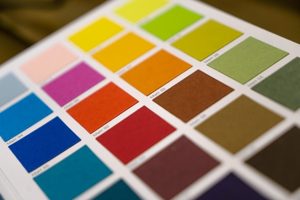
Earth tones are undertone minefields on a 2-inch chip, so sample properly: paint two coats on a poster board, move it around the room for 48 hours, and check it against your floor, sofa, and countertops specifically. Peel-and-stick samples (Samplize carries SW, BM, and F&B) run about $6 each and beat sample pots for mess. Sheen matters more with saturated color: matte or flat enriches earth pigments and hides wall texture — eggshell is the practical ceiling for walls, while anything glossier makes terracotta look like a pizzeria. For cabinets and doors in olive or umber, satin or a fine semi-gloss enamel (BM Advance, SW Emerald Urethane) gives the depth without the plastic shine. Budget note: Behr and Valspar will color-match any designer chip for $30-$45 a gallon versus $80-$130 for the premium lines — matching is imperfect on complex muted pigments, so buy one matched quart and test before trusting a whole room to it. Get the undertones right and earth tone paint colors are the rare trend that won’t date: clay, moss, and iron never go out of season.