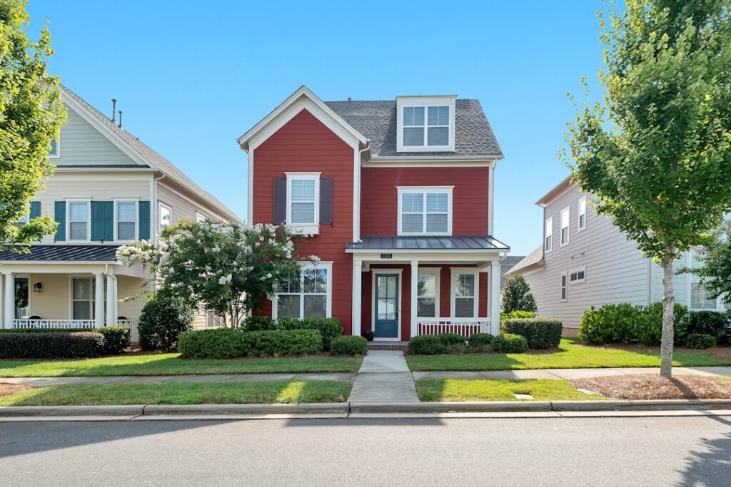
The exterior of your house is the one design decision your whole neighborhood sees, and it’s also the most expensive to get wrong. Choosing exterior paint colors for homes means balancing your personal taste with the fixed elements you can’t change — the roof, the stone, the brick, the landscaping — plus how sunlight will transform every shade over the course of a day. A color that looks perfect on a chip can turn chalky, garish, or muddy on 1,800 square feet of siding. Here’s how to build a palette that looks intentional and holds up for the fifteen years a good paint job should last.
- Start With What You Can’t Change
- The Three-Color Formula
- Popular Palettes That Always Work
- How Siding Type Affects Color
- The Way Light Changes Everything
- Matching Your Neighborhood and HOA
- Finish and Quality Considerations
- Matching Color to Architectural Style
- Don’t Forget the Details
- Hiring a Pro vs. DIY
- The Bottom Line
Start With What You Can’t Change
Before you fall for a color, take inventory of your home’s permanent features. The roof is the biggest one — a brown shingle roof pushes you toward warm palettes, while a gray or black roof opens the door to cool blues and grays. Stone or brick accents, the color of your concrete driveway, and even mature landscaping all set constraints.
The trick is to pull your palette from these fixed elements rather than fighting them. If you have a warm sandstone chimney, a greige with warm undertones will harmonize; a cool blue-gray will clash. Hold your samples directly against the brick or stone, not just against the siding, and you’ll immediately see what belongs.
The Three-Color Formula
Nearly every well-designed exterior uses three colors, each with a job:
- Field color: the dominant shade covering the siding — this is 60 to 70 percent of what you see
- Trim color: frames windows, corners, fascia, and the roofline, usually lighter or darker for contrast
- Accent color: the front door and shutters, where you can be bolder since it’s a small area
The most common mistake is too little contrast between field and trim, which leaves a house looking flat and washed out. Aim for a clear step in value — a light gray body with crisp white trim, or a deep green body with cream trim. The accent color is your chance to add personality: a red, navy, or black front door reads as a deliberate design choice.
Popular Palettes That Always Work
Some combinations have earned their status because they flatter almost any architecture:
- Warm white with black trim: clean, modern, and high-contrast; timeless on farmhouse and colonial styles
- Greige body with white trim and a black door: the safest crowd-pleaser, great for resale
- Deep charcoal with white trim and a natural wood door: dramatic and current
- Sage or olive green with cream trim: blends into wooded lots and reads classic
- Navy blue with white trim: crisp and coastal without being themed
If you’re painting to sell, lean toward the greige-and-white end of this list. If it’s your forever home, you have room to be more expressive.
How Siding Type Affects Color
The same paint reads differently across materials. Smooth fiber-cement and vinyl show color truest, while rough-sawn wood and stucco add texture that deepens and slightly darkens a shade. Board-and-batten and shingle siding cast shadow lines that make any color appear a touch darker than a flat sample. Always account for texture by testing on your actual siding, and remember that dark colors absorb more heat — on vinyl siding, going too dark can void the warranty or cause warping, so check the manufacturer’s guidance before committing to a deep charcoal or navy.
The Way Light Changes Everything
Exterior colors live under the harshest, most variable lighting there is. Direct sun washes a color out and pulls it lighter, so a shade that looks medium-gray on the chip can appear nearly white at noon. Shade and overcast skies pull colors darker and reveal cool undertones. Which direction your house faces matters too: a north-facing wall stays in cool light most of the day, while a south-facing wall bakes in warm sun.
This is why testing large samples matters more outside than anywhere else. Paint a 4-by-4-foot patch on the sunniest and shadiest walls, and look at it at 9 a.m., noon, and dusk. A color you love in the morning shade can look completely different in harsh afternoon light.
Matching Your Neighborhood and HOA
Individuality is great, but a house that ignores its street sticks out for the wrong reasons. Walk the block and note the general palette range. You don’t need to blend in, but a hot-pink house among earth tones will fight the whole streetscape. Many neighborhoods, especially HOA communities, have approved color lists or require submitting your choice before you paint. Check those rules first — repainting because you skipped approval is an expensive lesson.
Finish and Quality Considerations
Exterior paint sheen affects both looks and durability. Flat or low-luster finishes hide siding imperfections and suit the main body of most homes. Satin holds up better to washing and works well on trim and doors that get touched or splashed. Semi-gloss brings out the detail on doors, shutters, and railings while shedding dirt.
Don’t cheap out on the paint itself. A premium exterior acrylic ($55 to $75 a gallon) resists fading and cracking far longer than a budget line, and since labor is the bulk of a paint job’s cost, the paint upgrade is small insurance on a big investment. Quality exterior paint should hold its color for 10 to 15 years; a bargain product can start chalking in five.
Matching Color to Architectural Style
Your home’s architecture gives you a head start on color. Certain styles have historically appropriate palettes that almost always look right:
- Modern farmhouse: warm white or soft greige body, black trim and windows, natural wood or black door
- Craftsman/bungalow: earthy tones — olive green, warm brown, muted gold — with contrasting trim to highlight the woodwork
- Colonial: classic combinations like white or pale gray with black shutters and a bold door
- Mid-century modern: warm neutrals with a saturated accent door in orange, teal, or mustard
- Cottage: soft, cheerful colors — sage, blue-gray, or buttery yellow — with crisp white trim
You can absolutely bend these conventions, but they exist because they flatter each style’s proportions and details. Straying too far — a slick all-black scheme on a fussy Victorian, say — can fight the architecture rather than celebrate it.
Don’t Forget the Details
The body, trim, and door get all the attention, but the smaller elements pull a scheme together or quietly undermine it. Gutters and downspouts should usually match the trim or the body so they disappear; a mismatched gutter color chops up the roofline. Garage doors are a big surface — painting them to match the body rather than the trim keeps them from dominating the front of the house. Porch ceilings are a chance for a subtle soft blue or a warm tone that adds character overhead. And railings, shutters, and window sashes are opportunities to reinforce your accent color. Sketch out every paintable surface before you buy, so nothing gets an unplanned color by default.
Hiring a Pro vs. DIY
Exterior painting is one of the more demanding DIY projects — it involves ladders, pressure washing, scraping, priming, and a lot of square footage exposed to weather. A professional crew brings efficiency, proper prep, and safety on multi-story work, and a quality exterior job from a pro typically costs $3,000 to $8,000 depending on the home’s size and condition. Doing it yourself can cut that to the price of materials, roughly $500 to $1,500, but plan on a week or more of labor and the right equipment. If your home is single-story with easy access and sound siding, DIY is realistic. For two stories, extensive prep, or siding that needs repair, the pro’s result and saved weekends often justify the cost, especially since exterior paint is a 10-to-15-year commitment you don’t want to redo early.
The Bottom Line
Choosing exterior paint colors for homes is really an exercise in harmony — with your roof, your stone, your landscaping, your street, and the ever-changing light. Pull your palette from the elements you can’t change, build it around the three-color formula of field, trim, and accent, and always test large samples on your actual siding at multiple times of day. Get those steps right and you’ll land a look that feels considered and current, one that lifts your curb appeal and doesn’t have you second-guessing every time you pull into the driveway. It’s the highest-visibility improvement you can make, so it’s worth the extra weekend of testing.