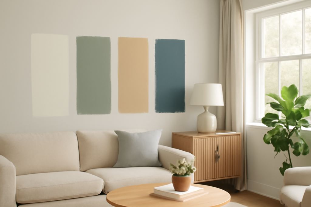
Choosing paint from a two-inch chip is how people end up repainting twice. This gallery of interior house paint colors pictures walks room by room and describes exactly what each palette looks like on a real wall — the undertone, the light it flatters, and the trim and finish that make it work — so you can picture the result before you open a can.
- How to Read Color Before You Buy
- Living Room: Warm Neutrals and Greige
- Kitchen: Crisp Whites and Soft Greens
- Bedroom: Calm Blues, Greens, and Soft Neutrals
- Bathroom: Spa Neutrals and Deep Accents
- Dining Room and Home Office: Rich, Saturated Color
- Hallways and Whole-House Flow
- Trim, Ceiling, and Finish Cheat Sheet
- Kids' Rooms and Playrooms: Soft Color With Energy
- Entryways and First Impressions
- Using Accent Walls Well
- Colors That Are Aging Well
Use these interior house paint colors pictures as a starting map, then always test the real color on your own wall, because light changes everything.
How to Read Color Before You Buy
Every color has an undertone — the subtle cast underneath the main hue. A “greige” can lean pink, green, or purple depending on your light. North-facing rooms get cool, flat light that pushes colors gray and blue, so warm them up. South-facing rooms flood with warm light that intensifies everything. Always buy a sample, paint a two-foot square on two different walls, and look at it in morning, midday, and evening light before committing. That single habit prevents almost every paint regret.
Living Room: Warm Neutrals and Greige
Picture this: a south-facing living room in a soft greige — a gray-beige like Sherwin-Williams Agreeable Gray or Benjamin Moore Revere Pewter — with crisp white trim and warm oak floors. The walls read as a calm, warm neutral in daylight and glow slightly golden at sunset. Greige is the most forgiving whole-house color because it bridges warm and cool furniture and never feels cold.
Alternative palette: a creamy warm white (Benjamin Moore White Dove) on the walls for an airy, gallery feel, letting furniture and art carry the color. Pair with black metal accents for contrast. Use an eggshell or matte finish in living rooms — it hides wall imperfections and reads soft and modern.
Kitchen: Crisp Whites and Soft Greens
Picture this: white shaker cabinets (Benjamin Moore Simply White or Chantilly Lace) against a warm greige wall, with a marble-look counter. Clean, bright, timeless — the safest kitchen choice and the one that photographs best when you sell.
The trending alternative: sage and muted green cabinets (Sherwin-Williams Evergreen Fog, the 2022 color of the year, or Benjamin Moore October Mist) paired with brass hardware and white walls. The green reads earthy and calm, not loud, and it has staying power. For walls behind colored cabinets, keep them neutral white or a pale warm gray. Kitchens take a lot of scrubbing, so use satin or semi-gloss on cabinets and trim, and a washable eggshell or satin on walls.
Bedroom: Calm Blues, Greens, and Soft Neutrals
Picture this: a primary bedroom in a soft, dusty blue (Benjamin Moore Quiet Moments or Sherwin-Williams Sea Salt, which reads blue-green) with white bedding and natural wood nightstands. The color is restful and cool without being cold — ideal for a space meant for sleep.
Moodier option: a deep, enveloping navy or slate on all four walls (Benjamin Moore Hale Navy, Sherwin-Williams Naval) with warm brass lighting and white trim. Dark bedrooms feel cozy and hotel-like, and they are surprisingly flattering at night. Balance the depth with lighter bedding and a light ceiling. Matte or eggshell suits bedrooms — no reason for shine.
Bathroom: Spa Neutrals and Deep Accents
Picture this: a small bathroom in a pale watery blue-green (Sherwin-Williams Sea Salt again — it is a bathroom favorite) with white subway tile and chrome fixtures. The color makes a small room feel like a calm spa and plays beautifully off tile and water.
Bold small-bath move: because bathrooms are small and low-stakes, they are the perfect place for a dramatic color — a deep green (Benjamin Moore Essex Green) or charcoal on the walls with white trim and warm metal. Small dark rooms feel intentional and jewel-box rich. Bathrooms need moisture resistance, so use a satin or semi-gloss with mildew resistance.
Dining Room and Home Office: Rich, Saturated Color
Picture this: a dining room in a warm terracotta or deep clay (Benjamin Moore Cinnamon, or a muted rust) that turns golden under a chandelier at dinner. Saturated warm walls make a dining room feel intimate and inviting for evening gatherings.
Home office: a deep, focused green (Sherwin-Williams Pewter Green) or a moody blue on the walls reads sophisticated on video calls and helps concentration. These are rooms where you can be brave with color because you are not living in them all day. A matte or eggshell finish keeps rich colors from looking plasticky.
Hallways and Whole-House Flow
Picture this: a hallway and open floor plan carried in one warm white or pale greige throughout, so rooms flow without hard color breaks, and each room gets its personality from an accent wall or the furnishings. When a home’s main spaces open into each other, one unifying neutral is almost always the right move — pick your whole-house color first, then layer bolder colors into closed rooms like bedrooms, offices, and powder baths.
A reliable formula: choose one warm white for trim and ceilings throughout, one warm neutral for open living spaces, and reserve saturated color for enclosed rooms. That structure gives cohesion and lets you have fun without chaos.
Trim, Ceiling, and Finish Cheat Sheet
- Trim and doors: a warm or crisp white (White Dove, Chantilly Lace) in satin or semi-gloss for durability and a clean line against wall color.
- Ceilings: flat white, or a whisper of the wall color at 25 to 50 percent strength for a soft, cohesive feel — see the light-grey ceiling trend for one popular move.
- Walls, general: eggshell or matte for living areas and bedrooms; satin for kitchens, baths, and high-traffic halls.
- Sheen rule: higher sheen means more durability and more visible wall flaws; lower sheen hides imperfections but scrubs less well.
Kids’ Rooms and Playrooms: Soft Color With Energy
Picture this: a nursery in a warm, barely-there blush (Benjamin Moore Proposal or a soft peach) with white furniture and natural wood — gentle and warm rather than sugary. For older kids, a cheerful but muted color that will not read babyish in a few years works best: a soft teal, a warm butter yellow, or a muted coral on one accent wall with white on the rest. The trick in kids’ spaces is choosing a color grown-up enough to survive a few birthdays, so lean toward muted, slightly grayed versions of bright hues rather than primary-crayon saturation. Use a scrubbable satin or a washable matte, because these walls will meet crayons and sticky hands.
Entryways and First Impressions
Picture this: a foyer in a warm greige that flows into the living spaces, with a front door painted a confident color on the inside — a deep navy or forest green — to give the entry a moment of personality the second you walk in. Entryways set the tone for the whole house, and because you pass through rather than linger, they can carry a slightly richer or more decorative color than you would choose for a room you sit in for hours. A darker entry also grounds the transition from bright outdoors to the interior.
Using Accent Walls Well
An accent wall is the low-commitment way to bring in a bold color, but it only works when placed with intent. The best accent wall is one with a natural focal point — the wall behind a bed’s headboard, the fireplace wall, or the wall a room’s furniture already orients toward. Painting a random wall a different color reads as an afterthought. Choose an accent color that is either a deeper version of the room’s neutral (tonal and calm) or a genuine contrast pulled from the room’s textiles and art (bold and intentional). Keep the other three walls quiet so the accent has room to speak. Done thoughtfully, an accent wall gives you the drama of color without committing the whole room to it.
Colors That Are Aging Well
If you want choices that will not feel dated in five years, the safest bets across these interior house paint colors pictures are warm whites, soft greiges, muted sage greens, dusty blues, and deep navy as an accent. The palettes trending out are cool gray-everything and stark builder-beige. Warm, nature-derived, slightly muted tones are where interiors have settled, and they photograph well whether you are decorating to live or to sell. Test your top two on the actual wall, live with them for a couple of days, and then buy your gallon.