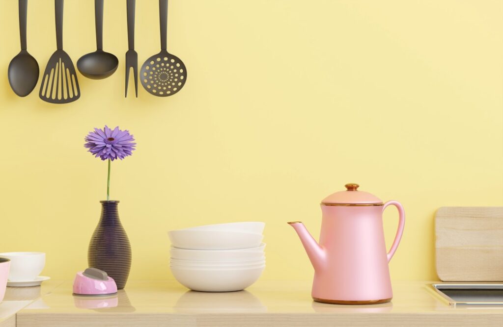
The kitchen is the hardest-working room in the house, and the right wall color makes it feel bigger, brighter, and more inviting every single day. Choosing among the endless kitchen wall paint colors comes down to three things that most people overlook: how the color plays against your existing cabinets, which way your windows face, and what finish will survive grease and steam. Pick a shade in the store under fluorescent light without testing it at home, and you risk a color that looks green in daylight, muddy at night, and dated within a year. Here is how to choose a color you will still love after a thousand dinners.
- Start With the Cabinets, Not the Walls
- Let Your Light Direction Guide You
- Popular Kitchen Colors That Keep Working
- Choosing the Right Finish for a Kitchen
- Working With an Open Floor Plan
- Don't Forget the Backsplash and Countertops
- Always Test Before You Commit
- Common Color Mistakes to Avoid
- Using Accent Colors Strategically
- How Color Affects Resale
- Final Thoughts
Start With the Cabinets, Not the Walls
Your cabinets cover far more visual area than your walls, so they are the anchor the wall color must complement, not the other way around. Look at your cabinet color and undertone first, then choose a wall color that works with it.
- White cabinets: The most flexible starting point. Nearly any wall color works, from soft greige to bold navy, so you can lean warm or cool based on the mood you want.
- Wood cabinets: Note whether the wood is warm (orange or honey) or cool (gray-brown). Warm wood pairs beautifully with soft greens, sage, and creamy whites, while cooler wood handles grays and blues.
- Dark or navy cabinets: Keep walls light to balance the weight, with warm whites, pale greige, or soft blush.
- Gray cabinets: Match the undertone. Warm gray cabinets want warm walls; cool gray cabinets can take crisp whites and pale blues.
The goal is harmony, not a perfect match. A wall color a few shades different from the cabinets, or in a complementary family, gives the kitchen depth without feeling like everything blends into one flat tone.
Let Your Light Direction Guide You
The single biggest reason a color looks different at home than in the store is the light. Which direction your kitchen windows face changes how any paint reads, and accounting for it prevents nasty surprises.
North-facing kitchens get cool, indirect light that can make colors feel flat and gray, so warm the space with creamy whites, soft yellows, warm greiges, and earthy greens. South-facing kitchens get abundant warm light all day and can handle cooler colors like blues and grays that would fall flat elsewhere. East-facing rooms get warm morning light and cooler afternoons, while west-facing rooms flip that, warm in the evening and cooler in the morning. Test any color in your own kitchen at different times of day before committing, because the same swatch genuinely changes character from breakfast to dinner.
Popular Kitchen Colors That Keep Working
Some colors have staying power because they flatter food, light, and cabinetry alike. These are the reliable performers.
- Warm white and off-white: Timeless, bright, and space-expanding. Creamy whites avoid the cold, clinical feel of stark white and pair with everything.
- Soft green and sage: Fresh, calming, and increasingly the go-to for a kitchen that feels natural and current without shouting for attention.
- Greige: The gray-beige hybrid that reads warm or cool depending on the light, making it the safest neutral for resale.
- Soft blue: Airy and clean, blue-gray and pale sky tones feel crisp and work especially well in south-facing rooms.
- Warm yellow and buttercream: Cheerful and sunny, a classic that brightens darker, north-facing kitchens.
- Charcoal or navy accents: Deep tones on an island or a single wall add drama when the rest of the kitchen stays light.
If resale is on your mind, warm whites and greiges have the broadest appeal, while greens and blues let you personalize without straying into risky territory.
Choosing the Right Finish for a Kitchen
Color gets the attention, but finish, or sheen, is what keeps a kitchen looking clean. Kitchens deal with grease, steam, splatters, and frequent wiping, so a flat matte finish that cannot be scrubbed is a poor choice for the walls.
Eggshell and satin are the sweet spot for kitchen walls. They have enough sheen to wipe down and resist stains, but not so much that they highlight every bump in the drywall. Satin is the more washable of the two and a smart pick behind counters and near the stove. Save semi-gloss for trim, doors, and cabinets where maximum durability and washability matter, and skip flat entirely on kitchen walls unless the room is purely decorative.
Working With an Open Floor Plan
Many kitchens now flow into a dining or living area, which means the wall color cannot be chosen in isolation. In an open plan, the kitchen color needs to transition smoothly into the adjoining spaces rather than stopping abruptly at an invisible line.
The cleanest approach is a cohesive palette: one main wall color that flows through the connected spaces, with the kitchen distinguished by its cabinets, backsplash, and island rather than a jarringly different wall color. If you want the kitchen to feel distinct, use a related shade a step lighter or darker, or introduce the accent color on the island so the change feels intentional and connected.
Don’t Forget the Backsplash and Countertops
Wall color shares the stage with your backsplash and countertops, and those surfaces have undertones of their own that must play nicely with the paint. A busy, multicolored backsplash calls for a calm, neutral wall so the room does not feel chaotic. A simple white subway backsplash gives you freedom to go bolder on the walls.
Pull a color from your countertop or backsplash into the general scheme to tie the room together. If your granite has warm gold flecks, a warm greige or soft green wall will echo it, while a cool quartz with gray veining pairs naturally with cooler wall tones. Bring a sample of your counter and backsplash to the paint aisle rather than trusting memory.
Always Test Before You Commit
The most important step, and the one most often skipped, is testing the color on your actual walls. Paint a large swatch, at least 2 feet square, on more than one wall, and live with it for a few days. Look at it in morning light, afternoon light, and under your kitchen’s own light bulbs at night.
Better yet, use peel-and-stick paint samples or paint two coats on a poster board you can move around the room, holding it next to the cabinets, the counter, and the backsplash. Colors shift dramatically with surroundings and lighting, and this small investment of a few dollars and a few days saves you from repainting an entire kitchen you got wrong.
Common Color Mistakes to Avoid
A few errors trip up homeowners repeatedly. Choosing a color under store lighting alone leads to a shade that looks completely different at home. Ignoring the cabinet undertone creates a clash where the walls fight the wood. Going too dark in a small or north-facing kitchen makes the room feel cramped and dim. And picking a flat finish that stains and cannot be cleaned means a wall that looks grimy within months. Test at home, respect your undertones and light, and choose a washable finish, and you sidestep all four.
Using Accent Colors Strategically
You do not have to commit the whole kitchen to one bold color to get personality. A single accent, applied strategically, adds interest while keeping the space calm. Painting just the island a deep navy, forest green, or charcoal while the walls stay light is one of the most popular moves in kitchen design, grounding the room without overwhelming it. A papered or painted accent on the wall behind open shelving, or inside a glass-front cabinet, adds a pop of color that reads as intentional.
The trick with accents is restraint: pick one place to be bold and let everything else stay quiet. Pull the accent color into a few small touches elsewhere, a set of stools, a runner, or a piece of art, so it feels woven into the room rather than isolated. That repetition is what makes a single strong color look designed instead of accidental.
How Color Affects Resale
If you might sell within a few years, keep resale in mind when choosing kitchen colors. Buyers respond best to neutral, widely appealing tones, so warm whites, soft greiges, and pale greens photograph well and let prospective owners imagine their own things in the space. Very bold or highly personal colors, a bright red or a deep purple wall, can shrink your buyer pool even if you love them. The safe strategy for a home you plan to sell is neutral walls with color introduced through easily changed elements like the island, accessories, and hardware, giving you personality now and broad appeal when it is time to list.
Final Thoughts
The best kitchen wall paint colors are the ones chosen in context: matched to your cabinets, suited to your light direction, coordinated with your backsplash and counters, and painted in a washable eggshell or satin finish. Warm whites and greiges are the safe, timeless bets, while soft greens and blues add personality that still feels current. Whatever you lean toward, test it large on your own walls across a full day before you commit, and you will land on a color that makes the busiest room in the house feel exactly right.