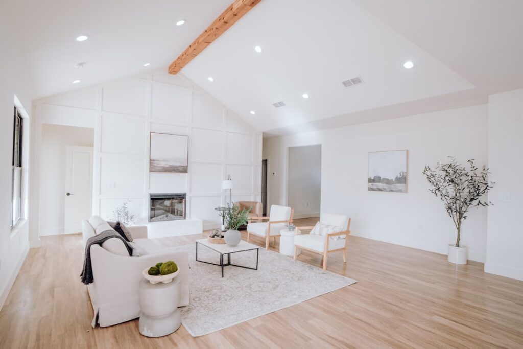
The living room is the hardest-working space in most homes, so its color has to flex from bright afternoon gatherings to quiet evening reading. Choosing the right living room paint colors means balancing the mood you want, the light you have, and the furniture and flooring you are keeping. Get it right and the room feels effortless; get it wrong and even beautiful furnishings look off.
There is no single best color, but there are reliable principles and proven shades that flatter real rooms. This guide covers the top picks across styles, how light changes them, and how to pair them so your living room feels cohesive rather than accidental.
- Start With the Mood You Want
- Best Neutral Living Room Colors
- Best Colors for a Cozy, Dramatic Room
- How Lighting Changes Everything
- Match Your Color to Existing Elements
- Using Accent Walls and Two-Tone Schemes
- Choosing the Right Finish
- Common Mistakes to Avoid
- Popular Living Room Colors by Style
- Making a Small Living Room Feel Larger
- Coordinating With an Open Floor Plan
Start With the Mood You Want
Color sets the emotional temperature of a room before anyone sits down. Warm tones like beige, greige, and soft terracotta make a large space feel cozy and inviting. Cool tones like blue-gray and sage read calm and expansive, which helps smaller rooms breathe.
Decide whether you want the walls to recede quietly behind your furniture or to become a statement. Most homeowners are happiest with a versatile neutral or soft color on the main walls, saving bold hues for an accent wall, built-ins, or the trim.
Best Neutral Living Room Colors
Neutrals dominate living rooms for good reason: they flatter nearly any furniture and never fight the TV, art, or rug. These are the workhorses I recommend most often, generally $50 to $75 per gallon in premium lines:
- Sherwin-Williams Agreeable Gray (SW 7029): The quintessential greige, warm enough to feel inviting and neutral enough to go with anything.
- Benjamin Moore Revere Pewter (HC-172): A slightly greener greige that reads sophisticated in traditional and transitional rooms.
- Sherwin-Williams Accessible Beige (SW 7036): A true warm beige that adds coziness without going yellow.
- Benjamin Moore Classic Gray (OC-23): A light, airy greige for rooms that want a soft, bright backdrop.
- Sherwin-Williams Alabaster (SW 7008): A warm white that makes a living room feel fresh and gallery-clean.
Best Colors for a Cozy, Dramatic Room
If your living room gets used mostly in the evening, or you want a moody, enveloping feel, deeper colors deliver. Contrary to the myth, dark walls can make a room feel larger by blurring its edges, especially at night with lamplight.
- Benjamin Moore Hale Navy (HC-154): A rich, classic navy that pairs with brass and white trim for timeless depth.
- Sherwin-Williams Urbane Bronze (SW 7048): A warm charcoal-brown that feels grounded and modern.
- Farrow & Ball Hague Blue (No. 30): A deep inky blue-green for a dramatic, library-like living room.
- Sherwin-Williams Evergreen Fog (SW 9130): A muted sage that adds color without shouting.
How Lighting Changes Everything
The same gallon can look completely different from one home to the next, and light is the reason. North-facing living rooms receive cool, indirect light that can make gray look drab and blue, so lean warm with a greige or beige to counteract it. South-facing rooms flood with warm light all day, letting cooler colors stay balanced and true.
East light is crisp in the morning and fades by afternoon, while west light glows golden in the evening, intensifying warm undertones. Always buy sample pots, paint a two-by-two-foot patch on more than one wall, and observe it at morning, midday, and night before committing.
Match Your Color to Existing Elements
Your walls do not exist in a vacuum. The flooring, sofa, rug, and even the undertone of your ceiling all interact with the wall color. Warm hardwood floors pair beautifully with warm greiges and beiges, while gray-washed or cool floors call for cooler wall tones.
- Pull the dominant undertone from your largest permanent element, usually the floor or a big sofa.
- Choose a wall color that shares that undertone or deliberately, tastefully contrasts it.
- Test the paint against those elements, not against a bare white wall.
- Keep the ceiling a soft white a shade or two lighter than the walls to lift the room.
Using Accent Walls and Two-Tone Schemes
An accent wall lets you enjoy a bolder color without overwhelming the room. The wall behind a fireplace, a bed of built-in shelves, or the largest uninterrupted wall are the best candidates. Paint it a few shades deeper than the main walls, or introduce a related color entirely.
Color-drenching, painting walls and trim the same rich hue, is another current approach that makes a room feel intentional and immersive. It works especially well with deep greens and blues in evening-focused living rooms.
Choosing the Right Finish
Sheen affects both durability and how the color reads. For living room walls, eggshell or satin is the sweet spot; it resists scuffs from furniture and cleans up better than flat, while hiding wall imperfections better than semi-gloss.
- Flat/matte: Hides flaws beautifully but marks easily; best for low-traffic adult spaces.
- Eggshell: The most popular living room choice, balancing washability and low sheen.
- Satin: A touch more durable and wipeable, good for homes with kids and pets.
- Semi-gloss: Reserve for trim, doors, and built-ins where you want a crisp accent.
Common Mistakes to Avoid
The most frequent misstep is picking a color from a tiny chip under store lighting and skipping home samples. The second is ignoring undertones, which is how a “gray” ends up looking lavender or a “white” turns yellow. Buy testers, live with them, and trust what you see on your own walls.
Popular Living Room Colors by Style
Matching your wall color to your home’s overall style keeps the room feeling cohesive. A few reliable pairings:
- Modern farmhouse: Warm whites like Alabaster or soft greiges like Agreeable Gray, paired with black accents and natural wood.
- Traditional: Rich neutrals like Revere Pewter, or deep classics like Hale Navy on an accent wall with crisp white trim.
- Contemporary: Cool grays, crisp whites like Chantilly Lace, or a bold charcoal like Urbane Bronze for drama.
- Transitional: Versatile greiges and warm whites that bridge classic and modern furnishings.
- Coastal: Soft blues, pale greens, and warm sandy neutrals that echo sky and shoreline.
Making a Small Living Room Feel Larger
Color is one of the cheapest ways to change how big a room feels. Light, warm neutrals with a higher LRV bounce more daylight and visually push the walls outward, which is why pale greiges and warm whites are the default for compact spaces. Painting the trim and walls a similar light tone blurs the room’s edges and adds to the sense of openness.
Counterintuitively, a small room used mainly at night can also work beautifully in a deep, enveloping color, since dark walls dissolve the corners under lamplight. The mistake to avoid is a mid-tone gray in a dim room, which tends to read flat and gloomy rather than cozy or airy.
Coordinating With an Open Floor Plan
Open-concept homes present a special challenge because the living room flows into the kitchen and dining area without walls to break the color. The cleanest solution is to choose one main neutral that carries across the connected spaces, then introduce variation through an accent wall, cabinetry, or furnishings rather than switching wall colors abruptly.
If you want distinct zones, use colors that share an undertone so the transition feels intentional. A warm greige in the living area paired with a slightly deeper warm tone in the dining nook reads as a considered palette rather than a mismatch. Keep the trim and ceiling color consistent throughout to tie everything together.
With a clear sense of mood, an eye on your light, and colors chosen to flatter your floors and furniture, the best living room paint colors pull the whole room together. Sample generously, choose an eggshell finish for the walls, and you will land a space that feels welcoming from the first morning coffee to the last lamp-lit evening.