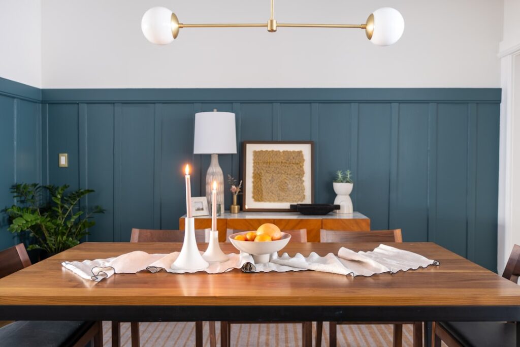
The dining room is the one space in the house that’s used almost entirely at night, under warm artificial light, for lingering meals and conversation. That single fact should drive your color choice, yet most people pick a safe beige better suited to a sunlit kitchen. The best dining room paint colors lean into the room’s evening personality with deeper, richer, more enveloping shades that make candlelight glow and food look appetizing. This guide covers the moods you can create, the specific shades designers reach for, and the finishes and pairings that pull it all together.
- Design for Evening Light
- Moody and Dramatic Options
- Warm and Inviting Neutrals
- Earthy and Rich Tones
- The Two-Tone and Accent Approach
- Choosing the Right Finish
- Pairing Colors With Your Furnishings
- Color-Drenching: The Whole-Room Trend
- Matching Paint to Your Home’s Style
- Lighting Changes Everything
- Test Before You Commit
- Final Thoughts
Design for Evening Light
Because dining rooms shine after dark, the smartest dining room paint colors are chosen for how they behave under lamplight and candle glow rather than midday sun. Deep, saturated colors that might feel heavy in a home office turn intimate and dramatic in a dining room, wrapping guests in a cozy envelope.
This is why so many designers go bold here specifically. A dining room is low-traffic and used in short, memorable bursts, making it the ideal place to take a color risk you wouldn’t in a room you sit in all day.
There’s also a practical angle. Because you’re not staring at these walls for eight hours straight the way you might in a kitchen or living room, a saturated color that could feel overwhelming elsewhere reads as luxurious and special in the dining room. The room’s occasional-use nature is exactly what gives you permission to be adventurous, which is why a shade you’d never commit to in a bedroom can become the star of a dinner party here.
Moody and Dramatic Options
Dark, dramatic walls are the signature move for a dining room that feels special. These shades read rich and sophisticated at night:
- Benjamin Moore Hale Navy HC-154 — a deep, timeless navy that pairs with almost any wood tone.
- Farrow & Ball Hague Blue — an inky blue-green that’s endlessly elegant.
- Sherwin-Williams Cyberspace SW 7076 — a charcoal with a blue undertone, modern and moody.
- Benjamin Moore Black Forest Green 2047-10 — a near-black green that’s dramatic yet natural.
- Farrow & Ball Brinjal — a rich aubergine for a truly bold statement.
Dark walls in a dining room work best with crisp white trim and generous lighting from a chandelier or wall sconces to keep the room from feeling like a cave.
Warm and Inviting Neutrals
If bold isn’t your style, warm neutrals still create a welcoming table. Skip cool grays, which can feel clinical over a meal, and choose colors with warmth:
- Benjamin Moore Revere Pewter HC-172 — the beloved greige, warm and flexible.
- Sherwin-Williams Accessible Beige SW 7036 — a warm neutral that flatters wood furniture.
- Benjamin Moore Manchester Tan HC-81 — a soft, classic tan.
- Farrow & Ball Setting Plaster — a warm blush-neutral that glows at night.
Earthy and Rich Tones
Between bold and neutral sits a sweet spot of warm, earthy colors that feel current and appetizing. Terracotta, warm olive, and deep clay reds evoke a welcoming, wine-and-dinner mood. Sherwin-Williams Cavern Clay and Benjamin Moore’s warmer greens and rusts fall here, tying beautifully to natural wood tables, rattan, and brass fixtures.
These tones photograph warmly and make the room feel gathered and lived-in, a nice middle path for those who want personality without going nearly black.
The Two-Tone and Accent Approach
You don’t have to commit the whole room to one bold color. Several techniques add drama in measured doses:
- Accent wall: paint the wall behind a buffet or built-in in a deep shade while keeping the rest light.
- Two-tone with a chair rail: a darker color below the rail, a lighter one above, a traditional and forgiving scheme.
- Ceiling color: paint the ceiling a soft color or even the same deep shade as the walls for an enveloping “color-drenched” look.
- Trim contrast: match trim to the walls for a seamless modern effect, or keep it bright white for classic contrast.
Choosing the Right Finish
Sheen shapes how dining room colors feel. A matte or flat finish deepens rich colors and hides wall imperfections, making it the go-to for moody schemes where you want the color to absorb light. Eggshell offers a touch more durability for homes with kids who leave fingerprints near the table. For a bit of drama, some designers use a higher sheen on a single feature wall or the ceiling to bounce candlelight, though this demands smooth walls since gloss reveals every flaw.
Pairing Colors With Your Furnishings
The wall color should conversation with what’s already in the room. Warm wood dining sets glow against navy, green, and terracotta. Black or dark-stained furniture looks sharp against warm neutrals or a bold jewel tone. Brass and gold lighting flatter deep blues and greens, while a rich red or aubergine pairs handsomely with natural linen and rattan.
Pull one color from your rug, artwork, or china pattern and let it guide the wall choice, so the room reads as a coordinated whole rather than a collection of parts.
Color-Drenching: The Whole-Room Trend
One of the strongest looks in dining rooms right now is color-drenching, painting the walls, trim, doors, and even the ceiling all in the same shade. In a dining room used mostly at night, this creates an incredibly immersive, cocoon-like atmosphere that feels intimate and refined. A drenched deep green or navy room, lit by a chandelier and candles, feels like a private supper club.
The technique also cleverly disguises awkward architecture, since there are no contrasting trim lines to draw the eye to a low soffit or an off-center window. Use a matte finish on the walls and a slightly higher sheen on the trim in the same color to add subtle definition. Color-drenching demands good lighting to keep the room from feeling closed in, so layer in sconces or a lamp alongside the overhead fixture.
Matching Paint to Your Home’s Style
The right dining room color also depends on your home’s overall character. A traditional or formal home suits deep, classic tones like Hague Blue, oxblood red, or a rich forest green paired with white wainscoting and crown molding. A modern home leans toward crisp charcoals, moody blue-grays, or a bold single accent wall with minimal trim.
- Farmhouse: warm whites, soft sage greens, and muted earthy tones.
- Traditional: deep navies, burgundies, and hunter greens with white trim.
- Modern: charcoal, near-black, or a single saturated feature wall.
- Transitional: warm greiges and soft blue-greens that bridge old and new.
Lighting Changes Everything
No dining room color decision is complete without accounting for your bulbs. Warm-white bulbs around 2700K flatter reds, terracottas, and warm neutrals, deepening their coziness, while cooler bulbs can make warm colors look muddy. Because the room is used at night, always judge a sample under the exact fixture and bulbs you’ll live with, not the store’s fluorescent lighting or midday sun.
Dimmable lighting is a dining room’s best friend, letting you brighten for homework and holidays and dim for intimate dinners. A dimmed warm light against a deep wall color is the whole point of choosing a rich shade in the first place.
Test Before You Commit
- Buy sample pots and paint large squares on at least two walls.
- Judge them at night under your actual dining lighting, since that’s when the room is used.
- Hold samples near your table, rug, and trim, not just the bare wall.
- Live with the swatches for several evenings before ordering gallons.
Final Thoughts
The most memorable dining room paint colors embrace the room’s after-dark nature with depth and warmth, whether that’s an inky navy, a rich terracotta, or a welcoming warm neutral. Because the space is low-traffic and used for special occasions, it’s the ideal room to be bold. Choose for evening light, pair the color with your wood tones and metals, pick a finish that suits the mood, and test under your own chandelier before you buy. Get it right and dinner will feel like an event every time.