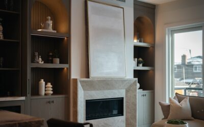
Pastels have shaken off their old reputation as strictly nursery and Easter-basket tones and moved firmly into sophisticated, grown-up interiors. Today’s pastel paint colors lean muted, dusty, and complex rather than sugary, giving you soft color that feels calm and current instead of childish. Used well, a pale sage, a dusty blush, or a whisper of blue can make a room feel serene, spacious, and light-filled. Used carelessly, the same colors can read flat or juvenile. This guide covers how to choose and apply pastels like a designer, with specific direction for every room in the house.
Part of our Paint & Walls guide — explore the full guide →
What Makes a Color a Pastel
A pastel is simply a color with high lightness and low-to-moderate saturation, a hue softened with a large amount of white so it reads gentle rather than bold. But not all pastels are created equal. The dated versions are clean and bright, think pure baby pink or crayon-box mint. The modern, elevated versions are muted and grayed, with complexity that keeps them from looking sweet. Adding a touch of gray or an earthy undertone is what separates a stylish dusty blue from a cartoonish sky blue.
When you shop paint chips, look for pastels described as dusty, muted, soft, smoky, or grayed. These have the depth that makes them work in a real home with real furniture. The brighter, purer pastels still have their place, especially in playrooms and whimsical spaces, but for living rooms, bedrooms, and kitchens where you want a mature, timeless feel, the muted family is almost always the better choice.
Understanding Undertones
Undertones are the single most important and most overlooked factor in choosing any paint color, and pastels are especially sensitive to them. An undertone is the subtle secondary color hiding beneath the main hue, a pale green might lean yellow-warm or blue-cool, and that hidden lean determines whether it flatters your space or fights it. A blush with a peachy undertone feels warm and cozy; a blush with a lilac undertone feels cool and airy. They are worlds apart despite both being “pink.”
Undertones also interact with your lighting. North-facing rooms receive cool light that can make cool pastels look drab and gray, so warm-undertone pastels often work better there. South-facing rooms flooded with warm light can handle cooler pastels beautifully. This is why you must test any pastel in your actual room before committing. Which brings us to the golden rule of paint selection.
Always Test With Large Samples
Never choose a pastel from a tiny chip under store lighting. Buy sample pots and paint large swatches, at least 2 feet square, on multiple walls of the room. Better yet, paint a poster board you can move around to see the color on different walls and in corners. Live with the samples for a few days, observing them in morning light, harsh midday sun, and warm evening lamplight, because a pastel can shift dramatically across those conditions.
This step catches the classic pastel disasters before they happen: the “gray” that turns lavender at noon, the “greige” that goes minty in shade, the pale blue that reads baby-nursery in the afternoon. Pay attention to how the color looks next to your flooring, trim, and largest pieces of furniture, since those permanent elements will live with the color every day. Ten dollars in sample pots saves you from repainting an entire room, which is the most expensive mistake in this whole process.
Best Pastel Colors by Room
Different rooms reward different pastels based on the mood you want and how the space is used. Here is a practical starting guide:
- Bedroom: dusty blue, soft sage, and muted lavender promote calm and rest without feeling cold
- Living room: warm greige with a pastel lean, pale blush, or soft buttery cream keep the space bright and welcoming
- Kitchen: pale sage green, soft mint, and light sky blue feel fresh and clean against white cabinetry
- Bathroom: spa-like pale aqua, soft seafoam, and pale gray-blue evoke a serene retreat
- Home office: muted sage or soft slate blue are calming yet focused, avoiding both sterility and distraction
- Nursery or playroom: here the brighter, cleaner pastels genuinely shine, from soft pink to cheerful pale yellow
Green pastels are having a particularly strong moment because sage and other muted greens act almost like neutrals, pairing effortlessly with wood tones, brass, and both warm and cool accents. If you want one pastel that is hard to get wrong, a muted sage is a safe, sophisticated bet in nearly any room.
Choosing the Right Finish
The sheen you choose affects both how the color reads and how the wall wears. Flat and matte finishes deepen a pastel and hide wall imperfections, giving a soft, velvety look that suits bedrooms and living rooms, though they are harder to wipe clean. Eggshell and satin add a subtle glow and are more washable, making them the practical default for busy spaces, hallways, and kids’ rooms.
For kitchens and bathrooms where moisture and cleaning are constant, lean toward satin or a scrubbable matte formulated for high-humidity areas. Trim and doors typically get a semi-gloss for durability and contrast. Remember that shinier finishes reflect more light and can make a pastel look slightly lighter and cooler, while flat finishes read a touch richer, so factor sheen into your sample testing rather than treating it as an afterthought.
Making Pastels Look Sophisticated
The difference between a pastel room that feels chic and one that feels like a nursery usually comes down to what surrounds the color. Ground soft pastels with contrast and texture: pair a dusty blush with warm wood tones and black hardware, or a pale sage with natural linen, rattan, and aged brass. These grounding elements give the eye something substantial to hold onto so the pastel reads as an intentional, refined choice rather than the only note in the room.
Keep the palette disciplined. One pastel as the main color, supported by neutrals and a couple of richer accents, looks far more polished than three or four pastels competing at once. Layer in texture through fabrics, wood, stone, and metal so a low-contrast pastel scheme still feels rich and dimensional. Approached this way, pastel paint colors deliver exactly what they promise, a light, calm, welcoming home that feels current and thoroughly grown-up, with none of the sugary sweetness the word “pastel” used to imply.
Pairing Pastels With Trim and Ceilings
What you do with the trim, ceiling, and adjacent walls has an outsized effect on how a pastel reads. For a soft, seamless, expansive feel, paint the trim a warm or crisp white that complements the pastel’s undertone, a cool pastel wants a cooler white, a warm pastel wants a creamier one. Mismatched whites are a subtle but common error; a bright cool white next to a warm blush can make the trim look dingy or the wall look muddy, so test them together.
For a more enveloping, cocooning effect, especially in bedrooms and small studies, try a color-drenched approach where the walls, trim, and even the ceiling all wear the same pastel. This monochromatic treatment erases visual boundaries and makes a room feel larger and more serene, and it is a favorite designer move for turning a modest space into a jewel box. Ceilings deserve thought too: a standard white ceiling keeps things airy, while a ceiling painted the same pastel or a lighter version of it adds softness overhead. Whichever direction you choose, keep the relationships intentional rather than defaulting to builder white out of habit.
Pastels and Resale Considerations
If you might sell your home in the next few years, it is worth thinking about how pastels play with a broad audience. The muted, sophisticated pastels this guide favors, dusty sage, soft greige, gentle blue-grays, are broadly appealing and read as neutral-adjacent, so they rarely scare off buyers and can make spaces feel fresh and move-in ready. These are safe, marketable choices even in rooms a buyer will scrutinize, like the primary bedroom and main living areas.
The pure, saturated pastels are a different story for resale. A bold candy pink or vivid mint may delight you but polarize buyers, so reserve the more daring pastels for spaces that are easy to repaint and easy to frame as personal, like a nursery, a child’s room, or a powder room. The beauty of paint is that it is the cheapest, most reversible change in the house, so you can indulge a favorite pastel now and repaint before listing if needed. Choose muted pastels for permanence and broad appeal, save the bright ones for low-stakes rooms, and you get all the charm of soft color without any resale worry.