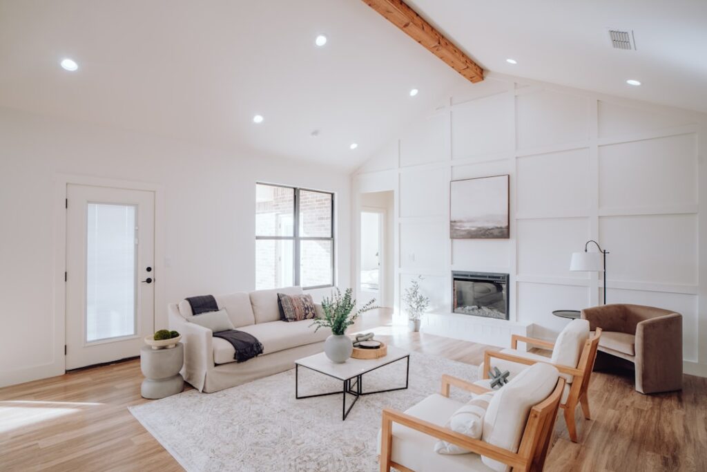
Blue is the color homeowners return to more than any other, and paint manufacturers know it, which is why nearly every “color of the year” list leans blue. The reason is simple: blue reads as calm, timeless, and endlessly adaptable, shifting from crisp and coastal to moody and sophisticated depending on the shade. This roundup of popular blue paint colors covers the specific shades designers reach for again and again, how to judge undertones, which finishes to use where, and how to keep a blue room from feeling cold. Whether you are painting a nursery, a kitchen island, or the whole exterior, the right blue is out there.
Part of our Paint & Walls guide — explore the full guide →
- Why Blue Remains the Most-Chosen Paint Color
- The Most Popular Blue Paint Shades Right Now
- Understanding Blue Undertones
- Matching the Blue to the Room
- Choosing the Right Finish
- Keeping a Blue Room From Feeling Cold
- Light Blues vs. Dark Blues: When to Use Each
- Blue for Exteriors
- Pairing Blue With Other Colors
- Testing Before You Commit
Why Blue Remains the Most-Chosen Paint Color
Color psychology gives blue a head start. It lowers perceived stress, evokes water and sky, and works in rooms where you want to relax, which covers bedrooms, bathrooms, and living spaces. Practically speaking, blue is also a near-neutral. Grayed-down and muted blues behave much like a soft gray or greige, pairing with almost any wood tone, metal finish, or countertop. That flexibility means a blue you choose today will still look right after the next design trend passes.
The Most Popular Blue Paint Shades Right Now
These are the specific colors that show up in real homes and designer portfolios most often. Names and codes make it easy to grab a sample.
- Benjamin Moore Hale Navy (HC-154): A deep, slightly muted navy that has become the default for cabinets, front doors, and accent walls. It reads sophisticated without going flat black.
- Sherwin-Williams Naval (SW 6244): A rich, saturated navy that is bolder than Hale Navy. Popular for kitchen islands and libraries.
- Farrow & Ball Hague Blue (No. 30): A dark teal-leaning blue with real depth, beloved for dramatic small rooms and paneled walls.
- Benjamin Moore Van Deusen Blue (HC-156): A classic mid-tone colonial blue that suits both interiors and shutters.
- Sherwin-Williams Sea Salt (SW 6204): Technically a blue-green, this soft spa color is one of the best-selling shades for bathrooms and bedrooms.
- Benjamin Moore Palladian Blue (HC-144): A gentle blue-green with gray, a perennial favorite for calming, airy spaces.
- Sherwin-Williams Rainwashed (SW 6211): A watery, coastal blue-green that feels fresh and relaxed.
Understanding Blue Undertones
The single most common paint mistake is ignoring undertones. Two blues that look identical on a chip can behave completely differently on a wall. Blues generally lean one of three ways: toward green (teal, spa, coastal), toward purple (periwinkle, some navies), or toward gray (chambray, denim). A blue with a green undertone feels earthy and calm. A blue with a purple undertone can go surprisingly cool or even lavender in north-facing light. A grayed blue is the safest, most neutral option.
To read an undertone, hold the sample next to a true primary blue and a pure gray. Whatever direction it drifts is the undertone that will amplify in your room. North-facing rooms cool colors down and can make a blue feel icy, so choose a warmer, greener blue there. South-facing rooms flood a blue with warm light, so you can get away with cooler shades.
Matching the Blue to the Room
Different spaces call for different intensities. In bedrooms, soft, muted blues like Palladian Blue or a chambray tone promote rest. In bathrooms, spa blue-greens like Sea Salt or Rainwashed reinforce the clean, watery feeling. Kitchens have embraced blue islands and lower cabinets, where a deep navy like Naval or Hale Navy grounds an otherwise white room.
For a home office or library, a dark, enveloping blue like Hague Blue turns a small room into a jewel box and reads as focused and serious. Living rooms do well with mid-tones that have enough color to feel intentional but enough gray to stay flexible. Front doors and shutters are the perfect place to go bold with a saturated navy or classic colonial blue against a neutral facade.
Choosing the Right Finish
Sheen matters as much as color, especially with deep blues that can show every flaw. As a rule:
- Flat or matte: Best for ceilings and low-traffic bedrooms. Hides wall imperfections but is harder to clean.
- Eggshell or satin: The workhorse for most walls. Enough sheen to wipe down, low enough to hide texture.
- Semi-gloss: The standard for trim, doors, and cabinets. It shows off a navy cabinet’s richness and stands up to scrubbing.
- High-gloss: Dramatic on a front door or a paneled accent wall, but it magnifies any surface imperfection, so prep must be flawless.
Dark blues in particular benefit from a tinted primer and at least two topcoats. Deep bases have less white pigment and cover unevenly, so skimping on coats leaves a patchy, streaky finish.
Keeping a Blue Room From Feeling Cold
Blue’s calming quality tips into chilly if the whole palette is cool. Warm it up with natural wood tones, brass or antique gold hardware, rattan or jute textures, and warm-toned whites on the trim rather than a stark blue-white. A pure white next to navy can look sterile; a creamy white softens the contrast. Layering in warm metals and organic materials keeps even a deep navy room feeling inviting rather than icy.
Light Blues vs. Dark Blues: When to Use Each
The intensity of the blue you choose changes a room’s entire personality, so match it to the effect you want. Light and soft blues like powder, chambray, and spa tones visually expand a space, bounce natural light, and keep a room feeling open and airy. They are the safe choice for small bathrooms, low-light bedrooms, and anywhere you want serenity without commitment. Because they read almost as neutrals, they pair effortlessly with white trim and most furnishings.
Deep, saturated blues like navy and Hague Blue do the opposite: they wrap a room in coziness, add drama, and create a sense of depth and sophistication. They shine in libraries, home offices, dining rooms, and accent walls where you want atmosphere rather than brightness. The catch is that dark colors absorb light, so a small dark-blue room can feel cave-like without adequate lighting, while the same color in a well-lit space feels luxurious. Many homeowners split the difference by using a light blue on the walls and reserving a deep navy for a single feature like a built-in bookcase, an island, or the front door.
Blue for Exteriors
Blue is not just an interior favorite; it has become one of the most popular exterior colors too, and the shade selection follows different rules outdoors. Sunlight is far more intense than interior light and washes colors out, so a blue that looks perfect on an inside wall can appear a full shade lighter and cooler on a facade. Choose a slightly deeper or more saturated version than you think you want. Classic exterior blues include muted colonial and Cape Cod tones, deep navy for a striking modern farmhouse, and soft gray-blues that read almost neutral against white or stone.
Coordinate the blue with your roof color, any brick or stone, and the trim. A navy body with crisp white trim and black accents is a timeless combination that suits many home styles. For shutters and front doors, blue is one of the safest bold choices, adding character without clashing with landscaping or neighboring homes. Always test exterior colors on a large swatch on the actual house and view it at different times of day, since outdoor light shifts dramatically from morning to evening.
Pairing Blue With Other Colors
Blue is a team player, and the accent colors you choose determine whether the palette feels classic, coastal, or contemporary. Blue and white is the timeless combination, crisp and nautical or clean and modern depending on the shade. Blue and warm brass or gold reads elegant and current. Blue with natural wood tones feels grounded and organic, while blue paired with soft blush or terracotta creates a warm, unexpected balance. For a bolder scheme, navy with emerald or mustard makes a rich, saturated statement. Whatever pairing you choose, repeating the accent in two or three spots around the room ties the whole palette together.
Testing Before You Commit
Never choose a blue from a chip alone. Buy sample pots and paint a two-by-two-foot swatch on at least two walls, since light changes across a room. Better yet, paint a poster board you can move around and view at morning, midday, and night. Blue is notoriously sensitive to light, and a color that looks perfect at the store can turn gray, purple, or teal at home. Living with the swatch for a few days costs a few dollars and saves you from repainting an entire room. With the right shade, a good primer, and adequate coats, a blue room becomes the kind of space that feels right for years, which is exactly why blue stays at the top of every popular-color list.