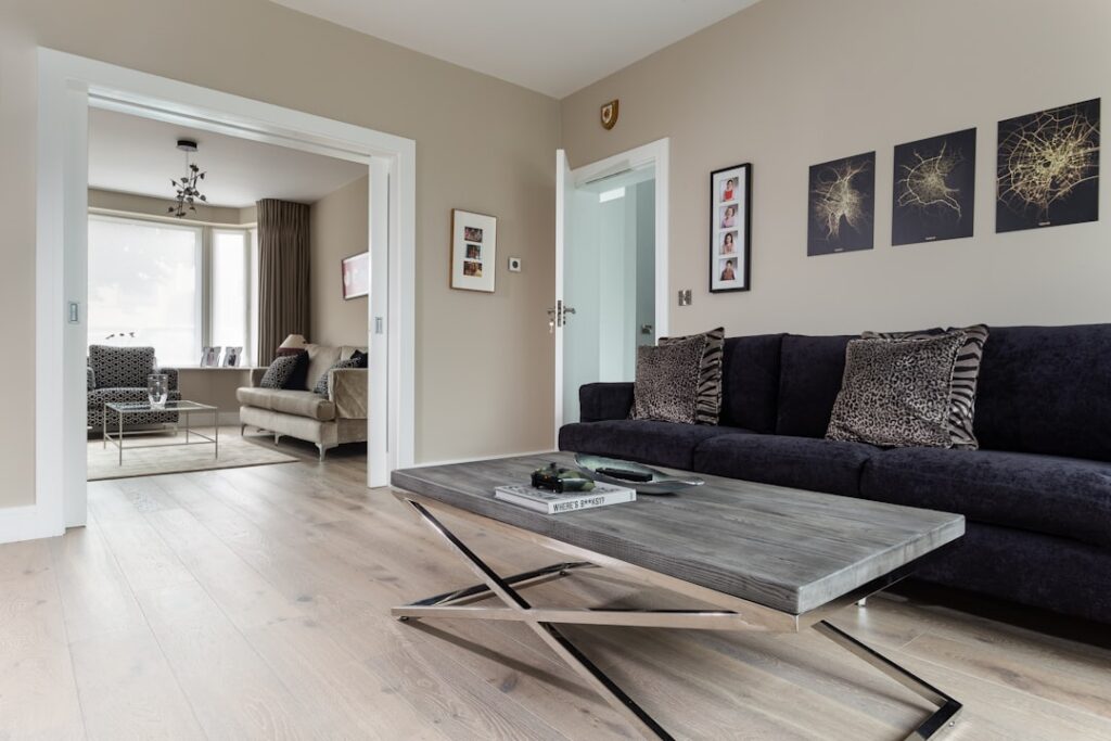
Choosing a floor color is the decision homeowners agonize over most, and for good reason: it covers more visual real estate than any other surface in the house. The popular laminate flooring colors of the moment run from cool grays and soft greiges to warm honey oaks and dramatic near-blacks, and each sends a completely different message. After helping hundreds of clients pick, I can tell you the right shade depends less on trends and more on your light, your walls, and how the room actually gets used.
- Gray: The Trend That Refuses to Fade
- Greige: The Best of Both Worlds
- Warm Honey and Golden Oak: The Comeback
- Dark Espresso and Near-Black: Drama With a Catch
- Light Blonde and Whitewashed: Airy and Scandinavian
- How to Match Color to Your Room and Light
- How Plank Width and Texture Change the Color
- Common Color Mistakes to Avoid
- Choosing a Color You Will Still Love
Laminate makes color experimentation affordable, since a convincing wood-look plank runs just $1 to $4 per square foot. That low cost is exactly why it is worth getting the color right, because a floor you dislike is a floor you will stare at for a decade.
Gray: The Trend That Refuses to Fade
Gray laminate exploded roughly a decade ago and remains a heavyweight. It reads modern, clean, and neutral, and it pairs effortlessly with the cool white-and-navy palettes that dominate contemporary interiors. Shades range from pale dove and weathered driftwood to deep charcoal and slate.
The caution with gray is that it leans cool, and in a room with limited natural light it can feel flat or even a touch cold and clinical. Gray also shows dust and light-colored pet hair more readily than mid-tones. If you love the look, warm it up with wood furniture, textured rugs, and warm lighting so the space does not tip into sterile.
Greige: The Best of Both Worlds
Greige, the blend of gray and beige, has quietly become the most requested shade in my showroom. It delivers the modern restraint of gray without the coldness, borrowing just enough warmth from beige to feel inviting. Greige is the great chameleon: it flatters both cool and warm decor, hides dirt better than pure gray, and photographs beautifully, which is why real estate stagers reach for it constantly.
If you cannot decide between a cool and a warm floor, greige is almost always the safe, timeless answer. It is the shade I steer indecisive clients toward more than any other.
Warm Honey and Golden Oak: The Comeback
After years of gray dominance, warm wood tones are surging back. Honey oak, golden brown, and natural amber laminates bring genuine warmth and a cozy, timeless feel that never truly goes out of style. These shades excel in traditional, farmhouse, and transitional homes, and they make north-facing rooms with cool light feel noticeably more welcoming.
Warm tones are also forgiving in daily life. They hide sawdust-colored crumbs, minor scratches, and pet hair from tan dogs far better than either very light or very dark floors. For a busy family home, a mid-tone warm oak is one of the most practical of all the popular laminate flooring colors.
Dark Espresso and Near-Black: Drama With a Catch
Rich espresso, walnut, and near-black laminates deliver undeniable drama and elegance. They anchor a room, create striking contrast against white trim and light walls, and lend a luxurious, high-end feel. In formal spaces and low-traffic rooms, a dark floor is stunning.
But dark floors are the highest-maintenance choice by a wide margin. They show every speck of dust, every footprint, every smudge and pet hair, which means near-constant sweeping to keep them looking sharp. Scratches also stand out more against dark planks because the exposed core underneath is lighter. In a home with kids, dogs, and heavy traffic, I gently warn clients that a dark floor is a commitment to daily cleaning.
Light Blonde and Whitewashed: Airy and Scandinavian
At the opposite end sit pale blonde, whitewashed, and light natural laminates. These make small rooms feel larger and brighter, echo the airy Scandinavian and coastal aesthetics, and reflect light beautifully in spaces that get plenty of sun. A light floor forgives dust and pet hair remarkably well, which makes it surprisingly practical despite its delicate look.
The tradeoff is that very light floors can show dark scuffs, mud, and dropped coffee more obviously, and cheaper light laminates sometimes read as slightly artificial. Spend up for a light plank with realistic graining and texture, and the effect is genuinely elegant.
How to Match Color to Your Room and Light
Color never exists in a vacuum, so test before you commit. A few field-tested guidelines make the choice far easier:
- Small or dark rooms benefit from lighter floors, which visually expand and brighten the space.
- North-facing rooms with cool light warm up with honey and golden tones; south-facing rooms can carry cool grays without feeling cold.
- Match the floor’s undertone to your cabinets and trim so they either coordinate or contrast intentionally, never clash by accident.
- Always buy a full plank or a large sample and live with it on the floor for several days, viewing it in morning, afternoon, and evening light.
That last tip matters most. Showroom lighting lies, and a floor that looks perfect under fluorescent panels can turn muddy or icy in your living room. A $10 sample is cheap insurance against a $3,000 mistake.
How Plank Width and Texture Change the Color
Color never works alone; the plank’s width, finish, and surface texture all shift how a shade actually reads on your floor. Wide planks of 7 to 9 inches make a color feel more expansive and contemporary, while narrower strip-style planks lend a traditional, busier look to the same tone. The graining pattern matters just as much, because a high-variation plank with knots and mineral streaks reads warmer and more rustic than a uniform, low-variation plank of the identical base color.
Surface texture is the finishing touch. A high-gloss finish amplifies color and light but shows scratches and dust, which is why I rarely recommend it for busy homes. A matte or embossed-in-register finish, where the texture aligns with the printed grain, mutes the sheen, hides wear, and makes even budget laminate read convincingly like real wood. Two floors of the exact same color can look completely different once width and texture enter the picture.
Common Color Mistakes to Avoid
The most frequent regret I see is choosing a floor that fights the home’s fixed elements. A cool gray floor beside warm-toned oak cabinets or a red-brick fireplace creates a subtle clash that homeowners feel without being able to name it. Before committing, pull your floor sample right up against the cabinets, countertops, and trim that are staying put, because those are the elements you cannot easily change.
Another trap is chasing a trend at its peak. Very cool grays and stark near-blacks were everywhere a few years ago, and some of those floors already feel dated. If resale is on your horizon, a versatile mid-tone reads as timeless and appeals to the widest pool of buyers. Finally, resist buying purely from a small chip; the color intensifies dramatically once it covers an entire room, and a shade that looked subtle on a two-inch sample can overwhelm the space at full scale.
Choosing a Color You Will Still Love
Trends come and go, but a floor is a long-term commitment, so weigh timelessness against fashion. Among the popular laminate flooring colors available today, greige and warm mid-tone oaks are the safest bets for lasting appeal and easy maintenance, while gray and near-black make bolder statements that demand more upkeep and carry more trend risk. Match the shade to your light, your lifestyle, and the rooms you actually clean, and you will pick a floor that still feels right ten years from now.
Prefer to explore on your own?
See how new flooring looks in your actual room in seconds — free, no signup.
Try the free Floor Studio →