Few backsplashes tell a story the way a Portuguese tile backsplash does. Inspired by the centuries-old azulejo tradition of Portugal, these hand-painted blue-and-white and richly patterned tiles turn a kitchen wall into a work of art. They carry a sense of history, craftsmanship, and Mediterranean warmth that mass-produced subway tile simply cannot match. Whether you dream of a single bold statement wall or a subtle patterned accent, Portuguese-inspired tile brings color, movement, and old-world character to modern kitchens and baths. This guide explores the patterns, colors, materials, layouts, and practical details that help you capture the look authentically.
- The Story Behind Azulejo Tile
- Signature Patterns and Colors
- Authentic Tiles vs Printed Look-Alikes
- Where and How to Use the Pattern
- Pairing Portuguese Tile With the Rest of the Kitchen
- What a Portuguese Tile Backsplash Costs
- Installation and Care Tips
- Styling for Maximum Impact
- Pros and Cons to Consider
- Mixing and Matching Patterns Successfully
- Final Thoughts on a Portuguese Tile Backsplash
The Story Behind Azulejo Tile
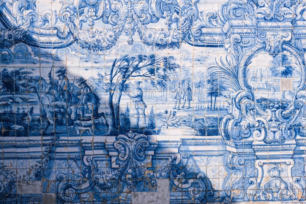
Azulejos are the painted, tin-glazed ceramic tiles that have adorned Portuguese buildings, churches, and palaces for over five hundred years. Traditionally cobalt blue on a white ground, they evolved to include yellows, greens, and intricate florals, geometrics, and storytelling scenes. Bringing this tradition into a backsplash means embracing pattern and handcraft, tiles that look painted rather than printed, with slight irregularities that give them soul. Understanding this heritage helps you choose tiles that feel authentic rather than generic, and it explains why the style reads as both timeless and full of personality.
Signature Patterns and Colors
The heart of a Portuguese tile backsplash is its pattern. Popular directions include:
- Classic blue and white: the iconic azulejo palette, cool, crisp, and endlessly elegant.
- Geometric repeats: interlocking stars, diamonds, and tessellations that create rhythm across the wall.
- Floral and botanical motifs: painterly flowers and vines for a romantic, garden feel.
- Multicolor Mediterranean: warm yellows, terracotta, greens, and blues together for a sunnier, Spanish-Portuguese vibe.
- Mixed patchwork: a curated jumble of different patterns in the same color family for eclectic charm.
The pattern you choose sets the tone: crisp blue-and-white feels coastal and refined, while multicolor patchwork feels lively and bohemian.
Authentic Tiles vs Printed Look-Alikes
You can achieve the look at several price points and levels of authenticity:
- Genuine hand-painted azulejos: imported, artisan-made tiles with real depth and slight imperfections; the most authentic and the most expensive.
- Screen-printed ceramic tile: factory tiles printed with azulejo-style patterns, affordable and widely available with crisp, consistent designs.
- Patterned porcelain: durable, water-resistant, and easy to clean, with printed Portuguese motifs, ideal for busy kitchens.
- Peel-and-stick tile: vinyl or gel tiles printed with patterns for a fast, renter-friendly, budget refresh.
Genuine hand-painted tiles reward close inspection with brushstroke texture, while printed options deliver the look affordably for those who prioritize easy care.
Where and How to Use the Pattern
Because the tiles are bold, placement is a design decision in itself:
- Full backsplash: a complete patterned wall behind the counters makes a rich, immersive statement.
- Behind-the-range feature: concentrate the pattern in a framed panel above the stove and keep the rest simple.
- Border and inset: use patterned tiles as a decorative band within plain white tile for a subtle nod.
- Vertical accent strip: a narrow column of pattern adds interest without overwhelming a small kitchen.
In a compact space, a full patterned backsplash can actually feel joyful rather than busy, while in a large kitchen a focused panel keeps the look balanced.
Pairing Portuguese Tile With the Rest of the Kitchen
These tiles are the star, so the surrounding elements should support, not compete:
- White or cream cabinets let blue-and-white patterns breathe.
- Natural wood cabinetry warms up the cool blues for a Mediterranean feel.
- Simple stone or solid counters such as white quartz or butcher block keep the focus on the tile.
- Navy or deep green cabinets create a bold, saturated look with multicolor patterns.
- Brass or matte black hardware adds a refined finishing touch.
What a Portuguese Tile Backsplash Costs
Pricing varies widely by authenticity:
- Hand-painted imported azulejos: roughly $20 to $60 or more per square foot.
- Screen-printed ceramic patterned tile: about $8 to $25 per square foot.
- Patterned porcelain: $10 to $30 per square foot.
- Peel-and-stick: $5 to $12 per square foot.
- Professional installation: $10 to $20 per square foot, higher for careful pattern alignment.
Because pattern matching adds labor, factor extra time or cost for lining up complex repeats precisely.
Installation and Care Tips
Patterned tile demands a little more planning than plain tile:
- Plan the layout carefully so the pattern centers nicely and cut tiles land at the edges, not the middle.
- Dry-lay the design first to confirm the repeat aligns before spreading adhesive.
- Choose grout thoughtfully; a soft gray or white keeps the focus on the pattern, while matching grout blends the joints.
- Seal unglazed or handmade tiles if recommended, since some artisan tiles are more porous.
- Clean gently with mild soap and a soft cloth to protect the glaze and painted surface.
Styling for Maximum Impact
To let a Portuguese tile backsplash shine, keep clutter off the counters so the pattern remains visible, and use warm under-cabinet lighting to bring out the glaze’s depth. A few Mediterranean touches, terracotta pots, olive-wood boards, or copper pans, reinforce the theme without tipping into kitsch. The goal is to let the tile feel like the heart of the room, a handcrafted focal point that draws the eye the moment you walk in.
Pros and Cons to Consider
Before committing to such a distinctive look, weigh the trade-offs honestly:
- Pros: a one-of-a-kind, artful focal point; rich color and pattern that add warmth and character; a timeless, heritage-rooted style; and the ability to transform even a small kitchen into something memorable.
- Cons: bold patterns are a stronger commitment than plain tile and harder to change later; authentic hand-painted tiles are pricey and more delicate; and busy patterns can overwhelm a room if overused or paired with equally loud finishes.
The way to enjoy the upside while managing the downside is scale and placement. Concentrating the pattern in a defined area, behind the range or as a framed panel, gives you the drama without the risk of the whole kitchen feeling frantic.
Mixing and Matching Patterns Successfully
The patchwork approach, combining several different azulejo patterns, is one of the most charming ways to use these tiles, but it needs a guiding thread to avoid looking chaotic. Keep the tiles within a single color family, such as all blue-and-white, so the varied patterns read as a collection rather than a clash. Distribute the busiest tiles evenly rather than clustering them, and let the eye move across the wall in a balanced rhythm. Done well, a patchwork Portuguese backsplash feels collected and soulful, as though the tiles were gathered over years of travel, which is exactly the romantic quality that makes this style so beloved.
If a full patchwork feels risky, start smaller: a single repeating pattern reads calmer and still delivers that unmistakable azulejo charm. You can always let one hero pattern carry the whole wall and reserve the mixed-tile treatment for a compact spot like a bar niche or a powder-room accent, where a burst of variety feels like a delightful surprise rather than visual overload.
Final Thoughts on a Portuguese Tile Backsplash
A Portuguese tile backsplash is more than a surface, it is a piece of history and artistry brought into your daily life. Rooted in the centuries-old azulejo tradition, these patterned tiles fill a kitchen with color, craftsmanship, and Mediterranean warmth that no plain tile can rival. Whether you invest in genuine hand-painted imports or capture the look with affordable printed porcelain, the secret is thoughtful placement, careful pattern alignment, and simple surroundings that let the design take center stage. Choose a pattern that speaks to you, and your backsplash will become the storytelling centerpiece your kitchen has been missing.
Prefer to explore on your own?
See how new flooring looks in your actual room in seconds — free, no signup.
Try the free Floor Studio →