Color sets the entire mood of a bathroom, yet it is the decision homeowners most often make last and regret first. A well-planned bathroom color scheme ties the walls, tile, fixtures, and finishes into a cohesive whole, while a random assembly of favorites turns a small room busy and disjointed. Because a bathroom is compact and heavily surfaced with permanent materials like tile, color mistakes here are more visible and more expensive to fix than in almost any other room.
Part of our Bathroom Remodeling & Flooring guide — explore the full guide →
The good news is that a handful of reliable principles make color selection far less intimidating. Understanding how to build a palette, balance it, and adapt it to your lighting will help you land on a scheme you still love years from now.
Start With the Fixed Elements
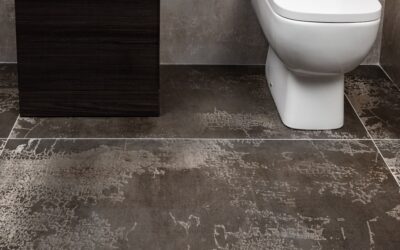
Before choosing a wall color, take stock of what you cannot easily change. Tile, countertops, and sometimes a tub or vanity are semi-permanent and expensive to swap, so they should anchor the palette rather than fight it. If you are keeping existing tile, build the scheme around its undertone, warm beige tile pairs with warm whites and earthy accents, while cool gray tile wants cooler companions.
When you are choosing everything fresh, pick the most permanent and expensive element first, usually the floor or shower tile, and let paint and accessories follow. Paint is cheap and easily changed; tile is not. Selecting a bold wall color and then trying to find tile to match is backward and frustrating. Anchor to the hard, costly surfaces and the flexible elements will fall into place naturally.
The 60-30-10 Rule
Professional designers lean on a simple ratio to keep any room balanced: 60 percent a dominant color, 30 percent a secondary color, and 10 percent an accent. In a bathroom, the dominant 60 percent is typically the walls and large tile fields, the 30 percent secondary might be the vanity, flooring, or shower tile, and the 10 percent accent shows up in towels, art, a painted vanity, or fixtures.
This structure prevents the two most common failures: a room so monochrome it feels flat, and a room so multicolored it feels chaotic. It also tells you where to be bold safely, keep the big surfaces calm and neutral, then concentrate personality in the easily changed 10 percent. A soft white and gray bathroom becomes memorable with deep navy towels and a brass mirror, and you can swap that accent for a new season without touching the tile. Applying the ratio makes even an amateur palette read as designed.
Popular Color Directions That Work
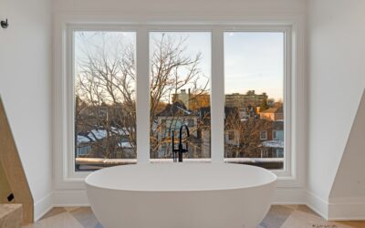
Certain schemes have proven their staying power in bathrooms. All-white and white-with-gray palettes remain the safest and most timeless, bright, clean, and appealing to future buyers, though they benefit from texture and warm accents so they do not read cold. Warm neutrals like greige, taupe, and soft beige create a spa-like calm and flatter skin tones under warm light.
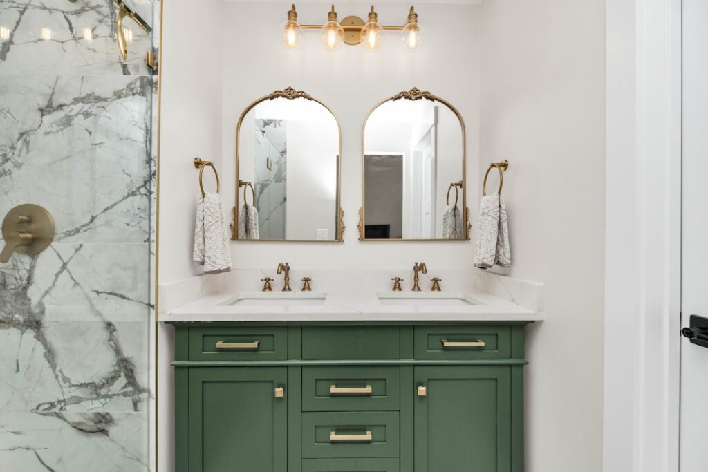
For homeowners wanting more character, a few directions deliver without risk. Blue and white, from pale sky to deep navy, feels fresh and coastal. Green, especially sage and soft eucalyptus, has become a favorite for its natural, restful feel. Black-and-white schemes read crisp and contemporary. If you want drama, apply the bold color to a single vanity or an accent wall rather than the whole room, so it energizes without overwhelming the small space. Reserve trendy, saturated colors for the changeable 10 percent.
Adapt to Your Lighting
Color behaves differently under different light, and bathrooms often combine limited natural light with artificial fixtures, so a shade that looks perfect in the store can disappoint on the wall. Warm bulbs around 2700K push colors toward yellow and make warm tones glow but can muddy cool grays. Cooler bulbs near 4000K sharpen whites and grays but can make warm beiges look dingy. Always test paint samples on the actual wall and view them at different times of day.
Rooms with little natural light benefit from lighter, brighter palettes that bounce what light there is, so a windowless powder room usually wants soft whites and pale colors rather than deep, absorbing shades. If you love a dark, moody scheme, compensate with generous layered lighting and reflective surfaces like a large mirror and glossy tile. Choose bulbs with a color rendering index of 90 or higher so your carefully chosen colors read true rather than washed out.
Coordinate Fixtures and Metals
Color is not only about paint and tile; the metal finishes on faucets, hardware, lighting, and towel bars are part of the palette. Pick one dominant metal and carry it consistently, matte black, brushed nickel, brushed gold, or chrome, because mismatched metals in a small room usually look accidental. The metal you choose also shifts the mood: black reads modern and crisp, brass and gold add warmth, chrome and nickel feel classic and neutral.
Coordinate the metal with your color direction. Matte black pairs sharply with white-and-gray contemporary schemes; warm brass complements greige, green, and traditional palettes; polished nickel suits blue-and-white and transitional rooms. Treating the fixtures as a deliberate part of the color plan, rather than whatever the store had in stock, is a low-cost way to make the whole scheme feel intentional and complete.
Using Undertones and Contrast Correctly
The most common color mistake in a bathroom is ignoring undertones, the subtle warm or cool bias hiding inside every neutral. Two grays that look identical on paint chips can clash badly on the wall because one leans blue and the other leans green or purple. The same trap catches whites, which range from warm creamy tones to cool blue-whites, and beiges, which can skew pink, yellow, or gray. Before committing, hold your paint, tile, and countertop samples together in the actual room and check whether their undertones harmonize. A warm greige wall beside cool gray tile will look muddy no matter how nice each is alone. Matching undertones, keeping the whole palette either warm or cool, is the single most reliable way to make a scheme feel intentional.
Contrast is the other lever worth using deliberately. A low-contrast scheme, soft white walls with pale gray tile, feels serene, spacious, and spa-like, which suits a small bathroom you want to feel larger. A high-contrast scheme, crisp white against deep navy or black, feels bold, graphic, and energetic, well suited to a powder room or a bathroom you want to make a statement. Neither is wrong; the choice should follow the mood you want and the size of the room. In tight spaces, lower contrast generally reads more open, while high contrast can make a small room feel busier. Deciding on your contrast level early gives the palette a clear direction and keeps you from second-guessing every sample.
Bringing in Accent Color Without Regret
The safest way to enjoy bold color in a bathroom is to confine it to elements you can change without a remodel. Towels, a bath mat, art, a window shade, a vase, and small accessories let you introduce a season’s favorite color, and swap it out cheaply when your taste shifts. A painted vanity is the next tier up, more committed than towels but far easier and cheaper to repaint than to retile, making it an ideal place for a confident navy, forest green, or charcoal. Reserve the permanent, expensive surfaces, the floor and shower tile, for neutrals with staying power. This layered approach gives you the personality of color without the risk, because the bold choices live in the flexible 10 percent while the costly 60 and 30 percent stay timeless. Homeowners who follow this rule rarely tire of their bathroom, since refreshing the look means buying new towels rather than tearing out tile.
Bringing the Scheme Together
A successful bathroom color scheme is really the product of a few disciplined choices: anchor to the permanent, expensive surfaces; balance the palette with the 60-30-10 ratio; keep big surfaces calm and put boldness in the changeable accents; test every color under your actual lighting; and coordinate one metal finish throughout. Follow that framework and you avoid the scattered, dated look that plagues so many bathrooms.
Above all, keep the large and costly elements neutral and timeless, then express personality through towels, art, and paint you can refresh anytime. That approach gives you a bathroom that feels current today, adapts easily to changing tastes, and still looks pulled-together when it is time to sell.