Benjamin Moore carries more than 3,500 colors, which is exactly why standing in front of that fan deck feels paralyzing rather than helpful. The good news is that among all those chips, a couple dozen do the heavy lifting in real homes — and knowing which Benjamin Moore interior paint colors designers actually specify saves you from painting a room twice. After matching these colors to hundreds of rooms, I have learned that the winners aren’t the flashy ones. They are the reliable neutrals and quiet accents that read correctly under different light, and this guide walks through the shades worth your sample dollars.
Part of our Paint & Walls guide — explore the full guide →
- Why Benjamin Moore Is Worth the Premium
- Understanding Undertones and LRV First
- The Best Whites
- Reliable Neutrals for Living Spaces
- Colors for Bedrooms and Quiet Rooms
- Kitchens, Baths, and High-Moisture Rooms
- Choosing the Right Finish
- Accent Colors Worth Considering
- Coordinating Colors Across an Open Floor Plan
- Test Before You Commit
Why Benjamin Moore Is Worth the Premium
Benjamin Moore’s Regal Select and Aura lines cost more than big-box paint — often $60 to $85 a gallon — but the coverage and color depth justify it on most jobs. Aura in particular uses the brand’s Color Lock technology, which delivers rich, true color in fewer coats and resists fading. On a deep or saturated color, that means two coats instead of three or four, which erases much of the price difference in labor and product.
The other reason pros lean on the brand is color consistency. A gallon mixed today matches one mixed next year, so touch-ups and additions actually blend. That reliability matters more than any single trendy shade.
Understanding Undertones and LRV First
Before any specific color, understand the two numbers that predict how a paint behaves. Undertone is the subtle secondary color hiding inside a neutral — the pink, green, or gold you only see once it covers a wall. Light Reflectance Value, or LRV, runs from 0 to 100 and tells you how much light the color bounces back, which controls how bright or moody the room feels.
A color with an LRV near 70 keeps a dim room airy; drop to the 50s and the same undertone reads cozy and enveloping. Always check a color’s LRV on the chip before falling for the swatch, because that number, paired with your room’s natural light, decides whether the shade succeeds.
The Best Whites
Whites are where Benjamin Moore earns its reputation, and three come up again and again:
- White Dove (OC-17): LRV 85, a soft warm white with a whisper of gray — the go-to for trim, cabinets, and whole rooms because it never looks stark or dingy
- Simply White (OC-117): LRV 92, a bright, clean white with a faint yellow warmth that keeps modern rooms from feeling cold
- Chantilly Lace (OC-65): LRV 90, the crispest true white in the lineup, ideal for contemporary trim and a stark white ceiling
Pair White Dove trim with a warm wall color and Chantilly Lace where you want maximum crispness. Mixing warm and cool whites in one room, though, tends to read like a mistake, so pick a lane.
Reliable Neutrals for Living Spaces
For main living areas, the greige and warm-gray neutrals do the most work. Revere Pewter (HC-172), at LRV 55, is the color that launched a thousand open floor plans — a greige that flexes warm or cool depending on light and pairs with nearly any flooring. Edgecomb Gray (HC-173), a step lighter at LRV 63, gives the same versatility in brighter, airier form for smaller or north-facing rooms.
When you want warmth without gray, Manchester Tan (HC-81) and Pale Oak (OC-20) deliver soft, livable neutrals. Pale Oak in particular reads as a barely-there warm greige that flatters both cool and warm finishes, making it a safe whole-home color for anyone nervous about commitment.
Colors for Bedrooms and Quiet Rooms
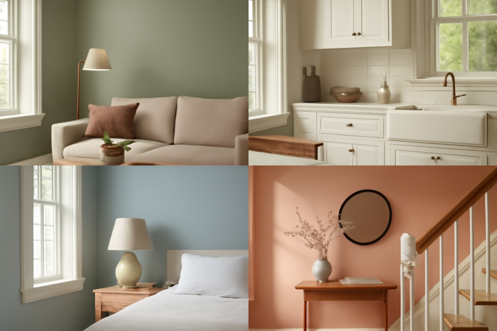
Bedrooms can carry more mood than shared spaces, so this is where the deeper and softer colors shine. Hale Navy (HC-154) is the brand’s most-loved deep blue — dramatic on an accent wall or full room, and stunning on built-ins and cabinetry. For a serene, spa-like feel, Quiet Moments (1563), a soft blue-green-gray, calms a bedroom without going cold.
If you prefer warmth at rest, a muted greige like Balboa Mist (OC-27) wraps a bedroom in soft neutral light. These lower-LRV and quieter shades work in bedrooms precisely because you experience them mostly in low, warm evening light where subtle depth reads as restful rather than dark.
Kitchens, Baths, and High-Moisture Rooms
In kitchens and baths, durability and cleanability matter as much as color. For cabinets, White Dove and Simply White remain the top picks, while a deeper green like Essex Green or a soft sage like October Mist (1495) — Benjamin Moore’s 2022 Color of the Year — bring current, grounded warmth to island bases and lower cabinets. October Mist is a gentle gray-green that pairs beautifully with brass hardware and natural wood.
Choose a scrubbable finish in these rooms. Benjamin Moore’s Aura Bath & Spa in a matte finish resists mildew in humid bathrooms while hiding wall flaws, and a satin or semi-gloss on cabinets and trim stands up to daily wiping.
Choosing the Right Finish
Sheen changes both durability and how the color reads. Flat and matte finishes hide imperfections and deepen color slightly, ideal for ceilings and low-traffic walls. Eggshell is the everyday workhorse for most walls — enough sheen to clean, not so much it highlights roller marks. Reserve satin and semi-gloss for trim, doors, cabinets, and high-moisture or high-traffic zones where you scrub often.
A glossier sheen also intensifies the undertone and reflects more light, so the same color in semi-gloss trim looks brighter than in the eggshell wall beside it. Plan those contrasts on purpose rather than being surprised by them.
Accent Colors Worth Considering
While neutrals anchor most homes, a few Benjamin Moore accent colors earn their place on a feature wall, a front door, or a piece of built-in cabinetry. Beyond Hale Navy, consider Salamander (2050-10), a near-black green that reads as deep and dramatic on a study or dining room. For warmth, Caliente (AF-290), a confident red that was a Color of the Year, brings energy to a front door or powder room without overwhelming a whole space.
Softer accents include Wickham Gray (HC-171), a cool light gray-blue that pairs beautifully with white trim, and Gray Owl (OC-52), a versatile pale gray with a subtle green-blue undertone that flexes between warm and cool rooms. The key with any accent is restraint — let it live on one wall or one element and echo it in small doses elsewhere so it reads as designed rather than random.
Coordinating Colors Across an Open Floor Plan
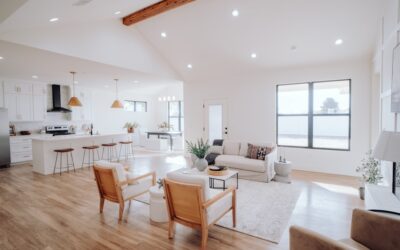
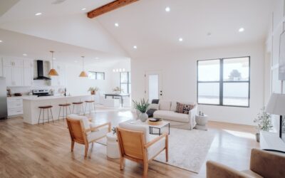
Open floor plans, where the kitchen, dining, and living areas flow together, demand a coordinated palette rather than a different color per zone. The reliable strategy is to choose one main neutral — Revere Pewter, Edgecomb Gray, or Pale Oak all work — and carry it across the connected spaces, then introduce variation through accent walls, cabinetry, and trim rather than switching wall colors room to room.
Benjamin Moore’s whites tie the whole scheme together when used consistently for trim throughout. Pick one trim white, such as White Dove, and use it everywhere so the transitions between rooms feel seamless. This whole-home approach keeps a house from feeling chopped up and lets light move naturally through the connected spaces, which is exactly what makes an open plan feel expansive.
Test Before You Commit
Even the most reliable shade can surprise you in your specific light, so buy sample pots and paint two coats on poster board. Move the board around the room across a full day and check it under your actual bulbs — warm 2700K LEDs push colors gold and pink, cooler bulbs flatten warmth. Prop samples next to trim, flooring, and countertops so you judge them in context.
Because these Benjamin Moore interior paint colors are formulated for consistency, what you approve on the board is what you’ll get on the wall — but only your room’s light can confirm the undertone plays nicely with your finishes. Start with the shades above to narrow the field, sample your top two or three, and you’ll skip the costly repaint that comes from choosing off the chip alone.