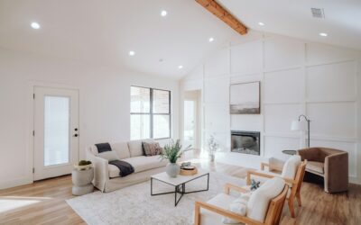
Designers who could specify any brand on earth keep reaching for the same short list of Benjamin Moore paint colors — White Dove, Revere Pewter, Hale Navy — and that’s not accident or nostalgia. Benjamin Moore’s color system is built on proprietary Gennex colorants and one of the most disciplined color libraries in the industry: over 3,500 colors organized into collections that each behave differently on a wall. The catch is that 3,500 options is a paralysis machine if you don’t understand how the system is organized. This guide maps the collections, names the proven performers in each color family, and covers the undertone and sampling habits that keep a color from turning on you at 4 p.m.
Part of our Paint & Walls guide — explore the full guide →
- How the Benjamin Moore Color System Works
- The Whites: Where Most Projects Start and Stall
- Grays, Greiges, and the Neutral Workhorses
- The Blues, Greens, and Statement Colors
- Reading Undertones Like a Pro
- Sampling: The $30 That Saves the $300 Mistake
- Exterior Colors: A Different Set of Rules
- A Short List That Rarely Misses
- Most Popular Benjamin Moore Colors by Room, Plus Twilight Blue and the Online Color Chart
How the Benjamin Moore Color System Works
Every color has a name and a number, and the number’s prefix tells you its family. The Classics collection (numbers 001-1680) is the deep historic backbone of the line. Historical Colors (HC-1 to HC-191) are muted, complex shades curated from 18th- and 19th-century American architecture — arguably the most foolproof 191 colors in any fan deck, because their softened chroma flatters nearly every light. Off-White Collection (OC-1 to OC-152) gathers the whites and near-whites in one place. Color Preview (2000-2172 range) holds the cleaner, more saturated contemporary shades, while Affinity (AF prefix) is a designer-curated set engineered so any two colors in the collection coordinate. Aura Color Stories (CSP) are full-spectrum formulas with extra colorant complexity that shift subtly through the day. When you’re lost, start in HC and OC — that’s where probably 80 percent of professional specs live.
The Whites: Where Most Projects Start and Stall
Benjamin Moore’s whites are the brand’s crown jewels, and three cover most situations. White Dove (OC-17) is the famous soft white — a whisper of warmth and gray that reads clean without ever going stark, the default for trim, cabinets, and whole-house white schemes. Chantilly Lace (OC-65) is the crisp, true white with almost no undertone; pick it for modern spaces, galleries of art, and anywhere you want white to actually look white. Simply White (OC-117), a former Color of the Year, sits between them with a faint warm glow that keeps kitchens from feeling clinical. Rounding out the family: Swiss Coffee (OC-45) for creamy warmth, Cloud White (OC-130) as a softer trim standard, and Paper White (OC-55) when you want a white that leans quietly gray and cool. The practical rule: pair warm whites with warm palettes and wood tones, crisp whites with cool grays and black accents, and never judge any of them off the chip — whites are the most light-dependent colors in the deck.
Grays, Greiges, and the Neutral Workhorses
Revere Pewter (HC-172) is the most famous greige in America — a light warm gray that bridges beige furnishings and gray trends, still the safest whole-house neutral in the line. Edgecomb Gray (HC-173) is its lighter, softer sibling; Balboa Mist (OC-27) lighter still, a barely-there warm gray that works where white feels flat. On the cooler side, Gray Owl (OC-52) is the classic light gray with green-blue flexibility, Stonington Gray (HC-170) the crisp coastal choice, and Coventry Gray (HC-169) the mid-tone that anchors them. For depth, Kendall Charcoal (HC-166) delivers a soft, sophisticated near-black, and Chelsea Gray (HC-168) has become the default gray for kitchen islands. Watch undertones here more than anywhere: grays flip green, blue, or purple depending on light direction — north light cools everything, south light warms it — so a gray that’s perfect in a south-facing living room can go icy in the north-facing bedroom on the same floor.
The Blues, Greens, and Statement Colors
Hale Navy (HC-154) is the single most specified dark color in the brand — a true, slightly softened navy that works on front doors, islands, exteriors, and entire moody dens without ever reading purple or black. Van Deusen Blue (HC-156) is its brighter cousin; Newburyport Blue (HC-155) sits deeper and grayer. In the blue-gray zone that photographs so well, Boothbay Gray (HC-165) and Water’s Edge (1635) carry bedrooms and baths. Greens have surged, and Benjamin Moore’s bench is deep: October Mist (1495) for soft sage, Backwoods (469) for muted forest, and Essex Green (CW-620) as the classic near-black green for exterior shutters and doors. For drama, Wrought Iron (2124-10) is the soft black-charcoal designers use on interior doors, and Black Forest Green and Onyx round out the near-blacks. Statement colors reward restraint in sheen — flat and matte finishes keep saturated walls velvety, while anything glossy amplifies every wave in the drywall.
Reading Undertones Like a Pro
Every Benjamin Moore neutral has an undertone, and the fastest way to find it is comparison, not squinting. Hold the chip against a true white (Chantilly Lace works as the reference) and the hidden hue jumps out — Revere Pewter shows its green-beige, Gray Owl its green-blue, Swiss Coffee its yellow. Then check the chip against the fixed elements in the room: floor stain, countertop, tile, brick. Clashing undertones (a pink-beige carpet under a green-gray wall) are what people mean when they say a color “just looks off.” Benjamin Moore’s fan decks arrange colors in strips of seven related values; a reliable designer trick is to pick your color, then use the shades two steps lighter and darker from the same strip for ceilings, trim accents, or adjoining rooms — guaranteed-coordinated because the undertone is identical.
Sampling: The $30 That Saves the $300 Mistake
Chips lie and screens lie worse. Buy the real half-pint samples, or better, the peel-and-stick versions from Samplize made with actual Benjamin Moore paint, and evaluate properly: two coats, at least a 2-by-2-foot area (or two sticker panels), on two different walls of the actual room. Look at them at morning, midday, and under evening artificial light — LED bulb temperature (2700K warm vs. 4000K cool) changes a greige as much as the window direction does. Paint sample boards white first if you’re testing over a dark existing wall, and never approve a color from a single viewing. One more system note: Benjamin Moore colors are formulated in Gennex colorants for Benjamin Moore bases, and competitor “color matches” of White Dove or Hale Navy routinely miss the complexity that made the color famous — if you want the color, buy the brand.
Exterior Colors: A Different Set of Rules
Outside, colors behave differently — daylight is five to ten times brighter than interior light, so every shade reads one to two steps lighter and more saturated on siding than on the chip. The standing designer advice with Benjamin Moore exteriors is to go a notch darker than the chip you love. The brand’s exterior stalwarts are their own club: Hale Navy and Kendall Charcoal for siding with white trim, Wrought Iron and Essex Green for front doors and shutters, White Dove and Simply White for trim that stays warm against brick, and the Williamsburg collection (CW numbers) for period-correct historic palettes. Sample outdoors exactly as you would inside — a 2-foot square on the sun side and the shade side of the house — because north-face siding and south-face siding will genuinely look like two different colors all day long. Fixed elements rule even harder outside: roof shingles, brick, and stone aren’t changing, so the siding color negotiates with them, not the other way around.
A Short List That Rarely Misses
If you need a starting roster for a whole house: White Dove on trim and ceilings; Edgecomb Gray or Balboa Mist for main living areas; Gray Owl or Stonington Gray for cooler bedrooms; Hale Navy or Chelsea Gray on the island or a front door; Wrought Iron on interior doors for contrast; and October Mist in a bath or office if you want one current color in the mix. Every one of those is a 20-year color, not a trend — which is really the Benjamin Moore signature: a library where the bestsellers were bestsellers before Pinterest and will still be specified when the algorithm moves on. Test in your own light, respect the undertones, and the deck’s depth becomes an asset instead of a maze.
Most Popular Benjamin Moore Colors by Room, Plus Twilight Blue and the Online Color Chart
The most popular Benjamin Moore colors stay remarkably stable year to year: soft whites, warm greiges, and one or two deep navies and charcoals make up most orders. What changes is where they get used, so the quickest way to shortlist is by room and by how much light that room gets.
Popular Benjamin Moore Colors by Room
| Room or surface | Popular picks | Why they work |
|---|---|---|
| Trim, ceilings, cabinets | White Dove OC-17, Chantilly Lace OC-65 | Soft or crisp white that suits most wall colors |
| Living rooms, open plans | Revere Pewter HC-172, Edgecomb Gray HC-173 | Warm neutrals that bridge wood and gray furnishings |
| Kitchens | Simply White OC-117, Chelsea Gray HC-168 | Bright perimeter walls with a darker island |
| Front doors, accent walls | Hale Navy HC-154, Twilight Blue 2067-30 | Deep blues that hold up in strong light |
Benjamin Moore Twilight Blue
Searches for Benjamin Moore Twilight usually mean Twilight Blue 2067-30, which the maker describes as a cobalt-toned blue inspired by the late evening sky. It sits in the Color Preview range and has a light reflectance value of about 12, so it reads as a dark color. Compared with Hale Navy, it is brighter and more saturated, which makes it lively on a front door or in a child’s room but strong for a whole living room. In a north-facing room it can look close to navy; in direct sun the cobalt comes forward.
Using the Benjamin Moore Color Chart Online
The physical fan deck is the most accurate color chart, but the colors section of the Benjamin Moore website is the fastest way to browse. Each color page lists the name, number, and light reflectance value, and the site lets you filter by color family and collection. Light reflectance value is the most useful number on the page: whites run roughly 80 and up, mid-tone neutrals sit around 50 to 65, and deep shades fall under 20. Two colors with similar values will sit comfortably side by side, while a big gap gives contrast.
- Use the website to narrow the list, never to make the final call.
- Note the color number, not only the name, since some names repeat across brands.
- Check the maker’s current page for the exact light reflectance value before comparing.