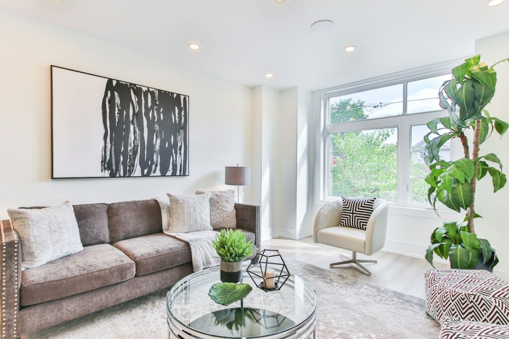
Plenty of “clean” whites turn creamy or gray once they hit a real wall, which is why so many homeowners repaint a room twice. Benjamin Moore Super White is one of the more predictable whites in the Off White Collection: the manufacturer lists it as OC-152 with a light reflectance value (LRV) of 87.36, and describes it as a radiant, slightly cool white that suggests clarity and simplicity. It reads bright and crisp without the stark, bluish glare of a pure ceiling white.
That slight coolness is the whole story. In north light it leans a touch gray-blue, in warm south light it looks close to neutral, and next to creamy whites it can look almost icy. It suits modern kitchens, trim, cabinetry and gallery-style walls best, and it can feel chilly in a dim, north-facing bedroom unless you warm the room with wood, brass or warm bulbs.
- Benjamin Moore Super White Specs at a Glance
- Understanding the Undertone
- Best Rooms and Surfaces for Super White
- Coordinating Colors and Pairings
- Super White vs Chantilly Lace and Decorators White
- How to Test and Apply It
- Troubleshooting Common White Paint Problems
- Cost and When to Hire a Painter
- Frequently Asked Questions
Benjamin Moore Super White Specs at a Glance
The core numbers come straight from the manufacturer’s color page. Use them as a starting point, then test a large sample on your own walls, since screens and printed chips rarely match the painted result.
| Spec | Value | What it means |
|---|---|---|
| Color number | OC-152 | Off White Collection code to give the store |
| LRV | 87.36 | Very light; reflects most of the light that hits it |
| Color family | White | Sits among the brighter whites, not the creamy ones |
| Undertone | Slightly cool | Can read faintly gray-blue in north light |
| Manufacturer pairings | Pure White, Hale Navy, Horizon, Juneau Spring | Suggested coordinating colors on the color page |
| Typical sheens | Matte or eggshell walls; satin or semi-gloss trim | Sheen changes how cool and bright it looks |
An LRV of 87.36 puts Super White in the bright-white range. The scale runs from 0 (absolute black) to 100 (perfect reflector), and most whites used on walls sit between about 80 and 92. Higher numbers bounce more light and look crisper, while lower numbers look softer and more shadowed.
Understanding the Undertone
Every white has some tint behind it, and that tint shows up most when you place the white beside something else. Super White carries a slight cool cast. On its own, on a large wall in good daylight, many people would simply call it white. Hold it next to a creamy white and the coolness jumps out. Hold it next to a stark, blue-leaning ceiling white and it may look almost soft.
Light direction changes the read more than anything else:
- North-facing rooms: Cool, indirect light pushes Super White toward a faint gray-blue. It stays clean, but it can feel cool in winter.
- South-facing rooms: Warm, strong light neutralizes the cool undertone, so it reads as a bright, balanced white.
- East and west rooms: Expect a shift through the day, crisp in cooler hours and warmer as the sun moves around.
- Artificial light: Bulbs around 2700K warm it up; bulbs at 3500K to 4000K keep it crisp and gallery-like.
Flooring and finishes matter as well. Warm oak floors and brass hardware balance the coolness, while gray tile, cool stone and chrome hardware amplify it. If you have warm honey or orange-toned wood, sample it against the floor before committing.
Best Rooms and Surfaces for Super White
Super White works best where you want a clean, modern backdrop and good light already exists.
Kitchens and cabinetry
White cabinets in Super White look fresh and contemporary, especially with quartz counters that have a cool or neutral background. Use a durable cabinet enamel in satin or semi-gloss so doors wipe clean.
Trim, doors and ceilings
Super White is a popular trim color because it reads as clean white without looking stark. It pairs well with gray, blue and green walls, and it keeps a modern tone next to cool neutrals. If your wall color is a creamy white, though, Super White trim may make the walls look dingy, so choose a warmer trim in that case.
Walls in bright or modern spaces
Open-plan living areas, home offices and art-filled hallways benefit from the bright, slightly cool look. In a small, dim bedroom, the same color can feel flat, so sample it first.
Exterior use
Outdoors, strong daylight washes whites out, and Super White can look very bright on a sunny facade. It works best on trim, columns and window casings, paired with deeper siding colors.
Coordinating Colors and Pairings
The manufacturer’s color page suggests Pure White (OC-64), Hale Navy (HC-154), Horizon (OC-53) and Juneau Spring (2041-40) as coordinating colors. Those picks show the range Super White can handle: a soft companion white, a deep navy accent, a pale gray-leaning neutral and a fresh green.
- With Hale Navy: Hale Navy has an LRV of 8.36, so the contrast is strong. Super White trim around navy walls, or navy lower cabinets with Super White uppers, gives a crisp, classic look.
- With Pure White: Pure White is softer, with gray tones and an LRV of 78.94. Use Pure White on walls and Super White on trim for a subtle two-white scheme.
- With pale grays and greiges: Super White reads clean against light grays, so it is a reliable trim color for cool neutral walls.
- With greens and blues: Muted greens and soft blues feel fresh next to it, especially in bathrooms and laundry rooms.
Avoid pairing it with very yellow creams on the same surface plane. The contrast between a cool white and a yellow cream can make one of them look off rather than intentional.
Super White vs Chantilly Lace and Decorators White
These three whites come up together in almost every white paint search. All three are bright, but they differ in reflectance and tint.
| Color | Number | LRV | How it reads |
|---|---|---|---|
| Chantilly Lace | OC-65 | 90.04 | Brighter, very clean white |
| Super White | OC-152 | 87.36 | Bright, slightly cool white |
| Decorators White | OC-149 | 82.68 | White with a hint of cool gray |
Chantilly Lace is a step brighter and is often chosen when you want the cleanest possible white for trim and cabinets. Side by side, Super White looks a little softer. Decorators White has a lower LRV and a noticeable cool gray hint, so it reads more muted and can look slightly shadowed in dim rooms. If Chantilly Lace feels too stark and Decorators White feels too gray, Super White sits between them.
For a warmer alternative, Simply White (OC-117, LRV 89.52) carries a subtle warm undertone, and White Dove (OC-17, LRV 83.16) is a softer, classic white. Both read creamier than Super White.
How to Test and Apply It
- Sample large. Paint two coats on a poster board at least 2 by 2 feet, or use a large peel-and-stick sample, and move it around the room.
- Check at three times of day. Look in the morning, mid-afternoon and under evening lamps before deciding.
- Compare against your fixed finishes. Hold the sample against flooring, counters and tile, since those will not change.
- Prep the surface. Clean, patch and spot-prime. Over a dark color, use a primer to avoid a third coat.
- Use good tools. A quality paint roller and tray kit with a 3/8-inch nap cover for smooth drywall gives an even finish, and a 2- to 2.5-inch angled brush handles cutting in.
- Apply two coats. Whites need full coverage to look uniform. Let each coat dry per the can label before recoating.
Troubleshooting Common White Paint Problems
It looks blue or gray. The room probably faces north or has cool bulbs. Switch to warmer bulbs or consider a warmer white such as Simply White.
The trim looks dingy next to the walls. If your wall white is warmer than the trim, the walls can look dirty by comparison. Match trim and walls to the same undertone family.
Patchy or uneven sheen. Patched spots absorb paint differently. Spot-prime every repair and keep a wet edge while rolling.
Old trim paint will not hold. Glossy oil-based trim needs a scuff sand and bonding primer. In homes built before 1978, test for lead before sanding and follow lead-safe practices if it tests positive.
Cost and When to Hire a Painter
Paint in a premium interior line typically runs about $60 to $100 or more per gallon depending on the product line and sheen, and a standard bedroom usually needs two gallons for two coats. Professional interior painting typically adds a few dollars per square foot of floor area, with cabinets priced separately. Hire a pro for tall stairwells, kitchen cabinets that need a sprayed finish, or any job involving lead-paint concerns. Ask the painter which product line and sheen the quote assumes, because Super White in a basic wall paint and in a cabinet enamel are very different finishes.
Frequently Asked Questions
Is Benjamin Moore Super White warm or cool?
It is slightly cool. The manufacturer describes it as a radiant, slightly cool white, and it can read faintly gray-blue in north-facing rooms while looking neutral in warm, sunny rooms.
What is the LRV of Super White?
Benjamin Moore lists Super White (OC-152) with an LRV of 87.36, which places it among the bright whites suitable for walls, trim and cabinetry.
Is Super White good for trim?
Yes. It reads clean without looking stark, so it suits trim around gray, blue, green and cool neutral walls. With creamy walls, a warmer trim white usually looks better.
Which is brighter, Super White or Chantilly Lace?
Chantilly Lace is brighter, with an LRV of 90.04 compared with 87.36 for Super White. Side by side, Super White looks slightly softer and a touch cooler.
Does Super White work on kitchen cabinets?
It works well on cabinets, especially with cool or neutral counters. Use a cabinet-grade enamel in satin or semi-gloss so the doors stay washable.