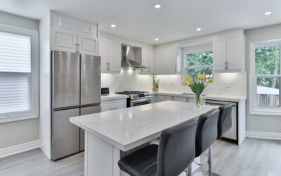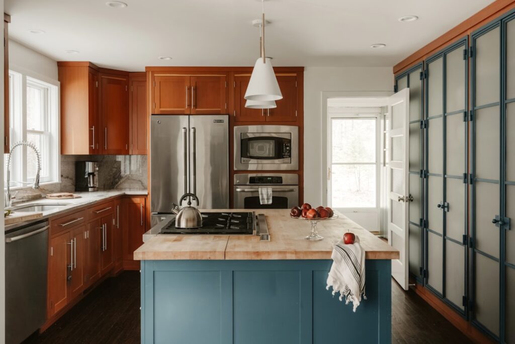
Few color combinations feel as fresh and timeless in a kitchen as blue paired with crisp white. Designing blue kitchen walls white cabinets the right way is all about matching the temperature and depth of your blue to the exact white on your doors, so the two read as an intentional pair rather than a lucky accident. Get the undertones right and the room feels cohesive, bright, and effortlessly current.
Part of our Kitchen Remodeling guide — explore the full guide →
The magic of this scheme is its range. The same two ingredients can produce a breezy coastal cottage, a moody navy showpiece, or a soft Scandinavian galley depending on which blue and which white you choose. Below are specific pairings, undertone guidance, and the finishing details that pull the whole look together.
Why Blue and White Works So Well
Blue and white is a classic for a reason grounded in color theory. White reflects light and keeps the space feeling open, while blue adds saturation and mood without overwhelming a room the way a warm bold color might. Because blue recedes visually, blue walls make cabinets step forward, giving white doors a clean, gallery-like presence.
The pairing also flatters kitchens of every size. In a small kitchen, a pale blue keeps things airy; in a large open-plan space, a deep navy adds the intimacy and grounding that big rooms often lack. The key in both cases is coordinating the temperature of the two colors.
Match Undertones Before Anything Else
Whites are never truly white. They carry warm undertones (yellow, cream, greige) or cool undertones (gray, blue, green). Blues split the same way, from warm periwinkles and slates to cool, icy, green-leaning shades. The single most important rule for this scheme is to keep the temperatures compatible.
Pair a warm, creamy white with a warm, softened blue, and a crisp, cool white with a clean or icy blue. Mixing a stark cool white against a warm, gray-green blue can make the cabinets look dingy or the wall look muddy. Always test large swatches on the wall and beside a cabinet door before committing.
Specific Paint Pairings That Work
Rather than guessing, start from these tested combinations. Colors are widely available across major brands and named here as reference points:
- Soft coastal: A powdery sky blue such as Sherwin-Williams Rainwashed or Benjamin Moore Palladian Blue on the walls, with a warm white like Benjamin Moore White Dove on the cabinets. Relaxed and cottage-friendly.
- Crisp and classic: A clean mid-blue like Benjamin Moore Buxton Blue paired with a bright, neutral cabinet white such as Sherwin-Williams Pure White. Fresh without feeling cold.
- Moody navy: A deep navy like Benjamin Moore Hale Navy or Sherwin-Williams Naval on the walls, balanced by a slightly warm white such as Benjamin Moore Simply White. High contrast and dramatic.
- Serene gray-blue: A muted slate like Sherwin-Williams Krypton or Benjamin Moore Wedgewood Gray with a soft greige-white like Sherwin-Williams Alabaster. Calm and sophisticated.
- Green-blue coastal: A teal-leaning shade like Benjamin Moore Beach Glass with a cool white such as Benjamin Moore Chantilly Lace. Bright, spa-like, and modern.
Choosing the Right Blue Depth for Your Kitchen
The intensity of your blue should respond to the room’s light and size. Kitchens with abundant natural light can carry a saturated navy or teal without feeling closed in, while north-facing or windowless kitchens do better with lighter, brighter blues that bounce what little light there is.
Consider how much wall you actually have. In many kitchens, upper cabinets and backsplash swallow most of the wall space, leaving only slivers of paint above the counters. In those rooms, a deeper, richer blue reads as an accent and looks intentional. If your walls are broad and open, a softer blue prevents the color from becoming overwhelming.
Getting the Cabinet White Right
The cabinet white does heavy lifting, so choose it deliberately. Bright, crisp whites like Chantilly Lace or Pure White look modern and clean and suit cool blues and stainless appliances. Warmer whites like White Dove, Simply White, or Alabaster feel softer and more traditional, pairing beautifully with muted or warm blues and with brass or gold hardware.
Sheen matters too. Cabinets typically look best in satin or semi-gloss, which cleans easily and gives the doors a subtle polish. Walls usually wear a flat or eggshell finish so they recede and let the cabinets shine. That difference in sheen quietly reinforces the contrast between the two elements.
Countertops, Backsplash, and Hardware
The supporting cast keeps blue and white from feeling flat. A few reliable directions:
- Countertops: White or gray quartz with soft veining keeps things light; a warm butcher block adds cozy contrast against navy.
- Backsplash: Classic white subway tile is foolproof; for more interest, a white zellige or a blue-and-white patterned tile ties the scheme together.
- Hardware: Brushed brass and gold warm up cool blues beautifully; matte black adds crisp, modern contrast; polished nickel keeps a cool, classic feel.
- Flooring: Warm wood tones balance cool blues, while light or greige floors extend an airy, coastal mood.
Adding Depth With Accents
Once the main pairing is set, small doses of a third color add life. Natural wood open shelving, woven pendant lights, and greenery from a potted herb or trailing plant introduce warmth and texture. Metallic accents in the same finish as your hardware create repetition that makes the design feel curated.
Keep accents restrained so the blue-and-white core stays the star. A few brass fixtures, a wood cutting board, and a plant or two are usually enough to complete the room without cluttering the clean palette.
Textiles offer another easy layer. A striped or gingham roman shade, linen bar-stool cushions, or a runner rug in complementary blues reinforce the scheme while softening hard surfaces. Because fabric is inexpensive and simple to swap, it also lets you refresh the room seasonally without touching the paint or cabinets.
Frequently Asked Questions
What shade of blue looks best with white cabinets?
It depends on your goal. For a bright, airy kitchen, soft blues like Palladian Blue or Rainwashed shine. For drama, deep navies like Hale Navy or Naval look striking against white. Match the blue’s warmth to your cabinet white for the most cohesive result.
Should the cabinets be bright white or creamy white?
Cool blues and modern kitchens suit bright whites like Chantilly Lace or Pure White. Warm, muted blues and traditional spaces look better with creamy whites like White Dove or Simply White. The cabinet white should share a temperature with the wall blue.
Will blue walls make a small kitchen look smaller?
Not if you choose a light blue. Pale, airy blues actually make small kitchens feel open and fresh. Save deep navy for kitchens with good light or for use as an accent on a limited wall area rather than every surface.
What hardware finish goes with blue and white?
Brushed brass and gold warm up the palette and read as elegant, matte black adds crisp modern contrast, and polished or brushed nickel keeps things cool and classic. Pick one finish and repeat it in your lighting for a pulled-together look.
What countertop color works with blue walls and white cabinets?
White or light gray quartz is the safest, brightest choice and lets the blue-and-white contrast lead. For warmth against a navy scheme, butcher block or a marble-look surface with soft gray veining both work beautifully.
Designing blue kitchen walls white cabinets is really an exercise in matching undertones and controlling depth. Choose a blue that suits your light, pair it with a white of the same temperature, and finish with wood, metal, and greenery to land a kitchen that feels bright, balanced, and genuinely timeless.