Coral has cycled in and out of interior design for a century, but the version that’s coming back now is nothing like the chalky pinks of the 1980s. The new coral paint colors are dustier, more sophisticated, and engineered to read as a warm neutral rather than a saturated statement. Picked right, coral can warm up a north-facing room, soften a stark white kitchen, or anchor a powder room without feeling juvenile. Picked wrong, it veers into salmon, peach, or a sticky-sweet shade that ages badly.
What Defines a Coral Paint Color
Coral sits between pink, orange, and red on the color wheel. True coral has equal parts pink and orange with a slightly muted, almost dusty quality borrowed from the actual sea coral that gives the color its name. The colors that read as “coral” rather than “salmon” or “peach” share three characteristics: a warm undertone, medium saturation (never neon), and a hint of gray that prevents the color from feeling synthetic.
Coral undertones matter more than the color name on the chip. A coral with too much pink reads as bubblegum; one with too much orange reads as terracotta or peach. The best corals balance both equally.
Top Coral Paint Picks by Brand
Five corals consistently get specified by interior designers. Each pulls slightly differently in light, so match the choice to your room’s exposure.
- Sherwin-Williams Coral Reef (SW 6606): The 2015 Color of the Year. Warm, slightly muted coral that reads as cheerful without being loud.
- Benjamin Moore Coral Spice (2007-40): Deeper, more saturated. Best in larger rooms with strong natural light.
- Sherwin-Williams Quite Coral (SW 6611): Lighter, dustier coral. Almost reads as a warm neutral.
- Farrow & Ball Setting Plaster (No. 231): Pale, restrained coral with a slightly pink lean. Sophisticated.
- Benjamin Moore Soft Salmon (2009-40): Borderline coral, slightly more pink. Calm and muted.
Always sample paint at home before committing. North-facing rooms cool corals down toward pink. South-facing rooms warm them toward orange.
Where Coral Works in the Home
Coral has best results in rooms where its warmth feels welcome — places people gather, relax, or get ready in the morning. Five rooms where coral consistently delivers.
- Powder rooms: Small, low-traffic, and ideal for a high-impact color choice. Pair with brass or matte black hardware.
- Bedrooms: Soft corals like Quite Coral or Setting Plaster create restful, warm spaces.
- Dining rooms: Deeper corals like Coral Spice flatter skin tones during dinner parties.
- Front doors: Coral on a black or white house exterior reads as cheerful and architectural.
- Accent walls behind beds or sofas: Anchors the room without committing all four walls.
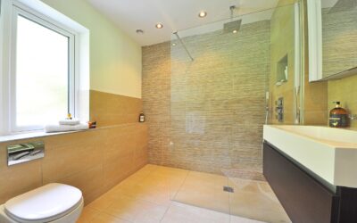
Coral struggles in kitchens and bathrooms where cool LED lighting fights the warm undertones. Stick to rooms with mixed or warm lighting.
Pairing Coral with Neutrals
Coral needs grounding neutrals to keep the room from feeling like a candy store. Three pairings consistently work.
Crisp warm whites — Benjamin Moore White Dove or Sherwin-Williams Alabaster — frame coral beautifully on adjacent walls and ceilings. Avoid stark cool whites, which create harsh contrast and emphasize the pinkness in coral. Soft greiges like Sherwin-Williams Agreeable Gray or Benjamin Moore Edgecomb Gray balance coral as a quieter alternative to white. Deep navy or forest green provides high contrast for a more dramatic, sophisticated look — coral pillows on a navy sofa, for example, or coral artwork against a green wall.
Coral with Wood and Metal Finishes
Coral is one of the few warm colors that works equally well with both warm and cool finishes, but the combinations that consistently photograph well share a quality of restraint.
- White oak or natural-finished wood: The warm undertone of light wood echoes coral and grounds it without competing.
- Walnut: Deep brown adds richness and prevents the room from feeling too light or feminine.
- Brass and gold metals: Pull out coral’s warm undertone. Best with traditional or transitional styling.
- Matte black: Modern and graphic. Calms coral down and prevents it from feeling old-fashioned.
- Polished nickel: Cool and timeless. Works with coral but is the safer choice for resale-conscious homeowners.
Skip rose gold and copper, which compete with the pink in coral and can muddy the room.
How to Test Coral Before Committing
Coral changes character more than almost any other paint color depending on light, time of day, and surrounding finishes. The brush-on-poster-board method is essential.
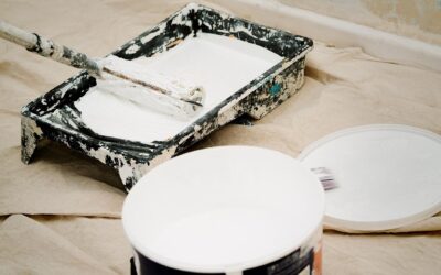
Buy 8-ounce paint samples and apply two coats to a 2-by-2 foot piece of poster board. Tape the board to the wall in the room you’re considering, and view it at 8 AM, noon, and 8 PM with the lights on. Move the board to two different walls in the same room to see how the angle of light affects the color. A coral that looks perfect at noon can read as bubble gum at sunset, or vice versa.
Common Mistakes to Avoid
Three errors plague first-time coral users:
- Picking a coral too saturated for the room. Bright corals overwhelm small spaces. Stick to dustier tones in any room under 150 square feet.
- Pairing with cool gray walls. Cool grays clash with coral’s warmth and make the room feel disjointed.
- Using coral in a kitchen with stainless steel. The cool metal fights coral’s warmth. Either commit to coral with brass and warm wood, or skip coral in the kitchen entirely.
Coral on the Exterior
Coral front doors and shutters add architectural interest to white, gray, or black exteriors. Sherwin-Williams Coral Bells and Benjamin Moore Tucson Coral both read well from curb distance, where lighter shades wash out. For full-exterior coral applications — popular on cottage and beach styles — pick a more muted shade like Setting Plaster to avoid the house feeling cartoonish.
Frequently Asked Questions
Will coral paint make a small room feel smaller?
Lighter corals like Quite Coral and Setting Plaster actually reflect light well and can make small rooms feel cozier without feeling smaller. Saturated corals do shrink rooms visually but create an intentional jewel-box effect.
Is coral too feminine for a primary bedroom?
Modern muted corals read as warm neutrals rather than feminine. Pair with masculine elements like leather, walnut, and matte black hardware to balance the palette.
What’s the difference between coral and salmon?
Coral is more orange-leaning; salmon is more pink. The line is fuzzy, but most paint companies label corals as warmer and salmons as cooler.
Does coral work well in a bathroom?
It depends on the lighting. Powder rooms with warm 2700K bulbs love coral. Primary bathrooms with cool LED lighting often dull coral into a muddy peach. Test under your actual bulbs before committing.