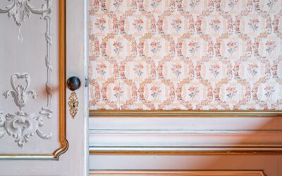
If stark white feels too cold and beige feels too dated, there is a perfect middle ground. Creme paint is the soft, buttery off-white that brings warmth and elegance to a room without committing to a strong color. It flatters natural light, pairs with almost any decor, and reads as both classic and current. But not all creams are created equal, and the wrong undertone can turn yellow or dingy fast. This guide explains what creme paint is, where it works, and how to choose and use it like a pro.
What Makes a Color “Creme”
Creme is an off-white with warm undertones, typically a gentle blend of yellow, sometimes with a touch of beige or gold. Unlike a pure, cool white that can feel clinical, creme carries a soft glow that makes a space feel cozy and inviting. It sits between white and beige on the spectrum, lighter and brighter than a true tan but warmer than crisp white.
Think of the color of fresh cream or vanilla custard. That subtle warmth is what gives creme its timeless, comforting quality and why designers reach for it when they want softness without sacrificing brightness.
Creme vs. White vs. Beige
Knowing the difference helps you choose correctly. White reflects the most light and feels modern and clean but can look harsh in cool light. Beige has stronger brown or tan undertones and reads as a true neutral color. Creme threads the needle: brighter than beige, warmer than white.
- White: crisp, cool, modern, can feel cold
- Creme: warm, soft, glowing, classic and versatile
- Beige: deeper tan undertone, reads as a color, cozier
If you have ever painted a room white and found it sterile, creme is likely the warmth you were missing.
Best Rooms for Creme Paint
Creme is a true whole-home color, but it especially shines in spaces where warmth matters. Living rooms feel welcoming, bedrooms feel restful, and kitchens take on a soft, sunlit glow. It is a favorite for traditional, farmhouse, and transitional interiors.
It also works beautifully on trim, cabinetry, and built-ins when you want a softer alternative to bright white. A creme trim against creme walls in slightly different finishes creates a subtle, layered, high-end look. In north-facing rooms with cool light, creme counteracts the blue cast that makes pure white feel gray.
Understanding Undertones
The biggest mistake with creme is ignoring undertones. Some cremes lean more yellow, others more pink, and a few have a green or gray base. The undertone interacts with your lighting and furnishings, so a creme that looks elegant in a showroom can turn unmistakably yellow on your wall.
- Yellow undertone: warm and sunny, but can read too gold in bright rooms
- Pink undertone: soft and flattering, great in bedrooms
- Gray undertone (greige-cream): more neutral and modern
Always test before committing. Paint a large swatch, or use a peel-and-stick sample, and observe it in morning, afternoon, and evening light across several days.
Popular Creme Paint Shades
Most major paint brands offer beloved creme tones. Shades in the soft white to warm white family are the usual starting points, with names that evoke dairy, vanilla, and natural light. Rather than chasing a specific product, look for off-whites described as warm, soft, or creamy with a low to moderate yellow undertone.
When comparing chips, place them next to a pure white card. The white card reveals the creme’s true warmth instantly, helping you avoid one that is either too yellow or so subtle it might as well be white.
Choosing the Right Sheen
Finish affects how creme looks and performs. A flat or matte sheen hides wall imperfections and gives creme a soft, velvety look ideal for living rooms and bedrooms. Eggshell and satin offer slightly more durability and a gentle glow for hallways and kitchens, while semi-gloss suits trim and cabinetry.
- Flat/matte: low-traffic walls, hides flaws
- Eggshell: versatile all-rounder for most walls
- Satin: kitchens, baths, high-touch areas
- Semi-gloss: trim, doors, and cabinetry
Higher sheens reflect more light, which can amplify a creme’s yellow undertone, so factor that in when you choose both color and finish together.
How to Pair Creme With Your Decor
Creme is endlessly flexible. It pairs naturally with warm woods, rattan, linen, and brass for a cozy, organic feel. For contrast, layer in black accents, charcoal, or navy to keep the space from feeling washed out. Sage green, terracotta, and muted blues all sit gorgeously against a creme backdrop.
Because creme is warm, it harmonizes best with other warm-toned elements. If your furnishings and floors lean cool, choose a creme with a more neutral or gray undertone so the room does not feel disjointed.
Tips for a Flawless Creme Paint Job
Prep and primer matter, especially when going over a darker or strongly colored wall, since creme is light and can require an extra coat for full coverage. Use a tinted primer to reduce the number of finish coats and ensure even color.
- Test large samples in your actual lighting first
- Use a quality primer, tinted if covering bold colors
- Plan on two finish coats for even, true color
- Keep trim a slightly different creme or white for contrast
- Buy from one batch to avoid subtle color shifts
How Lighting Changes Creme
No color shifts more dramatically with light than a warm off-white, so understanding your room’s exposure is essential. South-facing rooms get warm, abundant light that can push creme toward yellow, so a more neutral or slightly gray-leaning creme keeps it balanced. North-facing rooms receive cooler light, where creme’s warmth is an asset that prevents the space from feeling gray and flat.
Artificial lighting matters just as much. Warm-white bulbs around 2700K deepen creme’s cozy glow, while cooler daylight bulbs around 4000K make it read crisper and closer to white. Before you commit, observe your sample under the actual bulbs you use at night, not just in daylight, because a creme that looks perfect at noon can turn distinctly golden under warm evening lamps.
The Bottom Line on Creme Paint
Creme paint delivers the brightness of white with the warmth of beige, making it one of the most versatile and forgiving colors you can put on a wall. Mind the undertones, test in your own light, and pair it with complementary warm or balanced elements. Get those details right and creme will give your home a soft, glowing, timeless backdrop that never feels cold or dated.