The all-white kitchen had a long run, but the most talked-about kitchens today break the rules on purpose. Using different color kitchen cabinets, whether that means a bold island against pale perimeter cabinets or dark lowers under airy uppers, adds the depth, warmth, and personality that a single flat color cannot. Done well, a two-tone kitchen looks custom and intentional; done carelessly, it looks like you ran out of paint. This guide walks through the proven combinations, the design rules that keep it balanced, and how to choose colors you will still love in five years.
Part of our Kitchen Remodeling guide — explore the full guide →
- Why Two-Tone Cabinets Work
- Popular Color Combinations
- The 60-30-10 Rule
- Common Ways to Split the Colors
- How to Choose Colors That Last
- Tying It Together With Hardware and Counters
- Trendy vs. Timeless: Protecting Resale Value
- Choosing the Right Finish and Sheen
- Budget and Practical Notes
- The Bottom Line
Why Two-Tone Cabinets Work
Splitting your cabinets into two colors does more than look current. It lets you ground the room with a darker tone down low while keeping the upper cabinets light so the space feels open. It draws the eye to a focal point, usually the island, and it lets you introduce color without committing the entire kitchen to a bold shade. Practically, darker lower cabinets also hide scuffs and everyday wear better than white ones near foot traffic.
Popular Color Combinations
Certain pairings have become reliable favorites because they balance contrast with harmony:
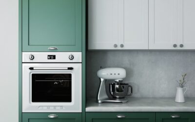
- White uppers with navy lowers: crisp, classic, and endlessly popular; navy reads as a sophisticated near-neutral.
- White or cream with a wood-tone island: natural oak or walnut adds warmth and texture against painted cabinets.
- Sage or forest green with white: the current darling, bringing an organic, calming feel.
- Two grays, light and charcoal: a subtle, modern tone-on-tone approach for those who want contrast without color.
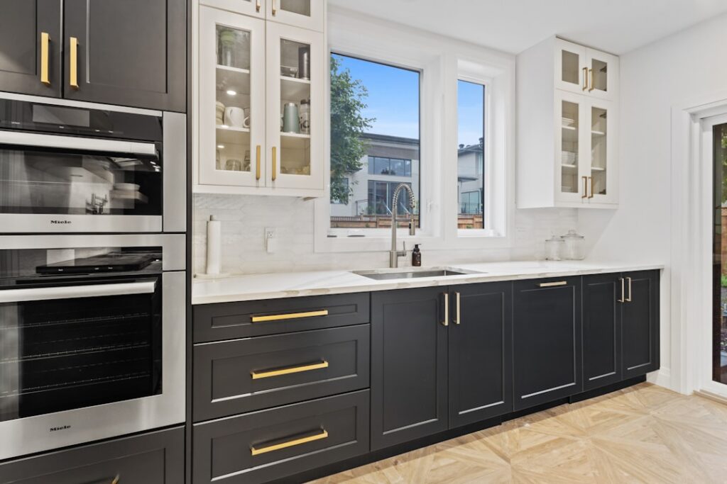
- Black lowers with white uppers: high-contrast and dramatic, best in kitchens with plenty of natural light.
The 60-30-10 Rule
Interior designers lean on a simple ratio to keep multi-color rooms balanced. Roughly 60 percent of the room is a dominant color, 30 percent a secondary color, and 10 percent an accent. In a kitchen, the perimeter cabinets often carry the dominant 60 percent, the island or lower cabinets provide the secondary 30 percent, and hardware, backsplash, or decor supply the 10 percent accent. Following this proportion keeps a two-tone kitchen from feeling like a 50-50 split that fights with itself.
Common Ways to Split the Colors
There are several tried-and-true places to introduce the second color:
- Contrasting island: the most popular and lowest-risk approach; the island becomes a natural focal point.
- Upper versus lower: light on top, darker on the bottom, which grounds the room and feels balanced.
- The perimeter versus a feature wall of cabinetry, such as a pantry or hutch in an accent color.
- Interior accent: painting the inside of glass-front cabinets a contrasting color for a subtle pop.
How to Choose Colors That Last
A few guidelines protect you from a combination you will tire of quickly:
- Anchor with a neutral. Pair one bold or saturated color with a timeless neutral like white, cream, greige, or natural wood so the room stays flexible.
- Respect the light. Dark lowers work in bright kitchens; in a dim galley, keep the darker tone minimal or it will feel cave-like.
- Test big samples. Paint large poster boards and move them around the room across the day, since kitchen colors shift dramatically under different light and next to your countertops.
- Coordinate with fixed elements. Your countertop, backsplash, and flooring are harder to change than paint, so choose cabinet colors that flatter what is staying.
Tying It Together With Hardware and Counters
The details are what make two-tone cabinets read as designed rather than accidental. Repeating a metal finish across both cabinet colors, such as matte black or brushed brass pulls, unifies the look. A countertop that appears on both the perimeter and the island, or a backsplash that bridges the two tones, creates visual continuity. Aim to carry at least one shared element, whether hardware, counter, or a color echoed in the decor, across both cabinet colors so the palette feels cohesive.
Trendy vs. Timeless: Protecting Resale Value
There is a real tension between a kitchen that feels current and one that will still look good, and appeal to buyers, in ten years. The safest way to resolve it is to put your trend-driven color where it is cheapest and easiest to change, and keep the expensive, hard-to-swap elements neutral. That is another argument for the contrasting island: if deep forest green or a bold navy is having a moment, painting only the island in that color lets you repaint a small footprint later without touching the perimeter, the countertops, or the backsplash. Perimeter cabinets in white, cream, greige, or natural wood are the enduring backdrop that never dates, while the island carries the personality and the risk.
Resale realities reinforce this approach. Real estate professionals consistently report that kitchens sell homes, and that most buyers respond to light, clean, broadly appealing palettes rather than highly personal color statements. A two-tone scheme with a neutral majority and one tasteful accent reads as designer and move-in ready, whereas two bold competing colors can narrow your buyer pool. If you are staying in the home for decades, follow your own taste freely; if a sale is on the horizon, lean neutral on the big surfaces and let removable elements, hardware, decor, and the island, express the color of the moment.
Choosing the Right Finish and Sheen
Color gets all the attention, but the paint finish you choose has just as much impact on how the kitchen looks and holds up. Cabinets take a beating from hands, grease, and cleaning, so a durable, wipeable finish is essential; satin and semi-gloss are the standard choices because they resist moisture and clean easily, while flat and matte finishes, though fashionable, show fingerprints and are harder to scrub. Many people use a slightly higher sheen on the lower cabinets and island that get touched most, keeping a touch less shine up high. Matching the sheen across both cabinet colors, even when the colors differ, keeps the two-tone look feeling intentional and cohesive rather than mismatched.
Budget and Practical Notes
If you are painting existing cabinets, a two-tone scheme costs essentially the same as a single color, just two cans of paint instead of one, making it one of the cheapest ways to transform a kitchen. If you are ordering new cabinetry, some manufacturers charge a small upcharge for multiple finishes, but it is usually modest. Repainting rather than replacing cabinets can update a kitchen for a few hundred dollars in materials, versus many thousands for new boxes.
The Bottom Line
Different color kitchen cabinets are one of the most effective ways to give a kitchen depth and character without a full remodel. Anchor a bold color with a timeless neutral, follow the 60-30-10 ratio, put the second color on the island or the lower cabinets, and tie everything together with shared hardware and countertops. Test large samples in your own light before committing, and you will end up with a kitchen that looks custom, current, and genuinely yours.