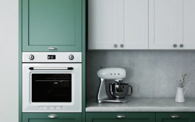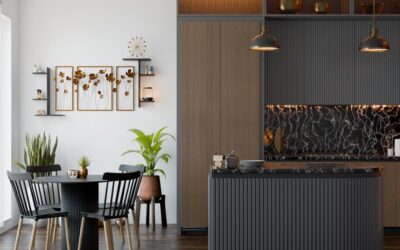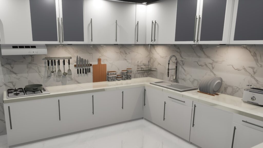
A two-tone kitchen now appears in roughly 65 percent of new high-end remodels, up from 12 percent a decade ago. Done well, contrasting kitchen island and cabinets add architectural weight, anchor an open floor plan, and let you commit to a bold accent color without overwhelming the space. Done poorly, the same idea creates a kitchen that looks like two halves of different houses crashed together. The difference comes down to four decisions: undertone, value contrast, finish, and hardware.
Part of our Kitchen Remodeling guide — explore the full guide →
Why Two-Tone Kitchens Work
Open-concept kitchens lose visual hierarchy when everything is the same finish. A contrasting island gives the eye a focal point and silently tells visitors where the room “starts.” It also lets you bring in a deeper or warmer color (navy, forest green, walnut) without committing every cabinet face to it.
From a resale standpoint, two-tone designs score 5 to 8 percent higher in buyer preference surveys conducted by Houzz and Zillow in 2024 and 2025. They photograph better, which now matters as much as how they live in person.
Pick a Lead Color and a Supporting Color
The perimeter cabinets are the lead. They cover more square footage, set the dominant mood of the kitchen, and usually pair with the backsplash and countertops. The island plays support. Three reliable formulas:
- White or off-white perimeter with a saturated island (navy, charcoal, sage, forest green)
- Light wood perimeter (white oak, hickory) with a painted island in a deeper tone
- Painted perimeter (warm gray, soft white) with a stained wood island in walnut or rift oak
Reverse formulas (saturated perimeter with white island) work too but feel more daring and rely on excellent natural light. They tend to date faster as paint trends shift.
Manage Undertones or the Kitchen Will Fight You
The most common failure in contrasting kitchen island and cabinets is undertone mismatch. A cool white perimeter with a warm-toned wood island looks unbalanced even when each piece is beautiful on its own. The fix is matching undertone families across both finishes:
- Cool whites (BM Decorator White, SW Pure White): pair with cool blues, true grays, charcoal
- Warm whites (BM White Dove, SW Alabaster): pair with greens, taupes, warm woods like white oak
- Greige perimeters: pair with rift-cut oak or hickory islands for a natural look
Bring physical samples home and look at them at three times of day: morning, midday, and under your evening kitchen lights. North-facing kitchens push everything cooler; south-facing rooms warm finishes up.
The Value Contrast Rule
Light-to-dark contrast (LRV difference) is what makes two-tone kitchens read as intentional. If the perimeter cabinets have an LRV of 80 (light) and the island has an LRV of 15 (dark), the contrast is high and dramatic. An LRV gap under 15 reads as a mistake or a color matching error.
Aim for an LRV difference of 30 to 60 points between the two cabinets for the most balanced look. Manufacturers publish LRV values on their color cards; Sherwin-Williams and Benjamin Moore both list it for every shade on their websites.
Finish, Sheen, and Material Choices
Finish is where the design polish lives. A few combinations that consistently look custom rather than catalog:
- Smooth painted perimeter (satin) with a fluted or reeded wood island
- Shaker-style perimeter cabinets with a flat-panel waterfall-counter island
- Painted Shaker perimeter with a stained wood island that picks up the floor color
- White painted cabinets with a soapstone or honed black quartz island in a contrasting tone
Sheen matters more than people expect. A semi-gloss painted island next to satin perimeter cabinets reflects light differently and can make the colors look mismatched even when they coordinate on paper. Stick to one sheen across both unless you are deliberately playing with material contrast.
Countertop Strategy
You can either match countertops across both or contrast them too, but only one of these works in most kitchens. Matching countertops let the cabinet colors do the talking and tie the room together visually. Contrasting countertops (white quartz on perimeter, walnut butcher block on island, for example) double down on the two-tone theme and require both finishes to be perfectly coordinated.
Quartz like Cambria Brittanicca on the perimeter pairs with a contrasting waterfall walnut island for around 4,500 to 8,000 dollars per kitchen. Less expensive: Caesarstone Pure White on both, around 70 dollars per square foot installed, with the cabinet color doing the contrast work.
Hardware That Bridges Both Cabinets
Hardware can either tie a two-tone kitchen together or split it further. The cleanest approach uses the same hardware finish across both perimeter and island. Brushed brass, matte black, and antique bronze all work on light and dark cabinets simultaneously.
If you want to vary hardware, use the same finish in different styles: T-bar pulls on the perimeter, cup pulls on the island, both in matte black. Avoid mixing finishes (brass on island, chrome on perimeter); it looks unintentional.
Lighting That Highlights the Island
A contrasting island needs lighting that draws the eye to it without flattening the color difference. Three pendant lights at 18 to 22 inches in diameter, spaced 24 to 30 inches apart over a typical 8-foot island, frame the contrast perfectly. Hang them so the bottom of each pendant sits 30 to 36 inches above the countertop.
Warm-tone LEDs at 2700K to 3000K make wood islands glow and prevent the kind of clinical lighting that washes out painted finishes. Dimmable fixtures (LED-compatible dimmer required, about 30 dollars) let you tune the contrast between cooking light and entertaining light.
Common Mistakes to Avoid
A few patterns repeatedly trip up homeowners trying contrasting kitchen island and cabinets for the first time. Too many colors in one kitchen (perimeter, island, and a hutch in three different tones) feels chaotic. A tiny island with bold color reads cartoonish; islands under 4 feet long usually look better matched to the perimeter.
Pairing trendy paint colors with traditional cabinet styles can also age the design quickly. A 2023 sage-green Shaker island looks dated by 2027. Stick to colors with at least a decade of design history (navy, forest green, charcoal, walnut) and the two-tone choice will look intentional for the lifetime of the kitchen.