The soul of an old house often lives in its color. Strip away a period-correct palette and even a beautifully restored Victorian can look generic; get the colors right and the whole home snaps into focus, honest to its era. Historical paint colors are more than nostalgic choices, they follow the pigments, tastes, and technology available when a house was built, from the muted earth tones of the Colonial period to the exuberant multi-color schemes of the Victorians. This guide walks through the major American architectural eras and their signature palettes so you can honor your home’s history while still creating a space you love to live in.
Part of our Paint & Walls guide — explore the full guide →
- Why Historical Colors Look Different
- Colonial and Early American Palettes
- Victorian Palettes: Bold and Layered
- Craftsman and Arts and Crafts Colors
- Mid-Century and Later Historic Styles
- How to Choose Authentic Colors for Your Home
- Interior vs. Exterior Historical Colors
- Working With Original Woodwork and Details
- Balancing Authenticity With Livability
Why Historical Colors Look Different
Early paint colors were dictated by what nature and chemistry could provide. Pigments came from earth, minerals, and plants, so colors tended to be muted, warm, and slightly grayed compared to the pure, saturated hues modern synthetic pigments allow. That is why authentic historical palettes have a softness and depth that bright contemporary colors lack. Understanding this helps you choose modern paints that capture the right feeling even though today’s formulas are far more durable and consistent.
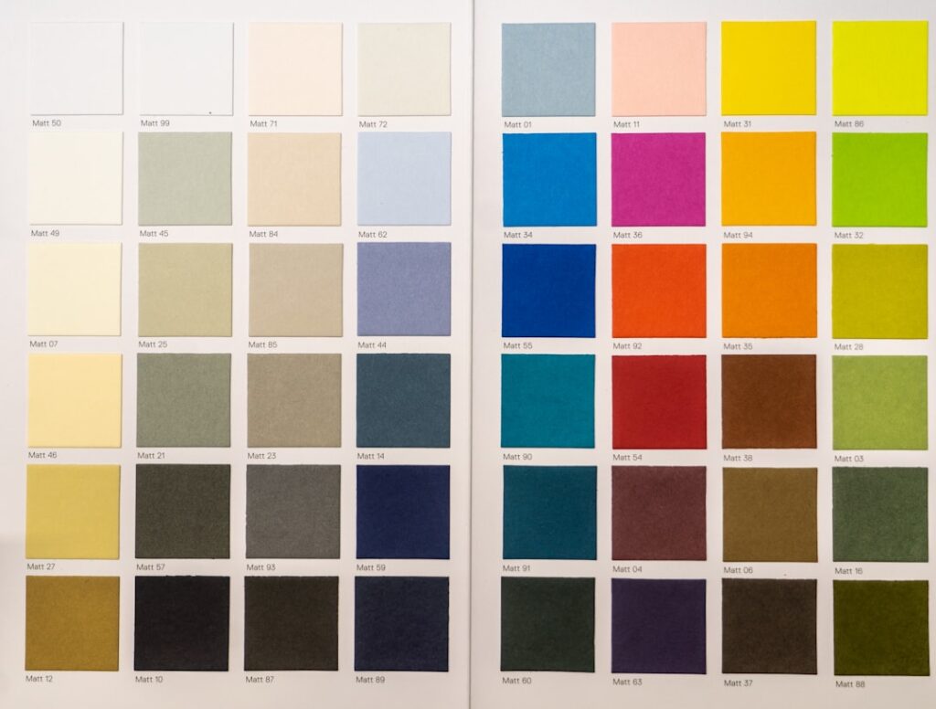
Major paint manufacturers now offer curated historical collections, researched from paint archaeology on actual period buildings, which take the guesswork out of finding an authentic shade in a durable modern formula.
Colonial and Early American Palettes
Homes from the Colonial era, roughly 1600 to 1780, favored practical, earthy colors drawn from local pigments. Interiors leaned toward muted, warm tones that worked by candlelight and firelight:
- Deep, dusty reds like barn and oxblood, from iron-oxide pigments.
- Mustard and ochre yellows that warmed rooms in dim natural light.
- Soft sage and muted blue-greens for parlors and dining rooms.
- Warm off-whites and creams for trim and ceilings.
Wealthier Colonial and later Federal homes, around 1780 to 1820, introduced more refined colors as pigments became available: elegant grays, soft blues, and pale greens, often paired with crisp white woodwork for a lighter, more genteel look.
Victorian Palettes: Bold and Layered
The Victorian era, roughly 1837 to 1901, embraced color like no period before it. New synthetic pigments unlocked richer, more varied hues, and homeowners showed off their houses with elaborate multi-color exterior schemes, the origin of the “painted lady.” A single Victorian facade might carry three, four, or more colors highlighting its ornate trim, brackets, and spindlework.
Typical Victorian palettes ran deep and warm: burgundy, forest green, mustard, terracotta, deep gold, and dusky plum, often set against a mid-tone body color with contrasting trim and accent details picked out in a third or fourth shade. Interiors were equally rich, with jewel-toned parlors, deep reds, and dark woodwork creating the layered, formal atmosphere the era loved. If you own a Victorian, resist the urge to paint it a single flat color; the architecture is designed to be celebrated with contrast.
Craftsman and Arts and Crafts Colors
The Craftsman and Arts and Crafts movement, around 1905 to 1930, reacted against Victorian excess with a return to nature and simplicity. The palette drew directly from the landscape, favoring earthy, harmonious tones that blended the house into its surroundings:
- Warm browns, tans, and khaki for body colors.
- Olive, moss, and forest greens that echoed the outdoors.
- Rust, brick, and deep gold as accents.
- Cream and soft ivory for restrained trim.
Craftsman interiors celebrated natural wood, so painted walls were often warm neutrals and muted greens that complemented the honey and dark oak trim rather than competing with it. The overall effect is grounded, cozy, and connected to nature.
Mid-Century and Later Historic Styles
As the twentieth century progressed, palettes shifted again. Colonial Revival homes of the early 1900s returned to the restrained grays, soft blues, and crisp whites of early America. By the mid-century, roughly 1945 to 1969, colors turned optimistic and earthy in a different way, with mustard, avocado, teal, and burnt orange defining the era. Even these more recent styles now count as historical, and honoring them means resisting the temptation to paint everything in current trendy neutrals.
Whatever the era, the principle holds: research what was actually used when your home was built, then adapt it to your taste rather than defaulting to today’s fashions.
How to Choose Authentic Colors for Your Home
Bringing historical accuracy to a real house takes a little detective work. Start with these steps:
- Identify your home’s era and style precisely, since each period has a distinct palette.
- Consult a historical color collection from a major paint brand, curated from period research.
- Scrape for original layers. Carefully sanding through old paint on trim or in a closet can reveal the home’s original colors.
- Check local records or a historical society, which may have documentation for homes in historic districts.
- Test large samples on the actual walls or siding and view them in your home’s specific light.
If your home sits in a designated historic district, verify whether there are exterior color guidelines you must follow before painting the outside.
Interior vs. Exterior Historical Colors
Historical palettes were rarely the same inside and out, so it helps to think about the two separately. Exterior colors were shaped by durability and available pigments, which is why earth-based reds, ochres, and muted greens and grays dominated older homes; these iron and mineral pigments held up to weather far better than delicate tints. Victorian exteriors broke that restraint with their famous multi-color schemes, but even those pulled from a specific, somewhat muted range rather than pure bright hues.
Interiors, protected from sun and rain, could be richer and more varied. Formal rooms like parlors and dining rooms often carried deeper, more saturated colors to impress guests, while everyday spaces stayed lighter and more practical. When recreating a period look, match the room’s original purpose: a formal front parlor can handle a deep Victorian burgundy or forest green, while a kitchen or bedroom historically leaned toward lighter, warmer, more workaday tones. Trim colors also followed conventions, often a crisp cream or white in Colonial and Federal homes, and richer contrasting shades in the Victorian era.
Working With Original Woodwork and Details
Many historic homes have original woodwork, and how you treat it shapes your whole color scheme. In Craftsman and many Victorian homes, natural stained wood trim, doors, and built-ins were central to the design, and stripping or painting over original old-growth woodwork is often a mistake that erases character and value. When the trim stays natural, your wall colors should complement the wood’s warm tones, favoring muted greens, warm neutrals, and soft golds that let the grain shine.
In Colonial and Federal homes, painted woodwork was the norm, so a crisp period-appropriate white or cream on the trim against colored walls is authentic. Before committing, examine what your home originally had. Careful scraping in an inconspicuous spot, or checking behind a switch plate or inside a closet, can reveal the original finish and colors. Honoring those original choices, whether painted or natural, keeps the home true to its era and preserves the details that make old houses irreplaceable.
Balancing Authenticity With Livability
Historical accuracy does not require you to recreate a museum. Many homeowners honor the spirit of a period palette while adapting it for modern comfort, using authentic colors on the exterior and in key formal rooms while choosing lighter, softer versions of period tones in daily-use spaces. Modern paints in historically inspired colors give you the best of both, the character of the era with the durability and low-VOC formulas of today.
The goal is a home that feels true to its bones without feeling frozen in time. Choose historical paint colors that connect to your home’s era, adapt the intensity to suit how you live, and you preserve the character that makes an old house special while making it genuinely yours.