The image of a Victorian house painted stark white is almost entirely a 20th-century invention. Authentic Victorian paint colors were rich, deep, and daringly combined, celebrating the newly available chemical pigments of the era with palettes that would make many modern homeowners nervous. If you own a Victorian, a Queen Anne, or a home built in that spirit, understanding the real historical color story helps you make choices that honor the architecture while still feeling livable today. This guide covers both the exterior “painted lady” tradition and the moody, layered interiors that defined the period.
Part of our Paint & Walls guide — explore the full guide →
The Victorian era ran roughly from 1837 to 1901, and its love of color grew as industrial chemistry produced affordable new pigments. Suddenly homeowners could buy deep greens, russets, ochres, and plums that earlier generations could never afford. Victorians embraced them enthusiastically, both inside and out, in ways that still look striking a century and a half later.
- The Painted Lady Exterior Tradition
- Historic Exterior Color Schemes
- Moody Victorian Interior Palettes
- Using Color to Frame Architecture
- Balancing Authenticity With Livability
- Choosing and Testing Your Palette
- Wallpaper, Stenciling, and Layered Detail
- Finishes and Sheens for Period Authenticity
- Bringing It All Together
The Painted Lady Exterior Tradition
The term “painted lady” describes a Victorian home painted in three or more contrasting colors to accentuate its elaborate architectural details. This tradition, revived famously in San Francisco, uses color strategically to highlight the gingerbread trim, brackets, spindles, and molding that make Victorian architecture so ornate. Rather than flattening the facade in one color, the painted lady scheme brings every carved detail to life.
A classic painted lady uses a body color for the main walls, a trim color for the window frames and corner boards, and one or more accent colors to pick out the smallest details like sash, brackets, and door panels. Getting the relationships right is an art, and the payoff is a facade that reads as three-dimensional and jewel-like rather than a flat box.
Historic Exterior Color Schemes
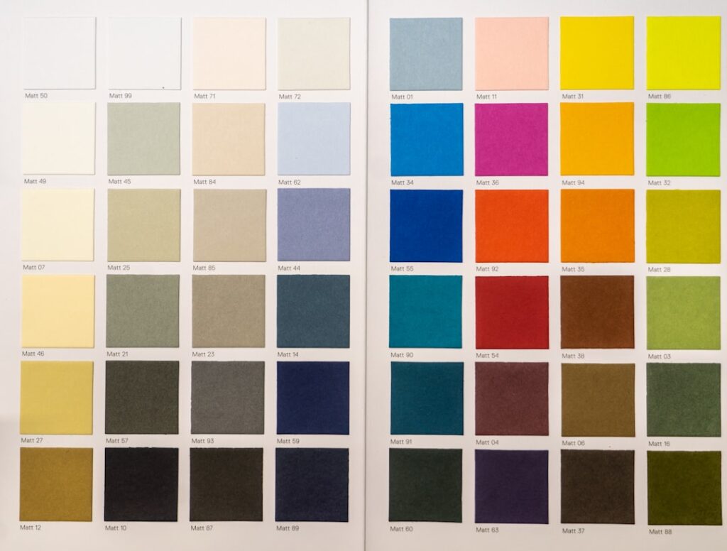
Authentic Victorian exteriors leaned into earthy, saturated tones drawn from the natural pigments and popular tastes of the day. These were deliberately harmonious rather than random, often built around analogous earth tones.
- Body: deep olive green, russet, ochre, dusty rose, sage, or slate blue
- Trim: cream, buff, warm tan, or a lighter shade of the body color
- Accents: deep red, dark green, burgundy, black, or gold on the finest details
- Doors: often a bold statement in deep red, forest green, or even faux wood-grain
A time-tested formula pairs a medium earth-tone body with a lighter trim two or three shades apart, then reserves the darkest, richest color for the smallest accents, which makes them pop without overwhelming the eye. Many paint companies now offer curated historic palettes, such as heritage or preservation collections, that take the guesswork out of finding period-correct shades.
Moody Victorian Interior Palettes
Inside, Victorians were even bolder, favoring deep, enveloping colors that suited candlelit and gas-lit rooms. Where modern taste often reaches for pale neutrals, the Victorians embraced drama: dark, dramatic dining rooms, richly colored parlors, and jewel-toned studies. These deep colors actually flatter the ornate crown molding, ceiling medallions, and picture rails typical of the era.
Popular interior colors included deep burgundy and oxblood, forest and hunter green, mustard and gold ochre, dusty rose, and rich navy and teal. Ceilings were rarely left plain white; they might be a soft cream, a tinted shade, or elaborately papered and stenciled. If a fully saturated wall feels like too much, you can capture the spirit with a deep color below a chair rail and a lighter tone above, a very period-appropriate treatment.
Using Color to Frame Architecture
The genius of Victorian color, inside and out, is that it serves the architecture rather than fighting it. Every color choice is meant to emphasize a detail: exterior accents outline the gingerbread, while interior deep tones make white or gilded moldings glow by contrast. This is the opposite of the modern instinct to blend trim into the walls.
To apply this thinking, identify your home’s best architectural features, the carved brackets, the paneled wainscot, the coffered ceiling, and use color to draw the eye to them. Paint the field a rich color and keep the trim crisp and contrasting so the millwork stands out in relief. This layered approach is what gives authentic Victorian spaces their sense of depth and craftsmanship.
Balancing Authenticity With Livability
Not everyone wants to live inside a fully committed 1880s color scheme, and you do not have to. You can honor the Victorian spirit while keeping rooms bright and current. One approach is to use the deep historic colors in lower-traffic, atmospheric rooms like a dining room, study, or powder room, where drama is welcome, while keeping main living areas in softer period-appropriate neutrals like warm cream, sage, or dusty blue.
Another strategy is to bring in Victorian color through an accent wall, a richly painted staircase, or a bold front door, rather than every surface. Modern paint formulas also let you enjoy these historic hues in low-odor, washable finishes the Victorians could only dream of. The goal is to capture the layered, jewel-toned character of the era without sacrificing the light and comfort you actually want to live in day to day.
Choosing and Testing Your Palette
Because Victorian schemes involve multiple coordinated colors, testing is essential before you commit. Start by researching your home’s specific style and period, since an early Gothic Revival, a High Victorian Italianate, and a late Queen Anne each favored somewhat different palettes. Many historic paint collections are organized by era to guide you.
Wallpaper, Stenciling, and Layered Detail
Paint was only part of the Victorian color story, because the era adored pattern as much as color. Wallpaper covered walls and even ceilings, often in richly patterned florals, damasks, and geometric designs that layered additional color and texture over the base scheme. If you want an authentic Victorian interior, consider pairing your deep painted colors with a period-inspired wallpaper on a feature wall, above a wainscot, or on the ceiling for a truly immersive effect.
Stenciling and hand-painted borders were also common, used to trace friezes along the tops of walls and to decorate ceiling medallions and cornices. These details let you introduce gold, deep red, or contrasting accents in controlled amounts without committing an entire surface. Even a simple stenciled border in a coordinating Victorian hue can transform a plainly painted room into something that feels genuinely of the period, adding the layered richness that defined the best Victorian interiors.
Finishes and Sheens for Period Authenticity
The sheen you choose affects how period-correct a room feels. Victorian interiors generally favored soft, low-luster finishes on walls, since flat and matte surfaces suited the muted gas and candlelight of the day and let deep colors read as velvety rather than plasticky. A modern matte or eggshell finish captures that historic softness while remaining practical to live with.
Woodwork and trim, by contrast, were often finished with more sheen or even faux wood-graining, a decorative technique that mimicked expensive hardwoods on humbler pine trim and doors. To echo this, use a satin or semi-gloss enamel on your trim and doors so the millwork stands out crisply against the matte walls. This deliberate contrast between soft walls and richer, glossier woodwork is a hallmark of authentic Victorian rooms and helps the architectural details earn the attention they deserve.
Bringing It All Together
A successful Victorian color scheme is really an exercise in orchestration, balancing bold body colors, contrasting trim, jewel-toned accents, pattern, and finish into a coherent whole. Start from the era and style of your specific home, build a palette of three or more coordinated colors, and reserve the richest tones for the details you most want to celebrate. Whether you go all-in on a fully saturated painted lady or simply borrow a few deep hues for an accent, the goal is that layered, confident richness the Victorians did so well.
Buy sample pots and paint large swatches, and for exteriors, view them at different times of day since sunlight dramatically changes how deep colors read. Always test your body, trim, and accent colors together, side by side, since Victorian schemes live or die on how the colors relate to one another, not how each looks alone. Take your time layering the palette, and you will end up with a home that wears its Victorian paint colors with the same confident, jewel-box richness that made the era’s houses so unforgettable in the first place.