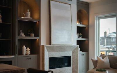
Light blue is the most-Googled neutral that is not technically neutral. Done well, a light blue living room reads serene, sophisticated, and timeless — the look magazine editors call “quiet luxury.” Done poorly, it reads like a 1990s baby nursery or a hospital waiting room. The difference comes down to undertone, sheen, and what you pair the blue with. Most homeowners pick the wrong paint chip in store fluorescent lighting and only see the cool gray cast once they get the swatches home.
This guide covers the shade selection, lighting math, and styling pairings that make pale blue rooms feel inviting in any climate.
Choosing the Right Shade of Light Blue
Light blues fall into three undertone families, and your choice should match the light your room receives.
Gray-Blue (Cool Undertone)
Best for south- and west-facing rooms with abundant warm afternoon light. The cool undertone balances golden sun and prevents the room from feeling overheated. Try Benjamin Moore Boothbay Gray HC-165 or Sherwin-Williams Sleepy Blue 6225.
Green-Blue (Warm Undertone)
The friendliest light blue family. The hint of green softens the cool blue and makes the room feel approachable. Benjamin Moore Palladian Blue HC-144 and Farrow & Ball Borrowed Light No.235 are the workhorses here. Both look beautiful in north- and east-facing rooms where light is cooler.
Powder Blue (Pure Pastel)
The trickiest. Pure pale blues with no green or gray reading skew nursery if you are not careful. They work best when paired with strong contrast — black trim, walnut floors, or saturated accent furniture. Sherwin-Williams Atmospheric 6505 is a balanced option.
Test Paint in Your Actual Light
Buy 8×8 inch peel-and-stick samples from Samplize ($6 each) and place them on multiple walls in the room. View them at three times: 9 a.m., 2 p.m., and after sunset under your room’s lamps. A light blue that looks ideal at noon often turns lavender or icy under warm LED bulbs at night.
Check the LRV (Light Reflectance Value) on the manufacturer’s website. Light blues with LRV between 60 and 75 keep a room bright; below 50 and you have effectively chosen a mid-tone, which behaves differently.
Sheen Matters More Than People Think
For walls in a living room, eggshell or matte finish is the standard — it hides imperfections and minimizes glare. Skip flat unless your walls are pristine; flat shows every fingerprint and scuff in a high-traffic space. Save satin and semi-gloss for trim and doors, where the contrast in sheen between matte walls and shinier trim adds visual depth.
Lighting Color Temperature
Pair a light blue living room with 2700K to 3000K bulbs. Anything cooler (4000K or 5000K) shifts the wall color toward green or gray and kills the warmth. CRI 90+ bulbs render colors more accurately, which matters when blue undertones are involved. Brands like Soraa, Hyperikon, and GE Reveal in the 2700K range work well.
Furniture and Wood Pairings
Light blue plays well with both warm and cool wood tones, but the effect changes:
- Warm woods (oak, walnut, teak): create a relaxed, layered, traditional feel. The wood warmth balances the blue cool.
- Cool woods (whitewashed, gray oak, ash): push the room into modern Scandinavian territory. Crisp and minimal but can feel chilly without textile warmth.
- Black furniture or accents: add the structural contrast that prevents pale blue from reading washed-out. A black-framed window or a black-iron coffee base anchors the room.
Accent Color Combinations
Three pairings consistently look pulled together rather than themed:
- Light blue + camel + cream. Adds warmth and reads modern coastal without nautical motifs. Use a camel-leather chair or curtains in oatmeal linen.
- Light blue + brass + walnut. Goes traditional and sophisticated. Brass picture lights, walnut bookcases, and a mohair sofa in soft cream.
- Light blue + terracotta + sage. The “elevated bohemian” palette. Use sparingly through pillows, art, and ceramics rather than large furniture pieces.
What to Avoid
Three pitfalls trip up most light blue rooms:
- White trim with cool undertones against blue walls creates a washed-out hospital effect. Choose a creamy white like Benjamin Moore White Dove OC-17 or Simply White OC-117 instead.
- Too many cool textiles. A blue-gray rug, blue curtains, and blue-leaning sofa stack the room with cool tones and zero contrast. Inject at least one warm element per visual zone.
- Matchy patterned pillows. The “blue pillow set from a chain store” look reads dated. Mix scale: one large-print pillow, one small geometric, one solid texture.
Real-World Sample Palette
For a 14×18 ft north-facing living room, this combination consistently photographs well: walls in Benjamin Moore Palladian Blue HC-144 eggshell, trim in White Dove OC-17 satin, ceiling in flat White Dove, oak floors in a natural matte finish, a cream linen sofa, walnut coffee table, brass floor lamp, and accent pillows in caramel velvet plus a small black-and-cream Berber print. The total cost of decor refresh runs about $1,800 if you keep existing furniture and replace only paint, pillows, and one lamp.
Maintenance Realities
Light blue walls show scuffs more readily than warmer neutrals. Buy a quart of touch-up paint when you do the original job and store it in a sealed glass jar with a plastic wrap layer over the lid — it will stay usable for two to three years for nail-hole cover-ups and chair-rub repairs. With the right shade, light, and accents, a light blue living room ages beautifully over a decade rather than feeling trendy and tired in two years.