Cherry was the most popular cabinet wood in North American kitchens from roughly 1995 to 2010, then fell out of favor as gray and white painted finishes took over. As of 2024, demand for natural cherry has climbed back to nearly 18 percent of new custom orders according to industry surveys, and the light cherry palette is leading that revival. Light cherry cabinets bring warmth, subtle grain, and a wood color that develops character over the first 12 to 18 months in a way no painted MDF can match. The challenge is pairing them with the right counters, floors, and wall colors so they do not read as dated 1998 honey-oak territory. This guide covers everything from real wood behavior to current designs.
Part of our Kitchen Remodeling guide — explore the full guide →
What Cherry Looks Like When New vs Aged
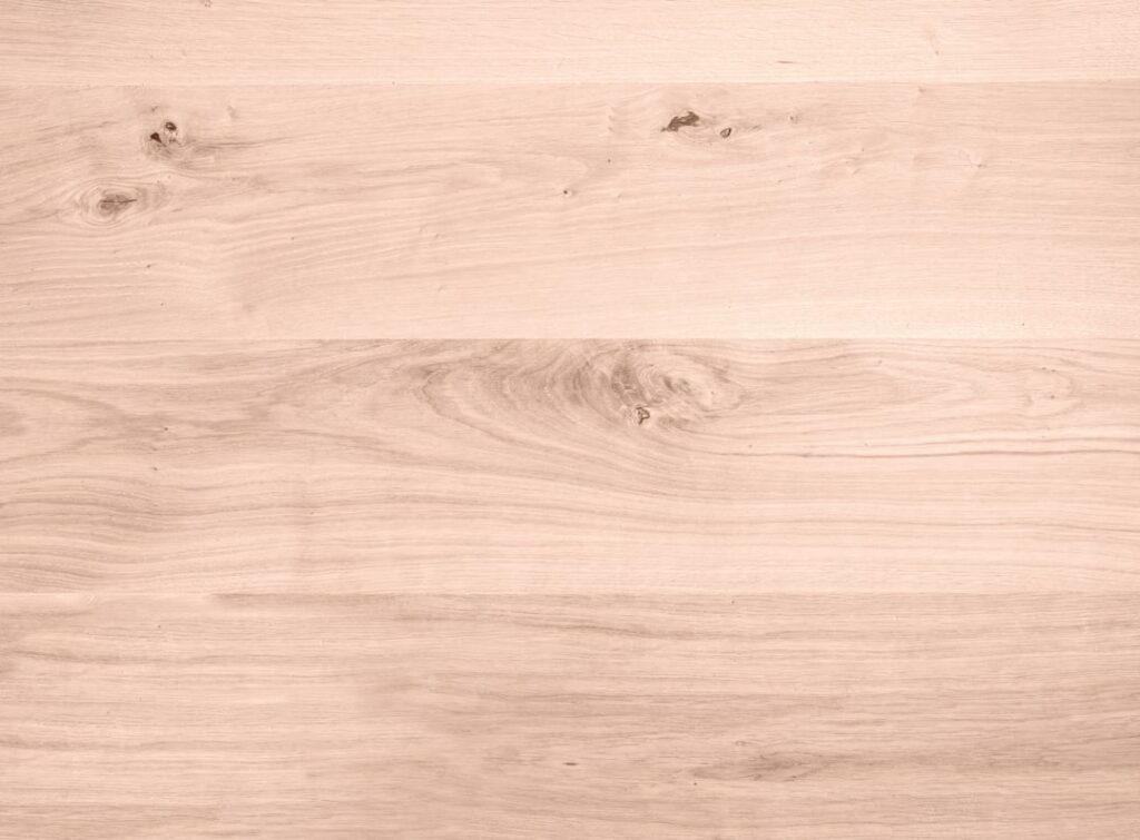
Freshly cut cherry has a pale pink or salmon tone with creamy sapwood streaks. Within 6 months of exposure to indoor light, oxidation deepens the color to a reddish-amber. By 18 months, fully exposed cherry settles into a rich, warm honey-red that is visibly darker than the freshly milled wood.
This is normal and expected. The aging is not a flaw; it is part of why cherry is prized. The only problem is when areas behind appliances, under stand mixers, or shielded by long-stored items stay lighter than the rest of the cabinet. Rotate items, open cabinets occasionally, and the color evens out over time.
Light Cherry vs Standard Cherry Stain
“Light cherry” can mean two different things. One is a clear or near-clear finish on raw cherry, letting the natural pink-amber color show. The other is a manufactured stain color labeled “light cherry” applied to maple, alder, birch, or even rubberwood to mimic the appearance.
Real cherry costs roughly 30 to 50 percent more than stained alder for the same cabinet line. Solid cherry with a clear or natural finish ages into the look you actually want. Stained alder labeled “light cherry” stays the same color forever and never develops the warmth of real wood. For long-term satisfaction, the upgrade to real cherry usually pays back.
Best Counter Pairings
The biggest cherry kitchen mistake is pairing the wood with green-tinged tan granite or busy multi-color quartz. Those finishes dominated 2002 kitchens and instantly date a cherry installation. Modern pairings keep counters quieter so the wood reads as the star.
- White quartz with subtle veining (Cambria Brittanicca Warm, Caesarstone Calacatta Nuvo) — clean and contemporary
- Soapstone or honed black granite — high contrast that makes cherry pop without competing
- Warm cream or off-white quartz (Cambria Berwyn) — softens the warmth, traditional feel
- Light cream or sand-colored natural stone — refreshed take on traditional
- Butcher block in a different species (maple or walnut) — for kitchen islands only, never the whole counter
Skip Uba Tuba, golden granite, and the multi-color “rainstorm” patterns. They were the default in cherry kitchens 20 years ago and read instantly as dated to anyone walking through.
Flooring That Works
The flooring rule with cherry: do not match. Putting cherry-stained hardwood floors under cherry cabinets washes both surfaces together and removes the contrast that gives the wood definition. Choose a floor that is noticeably different in tone.
White oak in a natural or light-honey finish works beautifully. The lighter cool-warm contrast makes both surfaces stand out. Wide-plank rift-and-quartered white oak is the current favorite in design magazines for a reason. A warm gray porcelain tile or a dark-stained walnut also creates effective contrast.
Avoid red oak, Brazilian cherry, and any maple stained with red undertones. They argue with the cabinet color and produce that monochromatic warm-on-warm look that defines outdated kitchens.
Wall Color and Backsplash Choices
Cherry needs cool neutrals on the walls to balance its warmth. Pale gray-greens (Benjamin Moore Healing Aloe, Sherwin Williams Silver Strand), soft warm whites (BM White Dove, SW Alabaster), and dusty blue-grays all let the wood speak. Avoid cream, beige, and yellow walls; they amplify the warmth into a sea of orange.
Backsplash choices that work include white subway tile (3 by 6 or 3 by 12), soft gray zellige tiles, white marble in a herringbone pattern, and creamy hand-painted Spanish tiles. Skip rough travertine, multi-color slate mosaics, and warm beige tumbled stone, all of which scream early 2000s.
Hardware That Modernizes the Look
Brass and warm-gold hardware is having a moment, and it pairs surprisingly well with light cherry, especially in unlacquered brass that develops its own patina over time. Aged or oil-rubbed bronze also works for a quieter look. Matte black hardware reads cleanly against the warm wood and is the most contemporary choice.
Skip polished chrome and shiny stainless pulls. They feel cold and clinical against the warm wood and create the same disconnect as cherry-on-cherry flooring. Hardware cost runs 8 to 25 dollars per pull for quality finishes; a typical kitchen needs 30 to 45 pulls, so budget 300 to 1,000 dollars for a complete update.
Finish Options and Maintenance
Light cherry cabinets are usually finished in a clear conversion varnish, catalyzed lacquer, or modern water-based polyurethane. The conversion varnish (used by quality cabinet makers like Wood-Mode, Crystal, and most semi-custom lines) gives the most durable finish, with excellent resistance to water, grease, and household cleaners.
Daily care is simple: a soft microfiber cloth and warm water for routine wipe-downs, an occasional dish soap solution for heavier soiling. Never use Murphy Oil Soap (it leaves a residue that yellows over time), citrus cleaners (they soften the finish), or paper towels (they leave micro-scratches). A quality wood cleaner like Method Wood Polish or Howard Restor-A-Finish applied 1 to 2 times per year keeps the finish looking fresh.
Lighting That Brings Out the Grain
Cherry’s subtle figure (gentle waves, occasional pin knots, sapwood streaks) only shows under good lighting. Standard recessed ceiling cans wash the cabinet faces flat. Adding under-cabinet LED tape in a warm white (2700K to 3000K) at about 350 lumens per linear foot dramatically brings out the grain along the counter.
Add pendant lights over the island in warm metals (brass, bronze, or even bare bulb in a vintage Edison style). Avoid cool 4000K and 5000K bulbs throughout the kitchen. They make the warm wood look washed-out and orange. Stay in the 2700K to 3000K range for everything except task lights at the sink.
Avoiding the Dated Look
The kitchens that read as instantly dated with cherry cabinets share a few features: heavily ornate raised-panel doors, granite with busy multi-color movement, golden hardware that matches the wood tone, cream walls, and Tuscan-themed accessories. Strip any three of those out and replace with current choices, and the same cherry cabinets look fresh again.
When chosen well, light cherry cabinets read as warm, classic, and quietly luxurious for decades. The wood ages, the trends rotate, and a thoughtful selection still looks great after three rounds of countertop and paint refreshes. That long-haul value is what makes the upgrade worth the original premium.