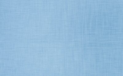
Light grey blue paint has dominated interior design for a decade because it acts like a neutral while bringing more warmth than pure gray and more sophistication than pure beige. The challenge is that most light grey blue paints look completely different in your home than they did in the showroom — north-facing rooms cool the undertone toward cold blue, while south-facing light pulls out unexpected green or lavender. This guide covers the best light grey blue paint picks from major brands, how to test them properly, and which rooms each one belongs in.
Part of our Paint & Walls guide — explore the full guide →
Why Light Grey Blue Is So Popular
The color category sits at the intersection of three popular looks: coastal, transitional, and modern farmhouse. It pairs equally well with brass and chrome fixtures, white and black trim, warm wood and cool gray cabinets. Resale value studies from Zillow and Opendoor consistently rank soft blue-grays among the top three interior colors for higher offer prices.
The Light Reflectance Value (LRV) on most light grey blues runs 55-75, which keeps rooms feeling bright without going stark white. Anything below 50 LRV reads as a medium color and changes the lighting dynamics noticeably.
Best Sherwin-Williams Light Grey Blues
Sherwin-Williams has the broadest range of light grey blue paints in the consumer market. Five colors consistently perform across regions and lighting conditions:
- Sea Salt SW 6204: LRV 63, soft green-blue undertone, beachy and calm
- Misty SW 6232: LRV 65, true blue-gray, slightly cooler
- Krypton SW 6247: LRV 60, deeper blue-gray, sophisticated
- Rainwashed SW 6211: LRV 67, lighter aqua-blue lean
- Window Pane SW 6210: LRV 70, very pale, almost reads white
Sea Salt remains the most-specified Sherwin-Williams color in this family for good reason. It reads blue in north-facing rooms and slightly green in south-facing rooms, making it forgiving across orientations. Sea Salt on bathroom walls with white trim is one of the safest design choices in the category.
Best Benjamin Moore Light Grey Blues
Benjamin Moore’s light grey blue lineup tends toward more sophisticated, less beachy undertones than Sherwin-Williams. Three colors are particularly strong:
Quiet Moments 1563 (LRV 64) is the workhorse of Benjamin Moore’s blue-gray family. Soft, calm, and consistent across orientations. Pairs particularly well with warm wood floors and brass hardware.
Healing Aloe 1562 (LRV 67) reads slightly greener than Quiet Moments. The undertone shifts toward sage in warm light and toward true blue-gray in cool light. Great choice for bedrooms and bathrooms.
Beach Glass 1564 (LRV 65) is the brighter, more saturated sibling. Reads as a real color rather than a near-neutral. Works in powder rooms and accent walls where you want the color to register.
Best Farrow & Ball Light Grey Blues
Farrow & Ball costs $130 per gallon versus $50-$70 for the American brands, and the price premium is real on certain colors. Their light grey blues use multi-pigment recipes that shift more dramatically with light, which can be either a feature or a bug depending on your space.
Borrowed Light 235 (LRV 67) is the most popular Farrow & Ball blue-gray. Cool, clean, almost reads white in north light and clearly blue in south light. Worth the price in primary living spaces where the color depth shows daily.
Skylight 205 (LRV 71) is the lightest blue in the line — a soft watercolor wash that works beautifully on ceilings in formal rooms. The traditional Farrow & Ball technique of painting ceilings in a soft blue-gray rather than pure white reads as quietly luxurious.
How Lighting Changes Each Color
North-facing rooms (in the Northern Hemisphere) get cool, indirect light all day. Light grey blue paints in these rooms shift toward true blue and can feel cold without warm-toned accents. Counteract with warm wood floors, brass fixtures, and warm white bulbs (2700K).
South-facing rooms get warm direct light that pulls the green or yellow undertones out of blue-gray paints. Sea Salt can read distinctly green in a south-facing kitchen. This isn’t bad — but verify with a test patch before committing.
East-facing rooms shift cool in afternoon and warm in morning. The same wall looks different at breakfast versus dinner. Test colors at multiple times of day.
West-facing rooms get the warmest evening light. Light grey blues here often read as their warmest, most green-leaning versions in the late afternoon and turn back to true blue under artificial light.
How to Test Properly
Skip the swatch from the store — it’s too small to predict accurately how a color reads on a wall. Buy a sample pot (Sherwin-Williams and Benjamin Moore sell quarts for $8-$15) and paint a 2×2 foot square on at least two walls in the room. Watch how it shifts at morning, noon, and night under both natural and artificial light.
Better yet, paint the test patches on white poster board and move them around the room. This avoids needing to repaint over test patches and lets you compare two colors side by side without the existing wall color affecting your read.
Trim and Ceiling Pairings
Pure white trim against light grey blue walls reads crisp and current. Sherwin-Williams Pure White SW 7005 and Benjamin Moore Simply White OC-117 both work well — they’re warm whites that don’t fight against the cool wall color.
Cream trim against light grey blue can work in older homes but reads dated in new construction. Skip it unless you’re committing to a traditional aesthetic.
Ceiling color depends on ceiling height. Standard 8-foot ceilings benefit from pure white ceilings that visually push up. Higher ceilings (9-10 feet) handle a lighter version of the wall color on the ceiling — a paler tint that adds intimacy.
Sheen Selection
For walls, eggshell or matte finish works best for light grey blue paint. The slight texture mutes brushstrokes and brushmarks, and the low sheen keeps the color reading true rather than reflecting glare.
Trim should be in satin or semi-gloss for durability and contrast. Skip high-gloss trim unless you have a specific traditional look in mind — it’s hard to apply well and shows every imperfection.
Ceilings stay matte. Always. Sheen on ceilings amplifies every minor flaw in the drywall.
Avoiding Common Mistakes
Don’t commit to a color you’ve only seen in pictures. Instagram and Pinterest images run through filters and grading that change the actual paint color significantly. Sample first, every time.
Don’t underorder paint. A 350 square foot room takes one gallon for two coats. A 500 square foot room needs two gallons. Running out mid-job and getting a slightly different batch from the store causes visible variation on the wall.
Don’t skip primer on dark walls. Light grey blue over a dark previous color usually needs primer plus two coats of color paint to cover properly. Skipping primer means three to four coats and visible patchiness even then.