
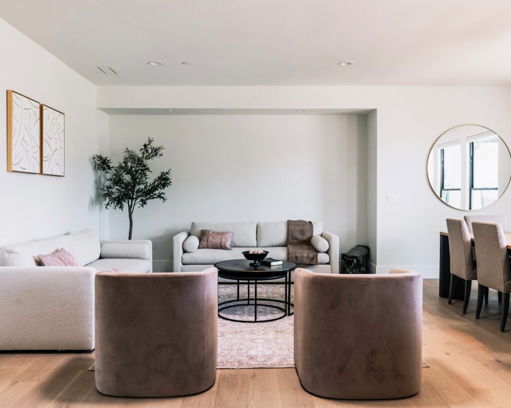
The right living room color ideas can transform a dull space into one that feels inviting, sophisticated, and perfectly in tune with your personal style. Color sets the emotional tone of a room, influences how large or small it feels, and plays a critical role in tying together furniture, flooring, and decor. In 2026, the trend is moving toward grounded, nature-inspired palettes with strategic pops of color that add personality without overwhelming the senses.
- Trending Colors for 2026
- Warm Color Palettes
- Cool Color Palettes
- Neutral Color Palettes
- Bold & Dramatic Accent Ideas
- Matching Colors to Your Flooring
- Color Tips for Small Living Rooms
- Choosing the Right Paint Finish
- Color Psychology in Living Spaces
- Frequently Asked Questions
- What is the most popular living room color in 2026?
- Should living room walls be lighter or darker than the floor?
- How do I test paint colors before committing?
- Can I use more than one color on my living room walls?
- What colors make a living room look bigger?
- How often should I repaint my living room?
This guide walks you through the most popular color schemes, explains how to coordinate wall colors with your flooring, and provides actionable tips for choosing the perfect palette for your living room.
Trending Colors for 2026
The 2026 color trends reflect a collective desire for calm, connection, and authenticity. Here are the shades leading the way.
| Color | Tone | Mood | Best Paired With |
|---|---|---|---|
| Warm clay | Earthy terracotta | Grounded, inviting | Cream, olive, charcoal |
| Sage green | Muted green-gray | Calming, natural | Warm white, walnut, blush |
| Mushroom | Warm gray-beige | Sophisticated, cozy | Ivory, rust, forest green |
| Midnight blue | Deep navy with purple | Dramatic, luxurious | Gold, cream, light gray |
| Buttery cream | Warm off-white | Bright, welcoming | Any wood tone, blue, green |
| Dusty rose | Muted pink | Warm, romantic | Gray, emerald, brass |
| Olive | Yellow-green earth tone | Organic, layered | Terracotta, cream, walnut |
| Charcoal | Deep warm gray | Modern, anchoring | White, blush, natural wood |
Warm Color Palettes
Warm color palettes create living rooms that feel cozy, welcoming, and intimate. They work especially well in north-facing rooms that receive limited natural light and in homes with warm-toned hardwood flooring.
1. Terracotta & cream: Paint walls in a rich terracotta shade and pair with cream-colored trim, ceiling, and upholstery. Ground the room with a natural fiber rug over tile or dark hardwood. Add wood wall art for texture.
2. Warm white & honey oak: A warm white wall (with yellow or peach undertones) lets natural wood furniture and honey-toned oak flooring take center stage. Introduce texture through woven baskets, linen curtains, and knit throws.
3. Amber & chocolate: Deep amber walls with chocolate brown leather furniture create a library-like atmosphere. This palette suits rooms with dark hardwood floors and works beautifully with brass lighting fixtures.
4. Peach & sage: A soft peach wall color paired with sage green accents creates a fresh, organic feel that feels both modern and timeless. Ideal for living rooms with light-colored laminate or pale hardwood floors.
5. Rust & ivory: Rust accent walls behind the sofa create a bold focal point, while ivory on the remaining walls keeps the room bright. This combination channels Spanish architectural warmth and works with terracotta tile flooring.
Cool Color Palettes
Cool palettes bring serenity and spaciousness to living rooms. They are ideal for sun-drenched south and west-facing rooms where warm light naturally balances cool wall tones.
6. Soft blue & white: A classic coastal palette that never goes out of style. Use a pale blue-gray on walls with crisp white trim and natural wood accents. Perfect over light vinyl plank flooring or whitewashed hardwood.
7. Navy & gold: Navy accent walls create instant drama, while gold-toned accessories (mirrors, lamp bases, picture frames) add glamour. Balance the depth with lighter secondary walls and plenty of warm lighting.
8. Sage & stone: Sage green walls with stone-gray furniture and natural wood coffee tables create a room that feels like a mountain retreat. Layer with wool textures and greenery.
9. Lavender & gray: A soft lavender feature wall behind the sofa, paired with cool gray on the remaining walls, creates a sophisticated yet calming environment. Best with light-colored flooring to prevent the room from feeling dark.
10. Teal & warm wood: Teal walls make a bold statement that is softened by warm wood furniture, caramel leather, and woven textiles. This palette works particularly well with mid-century modern decor.
Neutral Color Palettes
Neutrals remain the most popular living room color choice in 2026, but the approach has shifted from stark, cool grays to warm, layered neutrals with depth and character.
11. Greige (gray + beige): The ultimate versatile neutral that complements virtually any flooring, furniture, and decor style. Layer multiple greige tones for a sophisticated, monochromatic look.
12. Warm white on white: Different shades of warm white create a serene, airy space that feels open and clean. The key is varying textures: smooth plaster walls, nubby upholstery, rough-hewn wood, and woven rugs.
13. Taupe & black: Taupe walls with black-framed artwork, light fixtures, and furniture legs create a collected, gallery-like atmosphere. This palette works with virtually every flooring type.
14. Sand & driftwood: Inspired by coastal landscapes, this palette uses sandy beige walls with driftwood gray furniture and natural linen fabrics. Perfect for homes near the water or anyone seeking a relaxed, beachy feel.
15. Oatmeal & olive: An oatmeal base with olive green accents in pillows, throws, and plants creates an earthy, nature-connected living room that feels effortlessly stylish.
Bold & Dramatic Accent Ideas
If you love neutral base colors but want more visual excitement, accent elements add personality without committing to an entire room of bold color.
16. Black accent wall: A single black wall behind the television or fireplace adds instant drama and makes art and light fixtures pop. Balance with white or cream on the remaining walls.
17. Emerald green velvet: Rather than painting walls green, introduce the color through a statement emerald velvet sofa against neutral walls. The sofa becomes the room’s focal point.
18. Burnt orange pillows & throws: Neutral walls and furniture come alive with burnt orange accent textiles. This color shift is easy to change seasonally without repainting.
19. Gallery wall as color: A collection of colorful artwork on a white wall serves as your accent color source. This approach allows for variety and personalization.
20. Painted ceiling: Instead of an accent wall, paint the ceiling a soft color (sky blue, blush, or sage) for an unexpected design moment that draws the eye upward and makes the room feel unique.
Matching Colors to Your Flooring
Your flooring is a permanent (or semi-permanent) element that should guide your wall color selection. Use this table as a starting point.
| Flooring Type & Tone | Best Wall Colors | Colors to Avoid |
|---|---|---|
| Dark hardwood (espresso, walnut) | Warm whites, light grays, sage green | Dark brown, dark green (too heavy) |
| Light hardwood (maple, white oak) | Nearly any color; navy, emerald, charcoal for drama | Very pale yellows (can look washed out) |
| Red-toned hardwood (cherry) | Cool greens, blue-grays, warm whites | Red, orange, or warm brown (clashes) |
| Gray vinyl plank or laminate | Cool blues, greige, soft white, blush | Warm yellows, oranges (temperature clash) |
| Beige / warm vinyl or laminate | Warm whites, sage, terracotta, navy | Cool grays (creates disconnect) |
| White or light tile | Any color; use bold hues confidently | Very pale colors (room feels flat) |
| Dark tile (slate, dark porcelain) | Light, bright colors to balance weight | Dark walls (cave effect) |
| Carpet (beige or gray) | Colors 2 – 3 shades darker or lighter than carpet | Exact match (monotonous) |
Color Tips for Small Living Rooms
Small living rooms benefit from strategic color choices that create the illusion of more space.
- Go lighter on walls: Light colors reflect more light and make walls appear to recede, creating a sense of openness.
- Match walls to trim: Painting walls and trim the same color eliminates visual breaks that make a room feel choppy and small.
- Use a monochromatic scheme: Varying shades of one color family create depth without visual clutter.
- Consider dark paint strategically: Contrary to popular belief, a very dark color on all walls can make boundaries disappear, creating a cocooning effect that can actually make a small room feel expansive and moody.
- Keep the ceiling lighter: A ceiling painted one to two shades lighter than the walls creates the illusion of height.
- Limit the accent palette to two to three colors: Too many competing colors overwhelm a small space.
Choosing the Right Paint Finish
| Finish | Sheen Level | Best For | Durability |
|---|---|---|---|
| Flat / matte | No sheen | Ceilings, low-traffic living rooms | Low (hard to clean) |
| Eggshell | Slight sheen | Living room walls (most popular) | Good |
| Satin | Soft sheen | Family rooms, trim, doors | Very Good |
| Semi-gloss | Noticeable sheen | Trim, molding, accent areas | Excellent |
| High gloss | Mirror-like sheen | Accent walls, furniture, doors | Excellent |
For most living rooms, eggshell on walls and satin on trim provides the best balance of beauty and practicality. Flat finishes hide imperfections but show every scuff, while satin and semi-gloss finishes are easier to clean in homes with children or pets.
Color Psychology in Living Spaces
Colors affect mood and behavior more than most people realize. Understanding basic color psychology helps you create a living room that supports the atmosphere you want.
- Blue: Lowers heart rate, reduces anxiety, and promotes calm. Ideal for living rooms used as relaxation spaces.
- Green: Associated with nature and balance. Sage and olive tones create restful environments without feeling cold.
- Yellow: Energizing and optimistic in small doses. Best as an accent color; too much yellow can cause agitation.
- Red: Stimulates conversation and raises energy levels. Effective as an accent wall or in accessories, but overwhelming when used on all walls.
- Neutral tones: Provide a stable, grounding backdrop that allows furnishings and art to take the spotlight. Warm neutrals feel more inviting than cool ones.
- Black: Sophisticated and dramatic. Small doses add elegance; overdone creates oppression. Works best as an accent or in well-lit rooms.
Frequently Asked Questions
What is the most popular living room color in 2026?
Warm neutrals like greige, mushroom, and buttery cream lead in popularity for 2026. Sage green is the most popular non-neutral, followed by warm clay and dusty blue. The overall trend favors earthy, nature-inspired tones over the cool grays that dominated the previous decade.
Should living room walls be lighter or darker than the floor?
The traditional approach is walls lighter than the floor for a grounded, balanced feel. However, dark walls with light floors create a dramatic, contemporary look that works well in rooms with adequate lighting. The most important factor is sufficient contrast between the two.
How do I test paint colors before committing?
Purchase sample pots and paint large swatches (at least two feet by two feet) on the walls you intend to paint. Observe the color at different times of day, as natural and artificial lighting dramatically change how a color appears. Many paint brands also offer peel-and-stick color samples for mess-free testing.
Can I use more than one color on my living room walls?
Yes. An accent wall in a contrasting or complementary color adds dimension and visual interest. The accent wall typically features the boldest color, while the remaining walls use a lighter or more neutral tone. You can also use different shades of the same color family for a sophisticated tonal effect.
What colors make a living room look bigger?
Light, cool colors like soft white, pale blue, and light gray make walls appear to recede, creating a sense of spaciousness. However, dark colors used consistently on all surfaces can also create an expansive illusion by making boundaries disappear. The key is consistency and minimizing visual clutter.
How often should I repaint my living room?
Most living rooms benefit from repainting every five to seven years, though this varies based on paint quality, wall condition, and household activity level. Homes with children and pets may need repainting every three to five years, while well-maintained spaces can go ten years or more between coats.
Last updated: March 2026


