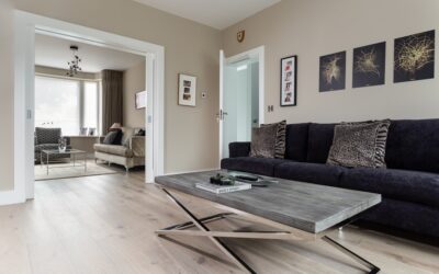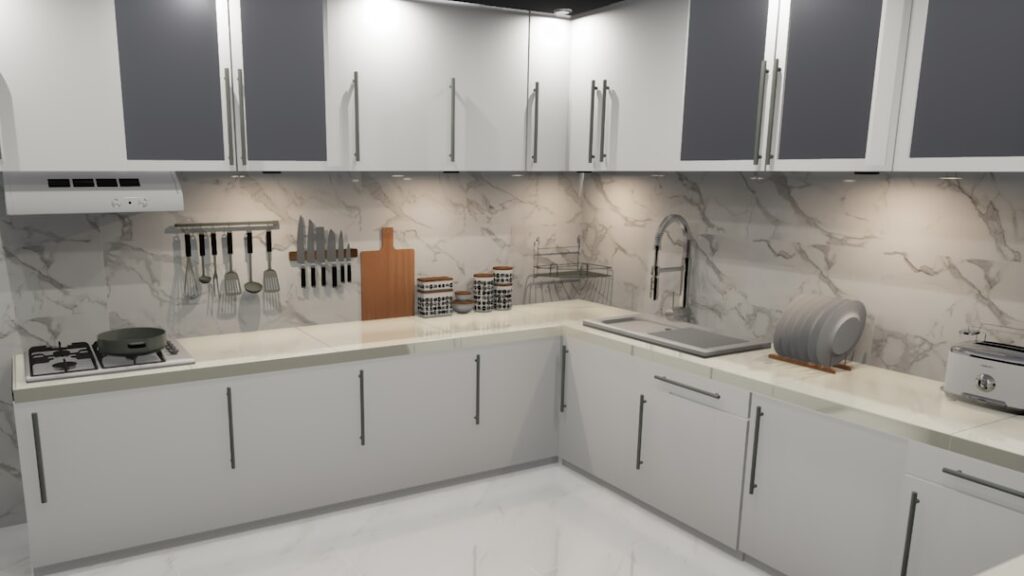
Most kitchen color regrets start the same way: a homeowner picks a paint chip under fluorescent showroom lighting and only sees how it actually looks when their north-facing kitchen turns it gray-green at 4 p.m. After repainting more than 200 kitchens over the past decade, I have learned that modern kitchen colours succeed or fail based on three variables — natural light, cabinet undertone, and the dominant fixed material like flooring or counters.
Part of our Kitchen Remodeling guide — explore the full guide →
This guide walks through palette strategies that actually work in real homes, not just on Pinterest.
- The Five Palettes Defining Modern Kitchens Right Now
- Choosing a Cabinet Color That Ages Well
- Wall Colors That Complement Without Competing
- Countertop and Backsplash Coordination
- Trim, Ceiling, and Hardware Considerations
- Color Strategies for Small or Dark Kitchens
- Common Color Mistakes to Avoid
- Putting Your Palette Together
The Five Palettes Defining Modern Kitchens Right Now
Warm whites and creams have replaced the cool grays that dominated 2015 to 2020. Sherwin-Williams Alabaster (SW 7008) and Benjamin Moore White Dove (OC-17) sit at the top of my recommendation list because they read clean without going stark. Both work on cabinets and walls.
The other four palettes earning permanent shelf space are sage and olive greens, deep navy and inky blacks, terracotta and warm clay, and two-tone combinations that pair stained wood with painted uppers.
Choosing a Cabinet Color That Ages Well
Pure white cabinets show every smudge but photograph beautifully, while greige tones forgive fingerprints and pair with more counter materials. Sherwin-Williams Accessible Beige (SW 7036) and Benjamin Moore Edgecomb Gray (HC-173) are reliable middle-ground choices that look intentional without being trendy.
For an island that anchors the room, go two shades darker than the perimeter cabinets. Navy on lower islands paired with white perimeter cabinets remains the safest non-white statement — Hale Navy (HC-154) and Naval (SW 6244) read deep but never garish.
Wall Colors That Complement Without Competing
Walls should be the supporting cast, not the headliner. With white cabinets, drop the walls one or two shades softer — Shoji White (SW 7042) or Swiss Coffee (OC-45) keeps the room warm without yellowing. With colored cabinets, push walls toward a soft neutral so the cabinet color reads as the intentional feature.
Sample paint on at least three walls before committing. Buy peel-and-stick samples for $6 each from Samplize or paint a 2 ft square in three locations. Check it at 9 a.m., 2 p.m., and under your evening lighting.
Countertop and Backsplash Coordination
Choose your counter before your wall paint, not the other way around. Quartz with cool gray veining demands warmer wall tones to balance it. Warm-toned quartzite or marble alternatives pair beautifully with cooler wall colors like Sea Salt (SW 6204) or Quiet Moments (BM 1563).
Backsplashes either disappear or speak up — pick one. A 3×12 inch white subway tile in a stack-bond pattern reads modern without dating, runs $4 to $8 per sq ft installed, and lets you swap wall paint freely. Statement backsplashes lock you into a specific palette for the long haul.
Trim, Ceiling, and Hardware Considerations
Trim color shifts the entire feel of a kitchen. Matching trim to cabinets in a satin finish creates a seamless built-in look, while keeping trim slightly cooler or warmer than cabinets creates depth. Use Benjamin Moore Decorator’s White (OC-149) for trim with most warm whites and Pure White (SW 7005) with cool whites.
Hardware is the jewelry. Unlacquered brass and matte black are the two finishes pulling away from the pack in 2026 remodels. Stick with 4 inch pulls for most drawers and 1.25 inch knobs for upper cabinets, sourced from Top Knobs or Emtek for $8 to $22 per pull.
Color Strategies for Small or Dark Kitchens
Small kitchens benefit from light reflective values above 70 percent — most warm whites land between 75 and 85, which keeps the space feeling open. Avoid hunter green or charcoal in a galley kitchen under 100 sq ft unless you have generous natural light from at least two directions.
For windowless or single-window kitchens, lean into warm-undertone whites and consider painting the ceiling the same color as walls in a flat finish. The trick erases visual lines and makes ceilings feel taller, which matters more than picking the trendy color of the year.
Common Color Mistakes to Avoid
Three errors come up repeatedly. The first is committing to a paint color from a 1×2 inch chip without sampling. Color shifts dramatically across light conditions and adjacent surfaces. Buy real samples every time.
Second is matching everything too closely. Counters, floors, cabinets, and walls in the same tonal range read flat and washed-out. Aim for at least one element that contrasts — typically the floor or counter.
Third is chasing the trend cycle. Modern kitchen colours that read fresh in 2026 should also read intentional in 2032. Stick to palettes with a 20-year track record and add trend through hardware, textiles, and bar stools you can swap in an afternoon.
Putting Your Palette Together
Start with the floor and existing fixed elements you cannot easily change. Pick a cabinet color that works with that base, then layer in counter, backsplash, and finally walls. Test the full palette in your actual kitchen before any paint touches a wall. Document your final color picks with brand names, formula codes, and sheen levels in a single notebook so future touch-ups and trim matches stay consistent for the life of the kitchen. Bring physical samples home of every finish and stack them on the counter together for a full week of natural and evening light. The kitchens that look effortless took the most planning — and they hold up because the colors were chosen to work together from the start.