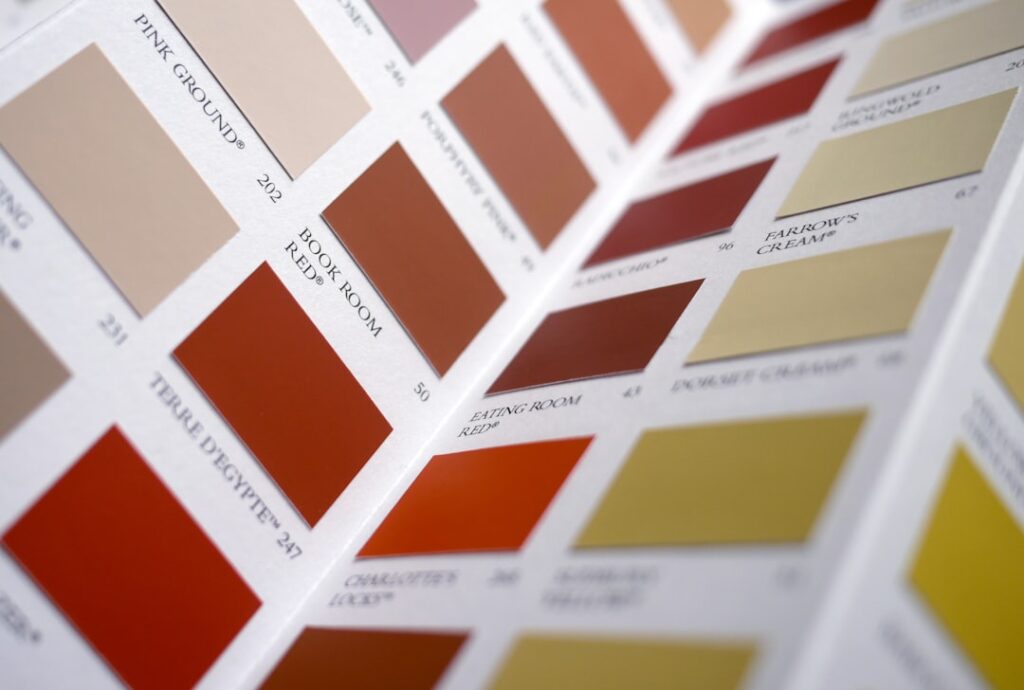
Walk into any paint store and the swatches people actually walk out with have shifted hard away from cool gray. The most popular interior paint colors right now lean warm, saturated, and confident — dusty greens, earthy terracottas, and rich blues alongside the creamy off-whites that make them pop. If you want your home to feel current instead of stuck in 2018, these are the most popular interior paint colors pros are mixing every week.
- The Big Shift: Warm and Saturated Wins
- Dusty and Sage Greens
- Earthy Terracottas and Warm Browns
- Rich, Confident Blues
- Warm Whites That Anchor the Rest
- Moody Charcoals and Warm Blacks
- Soft Blush and Warm Pinks
- Popular Colors by Room
- Pairing Colors That Work Together
- How to Use Trending Colors Without Regret
- Cost and Coverage Basics
- Testing Before You Commit
- The Bottom Line
The Big Shift: Warm and Saturated Wins
Cool gray had a decade-long run and it’s over. Homeowners want color that feels lived-in and cozy, not showroom-sterile. That means warmer undertones across the board, more color drenching where one bold shade covers walls, trim, and ceiling, and a return to actual color on feature walls instead of a safe greige everywhere. The colors below are the ones topping brand color-of-the-year lists and moving off the shelf fastest.
Dusty and Sage Greens
Green is the runaway favorite, and the muted, grayed-down versions are everywhere. They read as a neutral but bring life a beige never could.
- Sherwin-Williams Evergreen Fog (SW 9130) — LRV 30, a gray-green with a whisper of blue. A former color of the year that never cooled off; stunning color-drenched in a study.
- Benjamin Moore October Mist (1495) — LRV 46, a soft sage with a silvery undertone that shifts with the light.
- Sherwin-Williams Rosemary (SW 6187) — LRV 8, a deep forest green for a dramatic dining room or a moody bookcase.
Earthy Terracottas and Warm Browns
The “quiet luxury” of warm earth tones is pulling people back toward clay, rust, and chocolate. These feel grounded and pair beautifully with wood and brass.
- Benjamin Moore Cinnamon (2174-20) — LRV 12, a rich burnt-orange terracotta for an accent wall with real warmth.
- Sherwin-Williams Cavern Clay (SW 7701) — LRV 20, a warm, dusty terracotta with a Southwestern feel that reads modern, not dated.
- Benjamin Moore Bavarian Cream (OC-2) paired with a chocolate like Sherwin-Williams Black Bean (SW 6006), LRV 6, for the warm dark-brown trim that’s replacing black.
Rich, Confident Blues
Blue never really left, but the popular versions have deepened. Navy and inky blues are showing up on cabinets, built-ins, and full color-drenched rooms.
- Benjamin Moore Hale Navy (HC-154) — LRV 6, the go-to deep navy for kitchen islands and libraries. Reads near-black at night.
- Sherwin-Williams Naval (SW 6244) — LRV 4, a bold, saturated navy that’s been a top seller for years running.
- Benjamin Moore Van Deusen Blue (HC-156) — LRV 12, a smoky slate-blue that’s softer than navy and gorgeous drenched.
Warm Whites That Anchor the Rest
Bold colors need a warm white to breathe next to. The most popular whites this year all skip the blue-white crispness in favor of a creamy, inviting base.
- Sherwin-Williams Alabaster (SW 7008) — LRV 82, a soft creamy white and one of the best-selling colors in the country. Faint warm undertone, never sterile.
- Benjamin Moore White Dove (OC-17) — LRV 85, warm with a touch of gray so it stays clean under LED light.
- Sherwin-Williams White Duck (SW 7010) — LRV 74, a warm off-white with a subtle greige base for a cozier feel.
Moody Charcoals and Warm Blacks
True black is fading; warm off-blacks are the modern choice for front doors, trim, and dramatic accent walls. They feel softer and more expensive than a flat black.
- Sherwin-Williams Iron Ore (SW 7069) — LRV 6, a warm near-black that’s become the default for modern trim and exteriors.
- Benjamin Moore Soot (2129-20) — LRV 6, a blue-black with depth for a cabinet or feature wall.
- Benjamin Moore Kendall Charcoal (HC-166) — LRV 12, a smoky gray that bridges neutral and dramatic.
Soft Blush and Warm Pinks
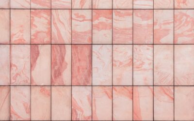
Pink grew up. The current favorites are muted, plaster-toned blushes that behave like neutrals in bedrooms, nurseries, and dining rooms.
- Benjamin Moore First Light (2102-70) — LRV 71, a soft rosy beige that reads pale and warm, not sweet.
- Sherwin-Williams Malted Milk (SW 6057) — LRV 60, a warm pink-beige that works as a whole-room color.
Popular Colors by Room
The most-requested colors cluster differently depending on the room, and matching the shade to the space is half the battle.
- Kitchen — deep green and navy cabinets against warm-white walls are the runaway favorite. Try Hale Navy or Evergreen Fog on the island with Alabaster above.
- Living room — warm greiges and soft sages dominate. October Mist or a warm off-white like White Duck keeps the space bright but cozy.
- Bedroom — moody and enveloping wins here. Van Deusen Blue, a drenched sage, or a soft blush like First Light for a calm retreat.
- Dining room — the place to be bold. Rosemary green or a deep terracotta color-drenched makes dinner feel like an event.
- Home office — saturated but focused. Naval or a forest green reads serious without feeling heavy.
- Powder room — go all in. Small, low-traffic, and windowless, it’s the perfect spot for Cinnamon, Iron Ore, or a drenched jewel tone.
Pairing Colors That Work Together
The colors on this list shine brightest in the right company. Warm greens like Evergreen Fog love natural wood, brass, and creamy Alabaster trim. Deep navies pair beautifully with white oak, warm brass, and a crisp White Dove. Terracottas and clays come alive next to unfinished wood, black metal, and warm whites. The through-line is warmth — these popular colors want warm metals and warm woods, not the cool chrome and gray-wash that defined the last decade.
How to Use Trending Colors Without Regret
A trend on a swatch and a trend on your walls are different animals. A few rules keep you from repainting in six months. Always sample first — buy a pint or a peel-and-stick swatch and live with it for a few days, checking it in morning, noon, and lamp light, because undertones shift dramatically. Use bold colors where you spend focused time — a dining room, office, or powder room can handle drama that would exhaust you in a main living space.
Balance saturation with warm whites and natural wood so a rich color feels intentional. And match sheen to the room: eggshell or matte for living areas, satin for kitchens and baths, semi-gloss on trim.
Cost and Coverage Basics
A gallon of quality interior paint covers about 350–400 square feet per coat and runs $50–$90 in premium lines like Sherwin-Williams Emerald or Benjamin Moore Aura. Deep and saturated colors — the navies, forest greens, and terracottas on this list — usually need a gray-tinted primer plus two finish coats for full, even color. Budget an extra gallon for anything bold; skimping on coats is the fastest way to make a trendy color look cheap.
Testing Before You Commit
Every color on this list can look wrong under the wrong light, so never buy five gallons off a two-inch chip. Grab a sample pint or a peel-and-stick swatch and put a two-foot patch on the wall you’re actually painting. Look at it in the morning, at midday, and under your evening lamps, because a saturated navy or terracotta shifts dramatically between daylight and warm bulbs. Tape the swatch next to your trim, flooring, and biggest piece of furniture, since these bold colors are only as good as what they sit beside. Give it two full days before you decide — first impressions of strong color are almost always too reactive.
The Bottom Line
The most popular interior paint colors this year are warm, grounded, and unafraid of saturation — sage and forest greens, earthy terracottas, deep confident blues, and creamy warm whites to tie it all together. Pick the family that fits your light and your rooms, sample before you commit, and give bold shades the two coats and warm-white balance they need. Done right, these colors will still feel fresh long after the next trend rolls through.