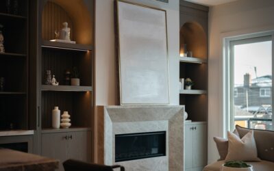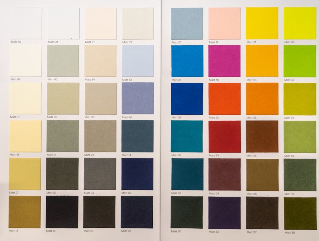
Color trends move slower than the internet makes them look, but 2025 has a clear direction, and it is a warm one. The popular interior paint colors 2025 lean into cozy, grounded, earthy tones — the cool gray era is genuinely over. After painting rooms for two decades, I can tell you what people are actually asking for this year, and it is warmth, depth, and colors that feel lived-in rather than showroom-sterile.
- The Big Shift: Warm Over Cool
- Warm Neutrals: The Foundation
- Earthy Browns and Mochas
- Deep, Moody Greens
- Moody Blues and Deep Accents
- Warm Terracotta and Clay Tones
- Room-by-Room Picks
- Trim, Ceiling, and Door Colors for 2025
- Finishes and Testing
- Colors That Are on the Way Out
- Pairing Colors With Your Fixed Elements
- Whole-Home Flow vs. Bold Individual Rooms
- The Takeaway
Here is the honest rundown of what is trending, the specific brand colors behind the trends, and where each one works best in a real home.
The Big Shift: Warm Over Cool
The single defining move in the popular interior paint colors 2025 is the swing from cool grays to warm neutrals. The gray-and-white palette that dominated the 2010s reads dated now. In its place: creamy whites, greige (gray-beige), soft taupes, and warm off-whites that make a room feel welcoming under both daylight and warm bulbs.
The major brands all pointed the same direction with their Colors of the Year — mocha and brown tones, warm terracottas, and earthy neutrals showed up across Sherwin-Williams, Benjamin Moore, and Pantone-adjacent picks. When every color house lands in the same neighborhood, that is a real trend, not marketing noise.
Warm Neutrals: The Foundation
These are the safe, high-resale, whole-house colors most people want:
- Sherwin-Williams Accessible Beige (SW 7036): the greige that flatters almost any room and lighting.
- Benjamin Moore White Dove (OC-17): a warm white that is not stark, perfect for trim and whole rooms.
- Sherwin-Williams Agreeable Gray (SW 7029): still popular, but its warm undertone is why it survived the gray fade.
- Benjamin Moore Swiss Coffee: a creamy off-white that softens bright rooms.
These are your default for living rooms, hallways, and open-plan spaces where you want light, flexible walls that work with any furniture.
Earthy Browns and Mochas
The headline of 2025 is the return of brown. Not the dark wood-paneling brown of the 1970s, but soft, sophisticated mochas and taupes. Benjamin Moore’s Cinnamon Slate and various mocha mousse tones led the year. These read as neutral but bring warmth and depth that beige alone cannot.
Where they shine: bedrooms, cozy dens, and accent walls behind a bed or fireplace. A mocha wall with cream trim and warm wood tones is one of the most inviting combinations you can put in a house right now.
Deep, Moody Greens
Green continues its strong run, especially the deep, grounded shades:
- Sherwin-Williams Rosemary (SW 6187): a rich, dusky green.
- Benjamin Moore Forest Floor / Backwoods: deep, dramatic greens for a statement.
- Sage tones like Sherwin-Williams Evergreen Fog (SW 9130): softer, more neutral green-grays that work whole-room.
Deep greens are perfect for a home office, a library, a powder room, or kitchen cabinetry. Sage tones work anywhere you want a calm, nature-adjacent feel without full drama.
Moody Blues and Deep Accents
Blue never really leaves, and in 2025 it is trending dark and rich rather than bright. Navy and inky slate blues make excellent accent walls, front doors, and cabinet colors. Benjamin Moore Hale Navy and Sherwin-Williams Naval are the perennial go-tos, and they pair beautifully with the warm neutrals dominating the rest of the palette.
Use deep blue where you want a room to feel intimate and considered — a dining room, an office, or a built-in bookcase. It reads as timeless rather than trendy, which is a safe bet for resale.
Warm Terracotta and Clay Tones
Earthy oranges, clays, and terracottas are having a moment as accent colors. They bring a hand-made, Mediterranean warmth that pairs naturally with the brown-and-cream base of the year. These are best used in moderation — a single accent wall, a niche, or an entryway — rather than a whole room, unless you are committing to a distinctly warm, earthy aesthetic.
Room-by-Room Picks
How to actually apply the trends:
- Living room: warm neutral walls (Accessible Beige, White Dove) with a deep accent wall or dark built-ins.
- Kitchen: creamy white walls, sage or deep green lower cabinets.
- Bedroom: soft mocha, taupe, or muted sage for a restful, cocooning feel.
- Home office: deep green or navy for focus and drama.
- Bathroom/powder room: a bold moody color — the small size makes a dark shade feel luxe, not heavy.
- Entryway: a warm terracotta or clay accent to set a welcoming tone.
Trim, Ceiling, and Door Colors for 2025
The trend is not only about wall color. Trim is softening away from stark bright white toward warm whites like White Dove and Swiss Coffee that flatter the warm walls beside them. Some of the most current rooms match trim to the wall color in a different sheen for a seamless envelope. Ceilings are trending away from default flat white toward soft, barely-there warm tones that add coziness overhead. And interior doors — especially in moody schemes — are getting painted in deep charcoals and greens rather than left builder-white. Treating trim, ceilings, and doors as part of the palette, not afterthoughts, is what makes a 2025 color scheme feel intentional and complete.
Finishes and Testing
Color is only half the decision — sheen matters too. Use matte or eggshell for walls to hide imperfections, satin for trim and doors, and semi-gloss for high-traffic and moisture areas. And never trust a color chip on the store rack. Buy a sample, paint a 2×2-foot patch on two different walls, and look at it in morning light, afternoon light, and under your evening bulbs. The same mocha can read purple, pink, or gray depending on the light in your specific room.
Colors That Are on the Way Out
Knowing what to avoid is as useful as knowing what is trending. A few looks now read as dated:
- Cool, blue-toned grays — the defining color of the 2010s, now the fastest way to date a room.
- Stark, clinical all-white with no warmth — sterile rather than fresh.
- Orange-toned “builder beige” from the early 2000s — replaced by cleaner greiges.
- High-contrast gray-and-white with no third color — reads flat and impersonal.
If your home still wears these, a shift to warm neutrals with one grounded accent instantly modernizes it — often the single highest-impact update you can make for the cost of a few gallons of paint.
Pairing Colors With Your Fixed Elements
Paint does not live in isolation. Before you commit, look at the things you are not changing — flooring, countertops, cabinets, tile, and large furniture. Warm 2025 tones pair beautifully with wood floors, natural stone, brass and matte-black hardware, and linen textures. They can clash with cool gray tile or blue-gray flooring left over from the last trend cycle. If your floors run cool, lean toward greiges with enough gray to bridge the two rather than a warm cream that fights them. Matching the wall color to your fixed undertones is what makes a room feel pulled-together instead of like two eras stitched into one space.
Whole-Home Flow vs. Bold Individual Rooms
There are two philosophies for applying the 2025 palette, and both are valid. The first is whole-home flow: pick one warm neutral for the open, connected spaces and repeat it, so the house reads as one calm, cohesive envelope. This is the safer, more resale-friendly approach, and it suits open-plan homes where rooms bleed into one another. The second is bold individual rooms: give each enclosed space its own committed color — a deep green office, a terracotta entry, a moody navy powder room. This works best in older homes with defined, separated rooms and doorways that let each color stand on its own.
Most homeowners land in the middle: a consistent warm neutral through the shared living areas, with two or three enclosed rooms treated to a bolder, saturated color. That combination gives you the calm flow of a cohesive base with the personality of a few standout spaces — the approach that best captures the spirit of the 2025 palette.
The Takeaway
The popular interior paint colors 2025 tell a consistent story: warmth is back. Ground your home in creamy whites and warm greiges, add depth with mochas and taupes, and bring drama with deep greens and moody blues. Terracotta accents finish the earthy palette. Test every color in your own light before committing, match the sheen to the room, and you will land on a scheme that feels current now and still looks intentional five years from today.