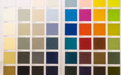
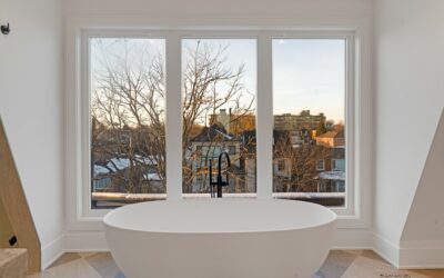
The most popular interior paint colors right now have quietly shifted away from the cold, stark grays that dominated the 2010s. Homeowners are reaching for warmer, softer tones that feel calm rather than clinical. As someone who has painted hundreds of rooms and watched swatches go in and out of style, I can tell you the popular interior paint colors that photograph well online and the ones that live well day to day are not always the same. Here is what is trending, and how to pick a shade you won’t repaint in two years.
Part of our Paint & Walls guide — explore the full guide →
- Warm Whites Are the New Neutral
- Greige and Warm Neutrals
- Moody Greens and Blues for Accent Spaces
- Earthy Terracotta and Clay Tones
- Room-by-Room Color Advice
- Understanding Undertones
- Coordinating a Whole-House Palette
- Choosing the Right Sheen for Each Room
- Colors That Are Fading Out of Style
- Test Before You Commit
- Pairing Wall Colors With Trim and Ceilings
- Final Advice From the Field
Warm Whites Are the New Neutral
Bright, blue-white paint has given way to creamy, warm whites that make a room feel inviting in real daylight. These shades read clean without the sterile chill.
- Benjamin Moore White Dove (OC-17): the go-to soft white for trim and whole rooms alike
- Sherwin-Williams Alabaster (SW 7008): a warm off-white that pairs with nearly any accent
- Benjamin Moore Swiss Coffee (OC-45): creamier still, forgiving on older walls
Warm whites hide minor wall imperfections better than cool whites because they don’t bounce harsh light. For most ceilings, a flat white in the same family keeps everything cohesive.
Greige and Warm Neutrals
Greige, the blend of gray and beige, remains the safest whole-house color because it flexes between warm and cool depending on your lighting and furnishings. Sherwin-Williams Agreeable Gray (SW 7029) is the runaway favorite, followed closely by Benjamin Moore Revere Pewter (HC-172). Both sit at a light-reflectance value in the 55 to 60 range, bright enough for a hallway with little natural light but not washed out.
If your rooms face north and feel cold, lean toward a warmer greige like Accessible Beige (SW 7036). South-facing rooms can handle a cooler tone without feeling gloomy.
Moody Greens and Blues for Accent Spaces
The biggest trend of the last two years is saturated color used deliberately, not everywhere. Deep greens have exploded in popularity for offices, dining rooms, and kitchen islands.
Benjamin Moore’s Green Smoke and Sherwin-Williams Pewter Green (SW 6208) show up constantly on cabinets and feature walls. For a richer, near-black drama, Sherwin-Williams Iron Ore (SW 7069) and Benjamin Moore Hale Navy (HC-154) anchor a room without feeling like a cave when balanced with warm white trim.
Earthy Terracotta and Clay Tones
Warm earth tones are quietly gaining ground, especially in bedrooms and reading nooks. Soft terracotta, clay, and muted rust bring a cocooning warmth that pairs beautifully with natural wood and rattan. Sherwin-Williams Cavern Clay (SW 7701) captures this look. These colors feel current now but carry a timeless, Southwestern warmth that won’t date as quickly as a trendy teal.
Room-by-Room Color Advice
The right color depends heavily on the room’s purpose and how much natural light it gets. What flatters a sunny kitchen can feel dreary in a north-facing den.
- Bedrooms: soft greiges, muted blues, and warm terracottas promote rest; avoid high-energy brights
- Living rooms: warm neutrals as a base, with a moody accent wall if you want depth
- Kitchens: warm whites keep the space bright, or a green island for character
- Home offices: deep green or navy reads focused and photographs well on video calls
- Bathrooms: soft blues, sages, and warm whites feel clean and spa-like
North-facing rooms receive cool, indirect light, so lean warm to counteract the chill. South-facing rooms flood with warm light and can carry cooler tones without feeling gloomy. East and west rooms shift dramatically from morning to evening, so test any color at both times of day.
Understanding Undertones
The single most common paint regret comes from ignoring undertones. Every neutral leans slightly toward another color, and that hidden bias is why a “gray” can suddenly look purple or blue on your wall. Greiges often carry a green, purple, or pink undertone that only shows up next to your flooring and furniture.
To spot an undertone, hold your swatch against a pure white card. Whatever tint you notice against that white is what will read on your wall in the wrong light. Match the undertone to your fixed elements: warm wood floors and beige tile want a warm-undertone paint, while cool gray tile and white marble handle a cooler neutral without clashing.
Coordinating a Whole-House Palette
For flow between rooms, especially in an open floor plan, build your whole-house palette from a small, disciplined set of colors rather than picking each room independently. A proven formula is one warm white, one light greige, and one deeper accent color used sparingly.
- Choose a warm white for trim, doors, and ceilings throughout for continuity
- Pick a light greige as the main wall color for shared and transitional spaces
- Reserve one or two saturated colors, like a green or navy, for accent rooms
Keeping the trim color consistent from room to room ties the whole house together, even when the wall colors change. This restraint reads as intentional and expensive, while a house where every room is a different bold color feels chaotic and dates quickly.
Choosing the Right Sheen for Each Room
Color gets all the attention, but sheen determines how a color actually looks and wears. The same gray in flat versus satin can read as two different colors.
- Flat or matte: ceilings and low-traffic adult bedrooms, hides imperfections best
- Eggshell: the all-purpose choice for living rooms, dining rooms, and hallways
- Satin: kitchens, kids’ rooms, and bathrooms where you need to wipe walls down
- Semi-gloss: trim, doors, and cabinets for durability and a crisp edge
Colors That Are Fading Out of Style
Knowing what’s on the way out is as useful as knowing what’s trending, since it saves you from painting yourself into a dated corner. The cold, blue-based grays that defined the 2010s are the clearest casualty; they now read stark and lifeless next to the warmer palettes taking over. If your walls are a steely gray, warming them up is one of the fastest ways to modernize a room.
A few other looks are cooling off. All-white, ultra-minimalist rooms are giving way to spaces with more warmth and color. Accent walls in a single random bright color, popular a decade ago, now look dated compared to a fully committed moody room or a two-tone approach. And the once-ubiquitous beige-on-beige “builder tan” reads flat next to today’s more nuanced greiges with intentional undertones.
None of this means you must repaint the moment a color trends down. The most timeless choices, warm whites, soft greiges, and nature-based greens and blues, have staying power precisely because they aren’t tied to a single moment. If you’re choosing colors you’ll live with for years, lean on those classics and use the trendier saturated shades only where they’re easy to change, like a single accent room or a piece of furniture.
Test Before You Commit
The mistake I see most often is choosing a color from a tiny chip under store lighting. Paint changes dramatically with your home’s light, the time of day, and the colors already in the room. Buy sample pints and paint a two-foot square on at least two walls, then live with it for a full day. A $6 sample saves you from repainting an entire room.
Peel-and-stick sample swatches from companies like Samplize let you move the color around the room and view it at different hours without opening a can. For a whole-house palette, pick one warm white and one greige as your base, then reserve the moody greens and clays for one or two accent spaces. That approach gives you the on-trend look while keeping the bones of your home flexible for years to come.
Pairing Wall Colors With Trim and Ceilings
A wall color rarely stands alone, and the trim and ceiling around it can make or break the look. The safest, most timeless approach is a warm white on all trim and doors, which frames any wall color cleanly and ties rooms together as your eye moves through the house. Benjamin Moore White Dove and Sherwin-Williams Alabaster both serve this role beautifully.
For ceilings, a flat white one or two shades lighter than the walls keeps the room feeling open, though painting the ceiling the same soft white as the trim is a foolproof default. In a moody room with deep green or navy walls, consider carrying that color onto the trim and even the ceiling for an enveloping, cocooning effect that reads intentional and luxurious rather than half-finished.
Final Advice From the Field
Trends are a starting point, not a rule. The popular interior paint colors that last in real homes are the ones matched to a room’s light and purpose, not the ones with the most saves on a design site. Anchor your house in warm neutrals, use bold color where you want energy, and always test on the actual wall before you buy the gallons.