For two decades, the default bathroom was a sea of gray tile and white fixtures, safe but utterly forgettable. The latest bathroom color trends finally break from that cold neutrality, embracing warmth, depth, and a little personality. Designers are leaning into earthy greens, soft warm whites, terracotta accents, and matte black hardware, all of which photograph beautifully and, more importantly, age gracefully. The smartest approach is to anchor the room in a timeless base, then layer in trend colors through elements you can swap cheaply.
Part of our Bathroom Remodeling & Flooring guide — explore the full guide →
- Warm Neutrals Replace Cool Grays
- Moody Greens and Deep Blues
- Matte Black and Mixed Metals
- Earthy and Terracotta Accents
- Two-Tone and Color-Drenching
- Choosing Colors That Last
- Color Psychology in the Bathroom
- Tile and Grout Color Trends
- Finish and Sheen Matter Too
- Bringing Trends Together in One Room
- Coordinating With the Rest of the Home
Warm Neutrals Replace Cool Grays
The biggest shift is away from blue-gray and toward warm, creamy neutrals. Greige, soft taupe, and warm white now dominate because they make a small bathroom feel cozy rather than clinical. Benjamin Moore White Dove and Sherwin-Williams Accessible Beige are perennial favorites that flatter both natural and artificial light.
Warm neutrals also play well with brass and gold fixtures, which is no accident given how dominant those metals have become.
Moody Greens and Deep Blues
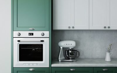
Saturated color has returned, and green leads the pack. Sage, olive, and forest green bring a spa-like calm and pair naturally with wood vanities and brass. Sherwin-Williams Evergreen Fog, a soft gray-green, was a color of the year for good reason. Deep navy and slate blue offer the same drama with a slightly cooler feel.
Use these darker shades on a vanity, a single accent wall, or the lower half of a two-tone wall so the room still feels light overall.
Matte Black and Mixed Metals
Hardware is where current bathroom color trends show up fastest. Matte black faucets, shower frames, and towel bars create crisp contrast against light tile and read as modern without feeling trendy. Mixed metals are now fully acceptable too, so a brushed gold faucet can coexist with matte black lighting if you keep the combination intentional rather than random.
- Matte black: bold, high-contrast, hides water spots well
- Brushed gold: warm, softens cool palettes, very current
- Brushed nickel: the safe, durable everyday choice
- Chrome: classic but shows spots and reads a touch dated
Earthy and Terracotta Accents
Beyond paint, color is arriving through tile and accessories. Terracotta, rust, and clay tones add warmth as a shower accent stripe, a niche backdrop, or a run of zellige tile. These hand-glazed Moroccan-style tiles, with their uneven surface and subtle color variation, have become a defining look of the era. A small dose goes a long way, so reserve bold earth tones for a feature rather than the whole room.
Two-Tone and Color-Drenching
Two distinct techniques are shaping how color gets applied. Two-tone walls put a darker tile or paneling on the bottom half with a lighter paint above, grounding the room and adding height. Color-drenching, the opposite approach, wraps walls, trim, and even the ceiling in a single deep shade for an enveloping, jewel-box effect. Color-drenching works best in a powder room or a windowless bath where you want drama rather than airy brightness.
Choosing Colors That Last
Trends are fun, but a bathroom remodel is expensive enough that you do not want to redo it in three years. Apply the cost-of-change rule: put trendy colors where they are cheap to swap and timeless colors where they are not.
- Permanent and pricey: tile, tub, and vanity should lean neutral and classic
- Semi-permanent: paint and hardware can take a trend you love
- Easy to swap: towels, art, rugs, and a vase carry the boldest seasonal color
Follow that hierarchy and you can chase the latest bathroom color trends without committing thousands of dollars to a look that may fade.
Color Psychology in the Bathroom
Color does more than decorate; it shapes how a bathroom feels at 6 a.m. and at the end of a long day. Soft greens and blues read as calming and spa-like, which is why they dominate primary baths designed for relaxation. Warm whites and creams feel clean and bright, ideal for a daily-use family bathroom. Deep, saturated tones bring drama and intimacy, perfect for a powder room you want to feel like a jewel box.
Think about the light your bathroom gets, too. North-facing rooms with cool, indirect light benefit from warm paint colors that counteract the gray cast, while a bright south-facing bath can carry cooler, moodier shades without feeling gloomy.
Tile and Grout Color Trends
Tile is where a lot of current color action happens, and grout is the detail people overlook. Beyond the terracotta and zellige looks, fluted and textured tiles in soft neutrals add dimension without bold color. For grout, designers are moving away from stark white, which stains and yellows, toward warm grays and tones that match the tile for a seamless, low-maintenance look.
- Matching grout: blends with the tile for a clean, expansive feel
- Contrasting grout: outlines each tile for a graphic, retro effect
- Warm gray grout: hides dirt better than bright white over time
Choosing a grout color that hides soap film and water spots keeps your trendy tile looking fresh years after installation.
Finish and Sheen Matter Too
Color is only half the equation; the finish determines how it wears in a humid room. Choose a satin or semi-gloss paint with mildew resistance so steam wipes away instead of soaking in. Flat and matte paints look elegant but trap moisture and stain in a bathroom. For the most durable result on walls near the shower, a quality semi-gloss in your chosen warm neutral or moody green gives you both the on-trend color and the washable surface a bathroom demands.
Bringing Trends Together in One Room
The most successful bathrooms do not chase every trend at once; they pick a lane and commit. A timeless approach is to keep the big-ticket surfaces, the tub, the floor tile, and the vanity, in warm neutrals, then layer in personality through paint, hardware, and accessories. That way a sage-green vanity with brushed gold pulls feels current today and easy to update later by simply swapping the smaller pieces.
If you love a bold direction, anchor it with one statement element rather than scattering color everywhere. A single zellige feature wall, a deep-green vanity, or a color-drenched powder room reads as confident design, while five competing trends in one space reads as cluttered.
Coordinating With the Rest of the Home
A bathroom does not exist in isolation, especially in an open or transitional floor plan where it connects to a bedroom or hallway. Pull a color or material from the adjacent space so the bathroom feels like part of the whole house rather than a disconnected box. If your bedroom leans warm and earthy, a bathroom in cool steel blue will feel jarring; echo the warm palette instead. Carrying a metal finish, brushed gold or matte black, consistently from room to room ties the design together and keeps your color choices from clashing across doorways.