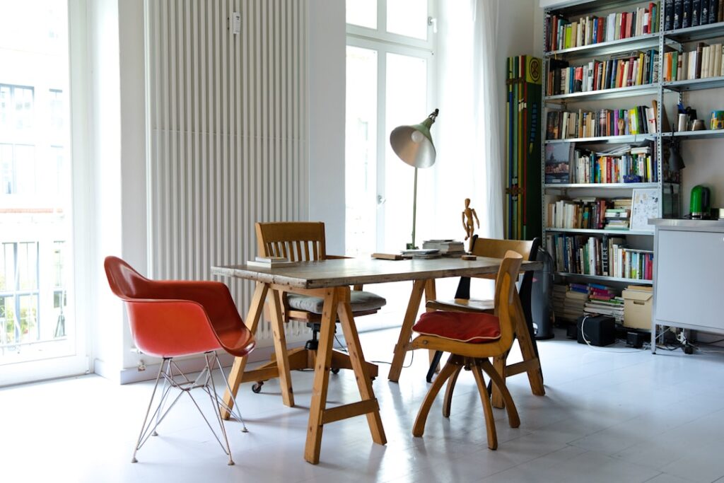
Neutral colors are the backbone of great interior design. They create calm, versatile spaces that serve as a foundation for personal expression — through art, textiles, furniture, and accent pieces. In 2026, the neutral color landscape has shifted away from cold grays toward warmer, more organic tones that feel inviting, timeless, and connected to the natural world.
- Table of Contents
- What Are Neutral Colors?
- Trending Neutral Colors for 2026
- Understanding Undertones
- Neutral Flooring Guide
- Neutral Wall Colors
- Room-by-Room Neutral Color Guide
- Adding Interest to Neutral Spaces
- Best Accent Colors with Neutrals
- Frequently Asked Questions
- What is the most popular neutral color for 2026?
- Is gray still a good neutral?
- How do I keep a neutral room from looking boring?
- Should walls and trim be the same neutral color?
- What neutral colors make a room look bigger?
- Can I mix warm and cool neutrals?
- What neutral color is best for resale?
- How do I choose between warm and cool neutrals?
But “neutral” does not mean boring. The right neutral palette creates depth, sophistication, and visual interest through subtle undertone variations, texture play, and strategic contrast. This guide covers how to select, combine, and apply neutral colors throughout your home for a polished, cohesive look that stands the test of time.
What Are Neutral Colors?
Neutral colors are tones that do not compete with other colors in a room. Traditional neutrals include white, black, gray, beige, and brown. In contemporary design, the definition has expanded to include muted versions of colors like sage green, dusty blue, blush pink, and warm taupe — tones that function as neutrals because they recede rather than dominate.
| Category | Colors | Undertone Family | Mood |
|---|---|---|---|
| Cool neutrals | Cool gray, blue-gray, silver, cool white | Blue, green, or violet undertones | Modern, crisp, sophisticated |
| Warm neutrals | Beige, cream, tan, warm white, camel | Yellow, red, or orange undertones | Inviting, cozy, organic |
| True neutrals | True gray, black, true white | No discernible undertone | Minimalist, stark, bold |
| Earth neutrals | Terracotta, olive, mushroom, clay | Complex warm undertones | Natural, grounded, rustic |
| Modern neutrals | Greige (gray-beige), warm gray, soft taupe | Balanced warm-cool | Contemporary, transitional |
Trending Neutral Colors for 2026
The neutral color trends for 2026 reflect a broader shift toward warmth, nature, and comfort in interior design.
Top Neutral Paint Colors
| Color Name | Brand | Description | Best Use |
|---|---|---|---|
| Warm Embrace | Benjamin Moore | Warm cream with golden undertone | Whole-house color, living rooms |
| Accessible Beige (SW 7036) | Sherwin-Williams | True greige, balanced warm-cool | Open floor plans, any room |
| Swiss Coffee (OC-45) | Benjamin Moore | Soft warm white, slight yellow | Trim, ceilings, cabinets |
| Alabaster (SW 7008) | Sherwin-Williams | Warm white, no stark contrast | Walls, trim, whole-house |
| Edgecomb Gray (HC-173) | Benjamin Moore | Warm greige with slight green | Living rooms, bedrooms, offices |
| Agreeable Gray (SW 7029) | Sherwin-Williams | Warm gray, universally appealing | Whole-house, resale preparation |
The Shift from Gray to Warm
The gray-everything trend that dominated 2015–2022 has given way to warmer neutrals. Greige (gray + beige), warm taupe, and creamy whites have replaced cool grays as the default neutral palette. This shift reflects a broader cultural desire for spaces that feel warm, lived-in, and connected to nature rather than cool and austere.
Understanding Undertones
Undertone is the most critical concept in working with neutral colors. Every “neutral” paint color has a subtle underlying hue that becomes visible in different lighting conditions. Getting undertones wrong is the number one reason neutral rooms feel “off.”
How to Identify Undertones
- Compare against pure white: Hold a paint chip against a sheet of true white paper. The undertone will become visible — does the sample lean yellow, pink, green, blue, or violet?
- Check in natural light: Undertones shift dramatically under artificial vs. natural light. Always evaluate colors in the actual room they will be used in
- Look at the darkest shade: On a paint strip with multiple shades, the darkest swatch at the bottom reveals the undertone most clearly
- Test large samples: Small chips are unreliable. Paint a 2×2-foot swatch on the actual wall and observe it at different times of day
Undertone Matching Rules
| Wall Undertone | Matches Well With | Clashes With |
|---|---|---|
| Yellow undertone | Warm-toned wood, brass, warm white trim | Blue-gray tones, cool metals, bright white |
| Pink/red undertone | Warm wood, terracotta, copper accents | Cool gray furnishings, blue accents |
| Green undertone | Cool and warm wood tones, plants, most metals | Strong pink or coral accents |
| Blue undertone | Cool-toned wood (gray oak), silver, cool white trim | Warm-toned wood (honey oak), yellow accents |
| Violet undertone | Cool gray, charcoal, chrome and silver | Warm wood tones, brass, yellow |
Neutral Flooring Guide
Flooring is the largest neutral surface in any room. Getting the flooring neutral right sets the stage for everything above it.
| Flooring Type | Best Neutral Tones | Undertone Notes | Style Match |
|---|---|---|---|
| White oak hardwood | Natural, light stain, cerused | Naturally cool-neutral to warm | Modern, Scandinavian, transitional |
| Red oak hardwood | Warm honey, golden brown | Warm (pink/red undertones) | Traditional, farmhouse |
| Luxury vinyl plank | Gray-wash, warm taupe, blonde | Varies by product — test carefully | Any style, budget-friendly |
| Travertine tile | Ivory, cream, classic walnut | Warm (yellow to golden) | Mediterranean, traditional, boho |
| Porcelain tile (stone look) | Warm gray, beige marble, limestone | Varies — match to wall undertone | Modern, contemporary |
| Carpet | Warm gray, greige, soft cream | Check samples under room lighting | Bedroom, cozy spaces |
The most versatile neutral flooring for 2026 is natural white oak with a clear or light finish. Its naturally balanced undertone (neither strongly warm nor cool) works with virtually any wall color and design style. For a comprehensive look at coordinating flooring with your overall design, see our flooring decor guide.
Neutral Wall Colors
Choosing the Right White
White is the most popular wall color, but there are hundreds of “white” paint options, each with different undertones. The wrong white can make a room feel dingy (too yellow), cold (too blue), or clinical (too bright).
- North-facing rooms: Choose a white with warm undertones (cream, yellow, or pink) to counteract the cool, blue-tinted natural light
- South-facing rooms: Nearly any white works, but warm whites feel especially inviting in abundant sunlight
- East-facing rooms: Warm white in the morning, cool in the afternoon — test samples at multiple times of day
- West-facing rooms: Cool whites balance the warm afternoon light; warm whites amplify the golden glow
Beyond White: Warm Neutral Walls
Full-color neutrals on walls create warmth and depth that white alone cannot achieve. Greige, warm taupe, soft sand, and mushroom tones work throughout the home as whole-house colors. The key is choosing a neutral dark enough to add warmth but light enough to maintain brightness.
Room-by-Room Neutral Color Guide
Living Room
The living room benefits from a warm neutral base — warm white or greige walls, neutral-toned flooring, and a sofa in cream, tan, or soft gray. Add personality through textured pillows, throw blankets, and artwork. The neutral base ensures the room feels collected and intentional. A boho theme layered over a neutral foundation is one of the most popular approaches in 2026.
Kitchen
Neutral kitchens remain the top choice for both daily enjoyment and resale value. White or cream cabinets, warm-toned countertops (butcher block, warm marble, or quartz), and neutral flooring create a kitchen that feels bright and timeless. Use natural wood, plants, and copper or brass hardware to prevent the space from feeling flat.
Bedroom
Bedrooms benefit from the most soothing neutral tones — soft warm whites, barely-there greiges, and whisper-quiet taupes. These colors promote rest and relaxation. Layer the bed with tonal neutrals in different textures (linen, cotton, sateen, chunky knit) for a luxurious, inviting look without bold color.
Bathroom
White and warm neutral bathrooms have enduring appeal. Natural stone like travertine in warm tones adds organic warmth. Pair with warm white walls, natural wood accents, and brushed brass fixtures for a spa-like neutral bathroom that feels anything but plain.
Home Office
Neutral colors in home offices promote focus and reduce visual distraction. Warm whites and light greiges work well with natural light and reduce screen-glare. Add interest through a statement desk, plants, and curated shelf styling.
Adding Interest to Neutral Spaces
The biggest challenge with neutral interiors is preventing blandness. These strategies add depth and visual interest without introducing competing color:
- Texture layering: Combine smooth (leather, glass, metal), medium (linen, cotton, wood), and rough (jute, stone, chunky knit) textures in every room. Texture creates visual interest that color-free spaces need
- Tone-on-tone variation: Use 3–5 shades of neutral from light to dark within the same undertone family. A room with cream walls, tan sofa, walnut coffee table, and chocolate throw has depth without color
- Architectural details: Millwork, trim, wainscoting, shiplap, and crown molding create shadow lines and visual structure. These details matter more in neutral rooms where color does not distract
- Natural elements: Wood, stone, plants, dried florals, and natural fiber textiles bring organic warmth and visual variety
- Metallic accents: Brass, copper, gold, matte black, and brushed nickel add shine and contrast. Mix two metal tones for a collected feel
- Art and photography: Black and white photography, abstract art, and sculptural pieces stand out beautifully against neutral walls
Best Accent Colors with Neutrals
| Neutral Base | Best Accent Colors | Accent Application | Style Result |
|---|---|---|---|
| Warm white + cream | Sage green, dusty blue, blush | Pillows, art, ceramics | Soft, romantic, organic |
| Greige + taupe | Navy, terracotta, forest green | Accent furniture, rugs, curtains | Sophisticated, grounded |
| Warm gray | Mustard, rust, deep teal | Pillows, throws, statement art | Modern, bold yet balanced |
| Black + white | Any single bold color | Furniture, art, large accessories | Graphic, contemporary, dramatic |
| Sandy beige + tan | Olive, burnt orange, indigo | Textiles, pottery, plants | Desert modern, bohemian |
The 60-30-10 rule applies perfectly to neutral rooms: 60% dominant neutral (walls, large furniture), 30% secondary neutral (flooring, curtains, secondary furniture), and 10% accent color (pillows, art, small accessories). This ratio adds life without overwhelming the calm, neutral foundation.
Frequently Asked Questions
What is the most popular neutral color for 2026?
Warm greige (the blend of gray and beige) is the most popular neutral for 2026. Specifically, warm whites with golden or yellow undertones are replacing the cool grays that dominated the 2015–2022 era. Benjamin Moore’s Warm Embrace and Sherwin-Williams’ Accessible Beige are among the top-selling neutrals.
Is gray still a good neutral?
Gray remains a valid neutral but has shifted from cool grays to warm grays and greige tones. Cool gray (with blue undertones) feels dated in 2026 unless used intentionally in modern or industrial spaces. Warm gray blends that lean toward taupe or beige remain fresh and versatile.
How do I keep a neutral room from looking boring?
Texture is the answer. Layer at least 3–5 different textures (wood, linen, leather, stone, knit, glass, metal) in every room. Add tone-on-tone variation (light to dark within the same color family), architectural details, and abundant plants. A well-layered neutral room has more visual depth than most colorful rooms.
Should walls and trim be the same neutral color?
Painting walls and trim the same color is a popular modern approach that creates a seamless, sophisticated look. If you prefer contrast, choose a trim color 2–3 shades lighter or darker than the walls, always within the same undertone family. The traditional white-trim approach works best with darker neutral walls.
What neutral colors make a room look bigger?
Light, warm whites and pale warm neutrals make rooms appear larger and brighter. Consistency is key — using the same neutral on walls, trim, and ceiling eliminates visual boundaries that define (and shrink) a space. Light neutral flooring amplifies the effect.
Can I mix warm and cool neutrals?
It is possible but tricky. Small amounts of cool contrast in a warm room (or vice versa) can add interest, but the dominant temperature should be consistent. A warm neutral room with one cool-toned art piece works. A room with half warm and half cool neutrals feels disjointed. When in doubt, stick to one temperature throughout.
What neutral color is best for resale?
Warm greige (like Sherwin-Williams Agreeable Gray or Benjamin Moore Edgecomb Gray) is the safest choice for resale because it appeals to the broadest range of buyers. These colors look good in any lighting, with any furniture, and in any style home. Avoid anything too warm (yellow-toned) or too cool (blue-toned) for maximum buyer appeal.
How do I choose between warm and cool neutrals?
Consider your fixed elements — flooring, countertops, cabinetry, and fireplace stone. If these lean warm (honey oak floors, warm marble counters), choose warm neutrals for walls. If they lean cool (gray tile, cool-toned counters), choose cool neutrals. Matching the temperature of your fixed elements to your paint creates harmony. Clashing temperatures create visual tension.