Color trends move faster than you might think, and the shades filling design magazines today look nothing like the cool grays that dominated a decade ago. Today’s trendy paint colors are warmer, richer, and drawn from nature — think earthy terracottas, moody greens, soft buttery neutrals, and muted blues that feel calm rather than cold. If you’re painting a room and want it to feel current without looking dated in two years, understanding where color is heading helps you choose confidently. This guide walks through the shades everyone’s talking about, where to use them, and how to ride a trend without regret.
Part of our Paint & Walls guide — explore the full guide →
- The Big Shift: Warm Is Back
- Earthy and Nature-Inspired Tones
- Moody, Dramatic Walls
- Soft, Calming Blues and Greens
- Warm Whites and Creamy Neutrals
- Where to Use Trendy Colors
- How to Follow Trends Without Regret
- Trends in Finishes and Techniques
- Kitchen and Cabinet Color Trends
- Balancing Trends With Resale Value
- Testing Before You Commit
- The Bottom Line
The Big Shift: Warm Is Back
The single biggest movement in recent years is the decisive turn away from cool grays toward warm, cozy tones. Homeowners grew tired of the gray-everything look, which could feel sterile and impersonal. In its place, warm neutrals — greige, warm white, mushroom, soft tan, and creamy beige — have taken over. These colors make a space feel inviting and layered, and they photograph beautifully in natural light. Sherwin-Williams and Benjamin Moore have both leaned into warmth in recent color-of-the-year picks, a clear signal of where the market is going.
Earthy and Nature-Inspired Tones
Biophilic design — the desire to connect our homes to nature — is driving a whole family of grounded, organic colors. These earthy shades feel timeless because they’re borrowed from the landscape:
- Terracotta and warm clay for a cozy, sun-baked feel in dining rooms and accent walls
- Olive, sage, and forest greens that bring the outdoors in and pair with wood and brass
- Warm browns and camel making a comeback on walls and cabinetry
- Ochre and mustard as bold but grounded accent choices
These tones feel rich and enveloping, and because they echo natural materials, they age far more gracefully than a fleeting neon or a stark trend color.
Moody, Dramatic Walls
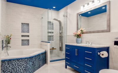
Alongside the warm neutrals, there’s a strong appetite for drama. Deep, saturated colors are having a major moment, especially in spaces meant to feel intimate — dining rooms, home offices, powder rooms, and bedrooms. Think inky navy, charcoal, deep forest green, and even near-black. The “color drenching” trend, where walls, trim, and ceiling all wear the same rich hue, creates a cocooning, high-end effect that’s everywhere in design right now. Used in the right room and balanced with good lighting and texture, a moody color reads as sophisticated rather than heavy.
Soft, Calming Blues and Greens
Muted blues and greens continue to be favorites because they hit the sweet spot between trendy and timeless. Soft sage, eucalyptus, and gentle blue-greens like Sherwin-Williams Sea Salt bring a spa-like calm that suits bedrooms and bathrooms. Dusty and slate blues add color without the commitment of a bold hue. These colors feel fresh and current, yet they’re rooted in nature, so they don’t scream “trend” and won’t feel dated when the next wave arrives.
Warm Whites and Creamy Neutrals
Pure, cool white has softened. The trend now favors warm, creamy whites with subtle undertones of yellow, beige, or greige — colors that feel sunlit and comfortable rather than clinical. These versatile shades work as whole-house neutrals, trim colors, and cabinet finishes, and they flatter the warm earth tones taking over elsewhere in the home. A warm white ceiling and trim make bold accent walls pop while keeping the overall feel cohesive.
Where to Use Trendy Colors
You don’t have to repaint your whole house to feel current. The smartest approach is to use trend colors strategically:
- Accent walls let you try a moody green or terracotta with minimal commitment
- Powder rooms and small spaces are perfect for bold, dramatic color you’d hesitate to use everywhere
- Front doors and cabinetry deliver a big style hit for a single quart of paint
- Whole-room drenching works beautifully in a home office or cozy den
This way you enjoy the current look without overwhelming the house or breaking the budget.
How to Follow Trends Without Regret
The risk with any trend is that it dates. Protect yourself with a few guidelines. Keep the big, expensive-to-change surfaces — flooring, large furniture, cabinetry — in more timeless tones, and express trends through paint, which is cheap and easy to redo. Choose muted, nature-based versions of trend colors over loud, saturated ones, since earthy tones have far more staying power. And trust your own taste over the color of the year; a trendy shade you don’t personally love won’t feel good to live with no matter how popular it is.
Trends in Finishes and Techniques
Color isn’t the only thing evolving — how paint is applied is trending too. Color drenching, mentioned above, is one of the biggest movements: coating walls, trim, ceiling, and sometimes even doors and built-ins in a single hue for a rich, immersive effect that makes a room feel considered and cocooning. Limewash and mineral-based paints are surging in popularity for the soft, cloudy, textured depth they bring, giving walls an old-world, hand-finished character that flat latex can’t replicate. Matte and dead-flat finishes are increasingly favored over the shinier sheens of years past, prized for their velvety, sophisticated look that hides imperfections. Two-tone walls, where a deeper color anchors the lower third or half of the wall beneath a picture rail, are also making a comeback. These techniques let you feel current through application rather than color alone, which is a smart hedge since a technique is often easier to update than a bold hue.
Kitchen and Cabinet Color Trends
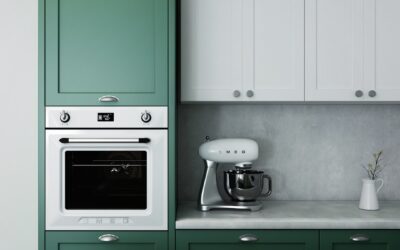
Some of the most dramatic color movement is happening on cabinetry, where all-white kitchens are finally sharing the stage. Warm, earthy greens — sage, olive, and deep forest — have become the leading alternative, bringing organic warmth to islands and lower cabinets while upper cabinets or walls stay light. Deep navy and moody blue-gray remain popular for a classic, timeless contrast. Warm woods and stained finishes are returning alongside painted cabinets, often in a two-tone combination that pairs a painted perimeter with a natural-wood island. Even black and charcoal cabinetry is having a moment in modern kitchens for its bold, high-contrast drama. If you’re not ready to repaint boxes, a colored island or a painted pantry door offers a lower-commitment way to bring the trend home. The common thread is warmth and nature, echoing the broader shift happening on walls throughout the house.
Balancing Trends With Resale Value
If you might sell your home in the next few years, factor resale into your color decisions. Buyers respond best to neutral, move-in-ready spaces, so the safest approach is to keep main living areas and the whole-house backdrop in versatile warm neutrals — greige, warm white, soft taupe — that photograph beautifully and appeal broadly. Save the bolder, trendier colors for spaces that are easy for a new owner to repaint or that read as tasteful accents, like a powder room, a study, or a single accent wall. A moody, saturated color that you love could give a hesitant buyer pause, and it’s an easy thing to neutralize before listing. The goal is to enjoy current color where it counts while keeping the big picture flexible enough that repainting for a sale is a quick weekend job rather than a whole-house overhaul.
Testing Before You Commit
Trend colors especially deserve a real-world test, because rich and earthy tones shift dramatically with light. Buy sample pints, paint two-foot squares on a couple of walls, and observe them across the day and under evening lamplight. A moody green can look almost black at night, and a warm terracotta can turn orange in bright sun. Live with the samples for a few days before buying gallons. This small step is the difference between a trendy room you love and an expensive do-over.
The Bottom Line
The most appealing trendy paint colors right now share a common thread: they’re warm, earthy, and drawn from nature, whether that’s a cozy terracotta, a moody forest green, a calming blue-green, or a creamy warm white. Cool gray has given way to inviting warmth, and drama lives in accent walls and small spaces. Use trends through paint rather than permanent surfaces, favor muted natural versions for longevity, and always test in your own light. Do that, and your home will feel current, personal, and timeless all at once.