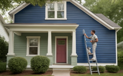
Beige never really left, it just got smarter. After years of cool grays dominating walls, warm neutrals are back in a big way, and Valspar beige paint colors offer some of the most livable, flattering options available at a hardware-store price. The trick with any beige is understanding its undertone, because the wrong one turns a cozy neutral into a dingy or peachy mistake. This guide highlights the best Valspar beiges, decodes their undertones, and shows you where each one shines.
Part of our Paint & Walls guide — explore the full guide →
- Why Beige Is Making a Comeback
- Understanding Beige Undertones
- Top Valspar Beige Paint Colors
- Choosing the Right Beige by Room
- Pairing Beige with the Rest of Your Palette
- Choosing the Right Sheen
- Testing Before You Commit
- Beige vs. Greige vs. Taupe: Knowing the Difference
- How Much Paint You Will Need
- Common Mistakes to Avoid with Beige
- The Bottom Line
Why Beige Is Making a Comeback
Cool gray walls, so popular for a decade, can feel sterile and cold, especially in rooms with limited natural light. Beige brings warmth back without sacrificing the neutral, go-with-anything quality homeowners want. Modern beiges, often called “greige” when they lean gray, are more sophisticated than the yellow-heavy tans of the early 2000s. They read as calm, grounded, and timeless, and they make wood tones, warm metals, and natural textures look their best.
Valspar, sold at Lowe’s and known for good coverage at a reasonable price, offers a deep bench of beiges from soft and creamy to rich and earthy. The key is matching the undertone to your room’s light and finishes.
Understanding Beige Undertones
Every beige has a hidden undertone that reveals itself on the wall, and this is where people go wrong. The main undertone families are:
- Yellow/gold undertones — warm and sunny, great for north-facing rooms that lack warm light but can look dated if too strong.
- Pink/red undertones — cozy but risky; they can flash peachy or muddy under certain lighting.
- Gray undertones (greige) — the most versatile and current, balancing warmth with a modern, cooler edge.
- Green undertones — subtle and earthy, pairing beautifully with natural materials.
Always test a beige in your actual room, because the same color that looks perfect in the store can flash pink or yellow under your lighting and next to your flooring.
Top Valspar Beige Paint Colors
Here are standout Valspar beiges worth sampling, grouped by their character.
Soft, Creamy Beiges
For light, airy rooms, look at colors like Valspar Bistro White and Cream Delight. These lean pale and warm, brightening a space while keeping it cozy. They work well in bedrooms, hallways, and rooms that get plenty of natural light where you want a soft, welcoming envelope rather than a bold statement.
Balanced Greige
The most versatile category. Valspar options like Woodrow Wilson Putty and Notre Dame combine beige warmth with a gray backbone, giving you a neutral that pairs with both warm and cool accents. Greige is the safest choice for open-concept spaces and homes you plan to sell, because it appeals broadly and flatters most furnishings.
Rich, Earthy Beiges
For a more grounded, enveloping feel, deeper beiges and warm tans like Valspar Sandstone-inspired tones add depth. These suit dining rooms, studies, and accent walls where you want warmth and coziness. They pair especially well with wood furniture and warm brass or bronze hardware.
Choosing the Right Beige by Room
Light exposure changes everything, so match the beige to the room’s orientation.
North-Facing Rooms
These get cool, indirect light that can make colors look grayer and flatter. Choose a beige with a warm yellow or gold undertone to counteract the coolness and keep the room from feeling cold.
South-Facing Rooms
Flooded with warm light, these rooms can handle a greige or a beige with a subtle gray or green undertone, which stays balanced rather than turning overly yellow in the strong sun.
East and West-Facing Rooms
Light shifts dramatically through the day, warm in the morning or evening and cooler at midday. A balanced greige adapts best, looking good in both the golden hours and flatter daylight.
Pairing Beige with the Rest of Your Palette
Beige is a team player, but thoughtful pairing elevates it from bland to beautiful. Consider these combinations:
- Beige with crisp white trim — a classic, clean look. Match the trim’s undertone to the wall so they harmonize rather than clash.
- Beige with warm woods — oak, walnut, and rattan glow against a warm neutral wall.
- Beige with black accents — light fixtures, hardware, and window frames in black add crisp contrast and a modern edge.
- Beige with soft greens and blues — sage, olive, and muted navy make beige feel current and layered.
- Greige with both warm and cool metals — its balanced undertone lets brass and nickel coexist.
Choosing the Right Sheen
Sheen affects both durability and how the color reads. For living rooms and bedrooms, an eggshell or matte finish gives a soft, elegant look and hides wall imperfections. For kitchens, bathrooms, and trim, step up to satin or semi-gloss for washability. Beige in a flat finish feels especially warm and cozy, while a slight sheen adds subtle depth.
Testing Before You Commit
The golden rule with any beige: never choose from a chip alone. Buy sample pots and paint large swatches, at least two feet square, on multiple walls. Live with them for a few days and observe how they look in morning light, afternoon sun, and evening lamplight. Beige is notorious for flashing unexpected undertones, and a color that looks perfectly neutral at noon can turn peachy or greenish under warm bulbs at night. Testing costs a few dollars and saves you from repainting an entire room.
Beige vs. Greige vs. Taupe: Knowing the Difference
These terms get thrown around interchangeably, but they describe distinct neutrals, and using the right one helps you shop with confidence. Beige is a warm neutral rooted in tan and cream, with yellow or gold undertones. Greige is a blend of gray and beige that sits cooler and more contemporary, making it the most versatile of the three for modern homes. Taupe is deeper and browner, sometimes with purple or gray undertones, giving it a richer, moodier presence.
When you browse Valspar’s palette, notice which direction each color leans. If a beige looks too yellow for your taste, shift toward a greige. If a greige feels too cool and gray, move back toward a true warm beige. Understanding this spectrum keeps you from ending up with a neutral that reads warmer or cooler than you intended.
How Much Paint You Will Need
Once you have chosen your Valspar beige, estimate your paint accurately to avoid multiple trips to the store. A gallon of paint covers roughly 350 to 400 square feet per coat. Measure the total wall area of your room, subtract for large windows and doors, and plan for two coats, which most beiges need for even, full coverage.
As a rough guide, an average 12-by-12-foot bedroom needs about 2 gallons for two coats of walls. A larger living room or an open-concept space can require 3 to 4 gallons. Buy all your paint in one batch with the same tint code so the color is perfectly consistent across every wall, and keep the leftover for touch-ups. Valspar’s mid-tier and premium lines offer good one-coat coverage claims, but for a color change to or from a very different shade, always plan on two coats.
Common Mistakes to Avoid with Beige
Beige has a reputation for going wrong, but the failures are predictable and avoidable. The biggest mistake is ignoring undertones and choosing a color from a tiny chip, which is how people end up with walls that flash pink or yellow. The second is failing to coordinate the beige with fixed elements like flooring, countertops, and tile; a beige that fights your warm-toned wood floor or your cool gray tile will always look off no matter how nice it is on its own.
Another common error is using a beige that is too yellow in a room with lots of warm incandescent lighting, which pushes it further toward gold and can look dated. And choosing a flat finish in a high-traffic area like a hallway or kids’ room leads to scuffs you cannot wipe clean. Match the sheen to the room’s use, sample generously, and always view your top choices against your permanent finishes before you commit.
The Bottom Line
Valspar beige paint colors give you affordable, flattering warm neutrals for every room in the house. Focus on undertone above all: choose warm gold beiges for cool north-facing rooms, balanced greige for versatility and resale, and rich earthy tones where you want cozy depth. Pair your beige with the right trim, wood, and metal accents, test generously before committing, and you will land on a warm neutral that feels timeless rather than dated.