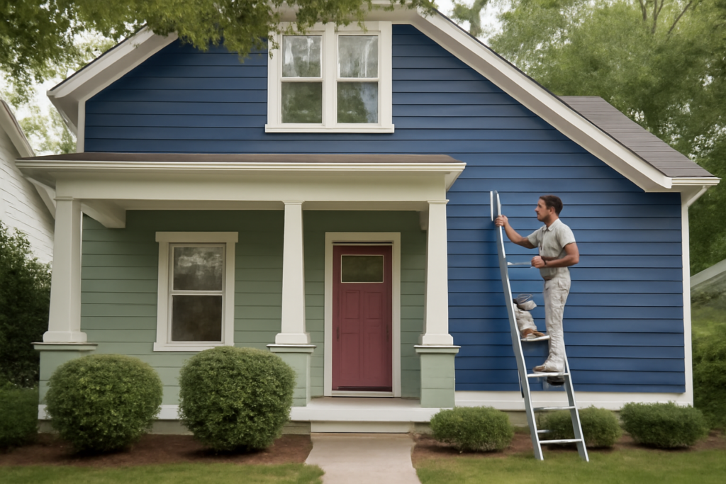
Choosing a house color is one of the highest-stakes decisions in home improvement, because a mistake stares back at you every time you pull into the driveway. Valspar exterior paint colors have earned a loyal following for their deep pigment saturation, fade resistance, and a palette that spans crisp coastal whites to moody charcoal grays. Sold primarily through Lowe’s, Valspar gives homeowners professional-grade durability at a friendly price. This guide walks through the most popular Valspar exterior shades, how to pair siding and trim, and the finish choices that determine how well your color holds up against sun and weather.
- Why Valspar Holds Up Outdoors
- Most Popular Valspar Exterior Colors
- Choosing Colors for Siding, Trim, and Doors
- Understanding Sheen for Exteriors
- Testing Colors Before You Commit
- How Much Paint You Will Need
- Prep Work That Makes the Color Last
- Understanding Undertones and Light
- Coordinating with Fixed Materials
- Matching the Right Color to Your Home Style
Why Valspar Holds Up Outdoors
Exterior paint faces punishment that interior walls never see: UV radiation, freeze-thaw cycles, driving rain, and temperature swings that make siding expand and contract. Valspar’s premium exterior lines, including Valspar Duramax and the Valspar Reserve exterior formulas, use acrylic resins and additives that resist fading, cracking, and mildew. Many carry a lifetime warranty when applied correctly, and the paint-and-primer-in-one formulas cut down on coats over previously painted surfaces. That durability is why the color you pick matters so much, since a well-applied Valspar coat can hold its look for 10 to 15 years.
Most Popular Valspar Exterior Colors
Certain shades come up again and again on homes across the country because they flatter a wide range of architectural styles. Consider these proven performers:
- Valspar Du Jour — a soft, warm white that reads clean without going stark, ideal for farmhouse and coastal exteriors.
- Valspar Woodrow Wilson Putty — a versatile greige that bridges warm and cool undertones for siding.
- Valspar Bonsai Trunk — a rich, earthy brown that suits craftsman and wooded-lot homes.
- Valspar Dark Kettle Black — a deep near-black for modern farmhouse siding and bold accents.
- Valspar Sea Storm — a muted blue-gray that gives coastal and traditional homes a serene look.
- Valspar Cliveden Sandstone — a classic warm tan for a timeless, low-risk palette.
Trends move toward warm neutrals and deep, saturated darks right now, but the safest bet is a color you still love after living with a large sample for a week.
Choosing Colors for Siding, Trim, and Doors
A polished exterior almost always uses three coordinated colors: a field color for the bulk of the siding, a trim color for windows and fascia, and an accent for the front door. A reliable formula is a neutral or mid-tone body, a lighter or crisp white trim for contrast, and a bolder door color that gives the entrance personality.
For a classic look, pair a greige body like Woodrow Wilson Putty with a bright white trim and a navy or forest-green door. For modern homes, a dark charcoal body with black trim and a natural wood door reads sophisticated. Whatever you choose, keep undertones consistent. A warm-toned siding fights with cool-gray trim and makes the whole house look slightly off without homeowners knowing why.
Understanding Sheen for Exteriors
Finish matters as much as color outside. Sheen affects both appearance and how forgiving the paint is over imperfect surfaces:
- Flat or matte: Hides siding flaws and looks upscale, but is harder to clean. Best for the main body on older homes.
- Satin or low-luster: The most popular choice for siding, balancing a subtle glow with washability.
- Semi-gloss: Reserved for trim, shutters, and doors, where the sheen adds crispness and stands up to frequent handling.
A common professional approach uses satin on the siding and semi-gloss on trim and doors, creating a subtle depth difference that makes the details pop.
Testing Colors Before You Commit
Never choose an exterior color from a paper chip alone. Outdoor light is dramatically brighter than the store, and it changes the perceived shade by several steps. Follow this testing routine:
- Buy sample quarts of your top two or three Valspar colors.
- Paint large swatches, at least two feet square, directly on the siding or on a poster board you can move around.
- Observe each swatch in morning, midday, and evening light, since sun angle shifts the tone significantly.
- Check the color against your roof, stone, brick, and any hardscape that will not change, because those fixed elements anchor the whole palette.
North-facing walls read cooler and darker, while south-facing walls wash out lighter in full sun. Judging a color on the actual wall prevents the most expensive painting mistake there is.
How Much Paint You Will Need
Estimating coverage keeps your budget on track. A gallon of Valspar exterior paint covers roughly 250 to 400 square feet per coat, with rougher surfaces like stucco and rough-sawn cedar landing at the lower end. Most homes need two coats for full color depth and warranty coverage. To estimate, measure the height and width of each wall, multiply for square footage, subtract for large windows and doors, then divide by the coverage rate and double it for two coats. Buying a little extra for touch-ups later is smart, since dye lots can vary slightly.
Prep Work That Makes the Color Last
Even the best Valspar exterior paint colors fail early over poor prep. Before the first drop of color goes on, the surface needs attention:
- Wash the siding to remove dirt, chalk, and mildew, using a pressure washer or a scrub with a cleaning solution.
- Scrape and sand any peeling or flaking old paint back to a sound edge.
- Caulk gaps around windows, doors, and trim joints to seal out water.
- Prime bare wood, stains, and drastic color changes so the topcoat adheres and covers evenly.
Paint over a clean, dry, sound surface and your color holds; paint over dirt or loose old coats and it peels within a season no matter how premium the product.
Understanding Undertones and Light
The single biggest reason a chosen color disappoints on the wall is undertone. Every neutral carries a hidden bias toward warm or cool, and outdoor light amplifies it. A gray that looked perfectly neutral on the chip can turn distinctly blue, green, or purple once it covers a whole wall in direct sun. Greiges lean warm or cool depending on the light, and even whites split into creamy warm tones and crisp cool ones. Before committing, hold your sample against a pure white card; the contrast reveals the underlying tone that will show up at full scale.
Orientation matters just as much. South-facing walls bask in strong, warm light that lightens and warms every color, so a shade may wash out a step or two lighter than the chip. North-facing walls receive cool, indirect light that deepens colors and pulls out cool undertones. East and west walls change dramatically through the day, glowing warm at sunrise or sunset and cooling at midday. Judging your Valspar samples on the actual walls, at the times of day you see the house most, is the only reliable way to predict the finished look.
Coordinating with Fixed Materials
Your siding color never lives in isolation. It has to coexist with the elements you are not repainting, and those fixed materials should anchor the whole palette. Start with your roof, since it is one of the largest surfaces and the most expensive to change. A warm brown or tan roof pairs naturally with earth-toned bodies, while a cool gray or black roof supports grays, blues, and crisp whites. Brick and stone accents carry strong undertones of their own that will clash with a mismatched body color, so pull your palette from the tones already present in the masonry.
Hardscaping, walkways, and even mature landscaping factor in too. A house surrounded by green lawn and trees can carry deeper, saturated colors, while a home in a desert or coastal setting often looks best in lighter, sun-friendly tones. By treating the roof, stone, and setting as fixed reference points and selecting Valspar exterior paint colors that harmonize with them, you avoid the jarring look of a body color that fights everything around it.
Matching the Right Color to Your Home Style
Architecture should guide the palette. Colonial and traditional homes wear classic combinations best, such as a soft body with white trim and a colored door. Craftsman bungalows shine in earthy greens, browns, and deep reds that echo their natural-material roots. Modern farmhouses lean into the crisp contrast of white siding with black trim, or the reverse with a dark body. Coastal homes come alive in blues, grays, and weathered whites. By starting with your home’s style and the fixed materials around it, then layering in Valspar exterior paint colors that share consistent undertones, you land on a scheme that looks intentional, ages gracefully, and lifts your curb appeal for years to come.